Usability Testing for Mobile VR Game
In this post, I will share mobile VR usability testing tips in the context of testing an Android game VR FPS.
I joined the project at the end of January 2018, and was tasked to conduct usability testing to understand how clear the pre-game UI and UI in the game-play were. Before joining, I collected information and data on what the experience was about.
NOTE: Gather all existing data for the product to be able to measure performance before and after testing + iterations. Collect data on the target user to understand their motivations, limitations and needs.
About the Game
VR FPS is a first player shooter game created for mobile VR. The game is available to download on Google Play Store for the latest Android phones to use with the cardboard headset. For the best game experience, it is recommended to play with a game-pad.
Usability Testing
There were 6 people recruited for the Usability Testing, 5 of whom are regular FPS players and have had some experience playing VR games.
With this exercise we wanted to test the hypotheses:
- Players would find the pre-game Information Architecture confusing;
- Players would miss some game settings in the pre-game menu;
- Whilst in the game-play, players would find UI elements comfortable to view and interact with.
Methodology
After creating a script with tasks for players to complete, I ran moderated face-to-face usability testing sessions. To test the game, I used an Android phone, a mobile VR headset, and a game-pad; to record each session, I used the DU Recorder app. Having had 6 users to test on, I spent 20–30 minutes for each session.
NOTE: Being a mobile VR testing moderator, you can’t see the player’s screen. Hence it is very important to ask players to constantly comment on what they see, so you can give tasks and ask questions contextually.
NOTE: For hygiene purposes, I recommend using a one time use eye masks with the headset.
The script consisted of the warm up questions to learn about players’ experience with VR and FPS games; series of tasks; and general feedback questions after the test.
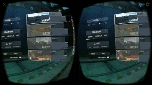
The tasks in the script were grouped around the focus areas, and involved the following sections:
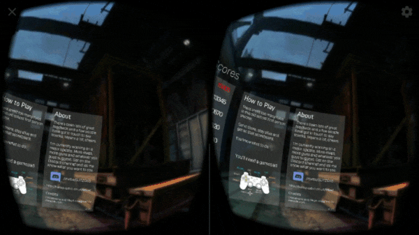
- How To Play panel
- About panel
- Settings menu
- Leader-board view
- Game-play settings
Findings
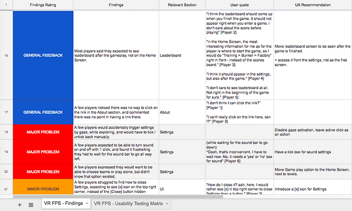
To document observations, I created a Matrix, with the list of tasks as rows and players as columns, so that the performance of each task can be easily viewed in a row, and the completion rate ranked.

After filling in the observations and players’ quotes into the matrix, I measured the tasks completion rate and looked for patterns in user behaviours. I then prioritised findings from major problems to minor problems, general observations, positive findings, and ideas.
The observations, as well as general feedback, pointed out a few major and minor problems with the pre-game UI:
- The pre-game Information Architecture was confusing;
- Some UI panels were not comfortable to view in the VR headset;
- Some settings were not easy to discover;
- Some interactions were found inconvenient.
A few players went further with the feedback and suggested a number of ideas that they would like to see in the game-play.
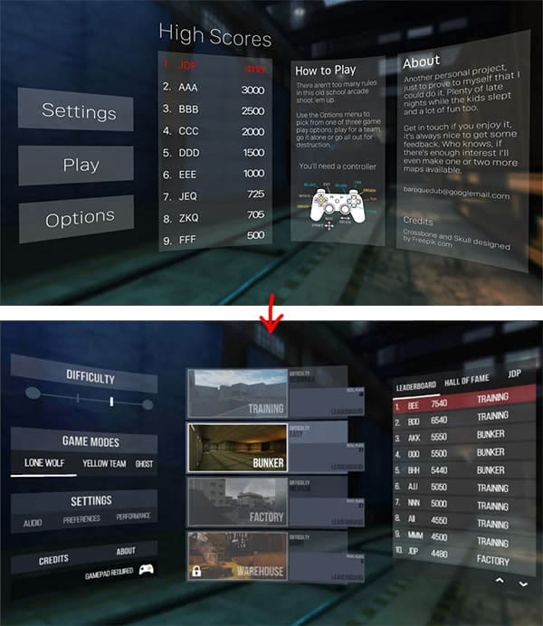
Information Architecture
Moving forward with the results to the usability testing, we decided to improve the pre-game IA. To do that, I conducted an open card sorting exercise to improve discover-ability of different options and settings.
11 people took part in the testing, and the results gave us a clear indication of groups of content, as well as labelling of how players expected the categories to be named.
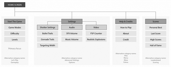
Wire-framing
Taking card sorting results and players’ feedback into consideration, there were created a few mock-ups, for further testing. Baroquedub built a couple of Menu scenes in Unity — to run another test, and collect data on the level of comfort and discover-ability of elements.
Results
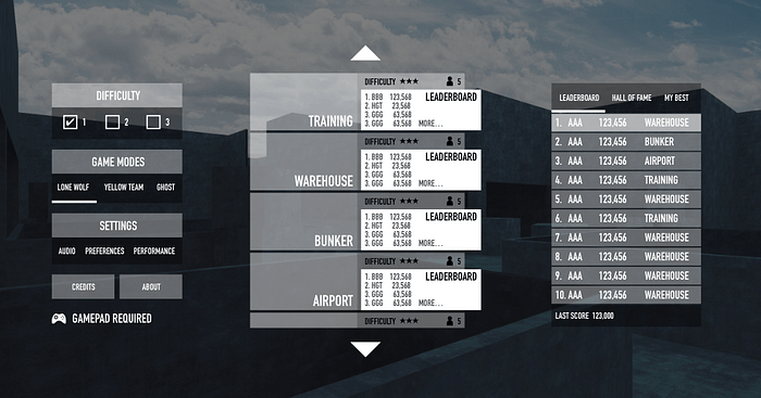
After another round of testing, the pre-game UI proved to be clearer:
- all information and necessary settings are easier to find and access;
- secondary information is sitting within the settings menu and is not cluttering the main menu view;
- game levels are added to the home screen with thumbnails, difficulty level and leader-board available to preview right away;
- visual hierarchy and fonts are kept consistent.
There were some changes made to the UI within the game experience too, which also contributed to a better perception of information during the game.
- The app has now been downloaded over 50,000 times (1,000 downloads in February 2018).
- The rating has grown from 4.1 to 4.3 over the first week since April 2018.
Useful links
- Running User Tests for Virtual Reality, by Steve Bromley
- Simulator Sickness Questionnaire, by Kennedy, Lane, Berbaum, & Lilienthal
- The Reality of Virtual Reality User Testing. Our Top Tips, by Bunnyfoot
- Lessons in Mobile VR Usability Testing, by Chloe Ng
Originally published at anastasiia-ku.com
