Usability testing of note-taking app, Evernote.
Does it require a redesign of it’s visual hierarchy?
I am one of those people who need to take down notes for everything — be it birthdays, grocery lists, return a book to a friend or a recipe I learnt from mom. That’s how I remember things! Having said that, I am a huge fan of Evernote and I take lots of notes right there. But, I just feel that when it comes to the mobile design, they’re missing out on a very important aspect.
About Evernote
(For those who haven’t tried Evernote)
Evernote is a note-taking application that allows users to create notebooks, take notes (text or image) within each notebook and share individual notes/ entire notebook.
Objective of the usability test
To identify the challenges a user faces in creating a note in a new notebook and how an upfront option of creating a new notebook works opposite to that.
Existing Flow in Evernote :
For those who do not use Evernote quite regularly, here’s the existing process of “creating a note in a new notebook” in Evernote -
When the application is opened, new users are, by default, taken to a screen with a blank note that has already been placed in an existing Notebook called “My First Notebook.”

Now, to create a new notebook (/new folder) this is what a user has to do ideally -

My hypothesis about the problem — Now, here I believe that the bigger problem is not that the “Notebooks” option is hidden behind a hamburger. The bigger problem I feel is the visual hierarchy of the interface. It is difficult for the user to understand that he/she is in a default notebook (/folder) “My First Notebook” and he/she has to exit this notepad to create a new one.
I go on to test my hypothesis.

User Research
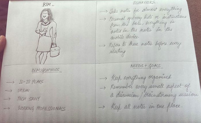
User persona
Prior to conducting usability tests, I developed a user persona to better understand the target users of Evernote’s android app. This process helped me get into the mindset of the users, thinking in terms of their contexts, needs, and goals.
So meet Kim!
Users in the test
A total of 12 tech savvy participants with experience on other note taking apps were tested. Participants were selected through sampling via in-person requests and referrals.
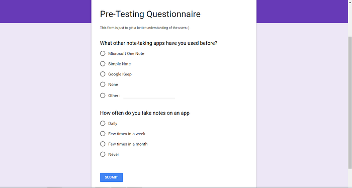
I got this Google questionnaire filled just to understand the need of the app and the competency of the users in note taking apps.
Tools used for experiment
I have used the CanvasFlip online tool for creating the prototypes and for all UX insights such as session replay (the user videos). conversion funnel and heat maps etc.
For pre-test questionnaires I used Google Forms.
Task Scenario
You and three other teammates are working on a project for your company. You all have different shifts and so it’s not possible to work together and meet up in person, so you have chosen to split up the tasks for the project but collaborate on ideas remotely using the Evernote application. You are the team leader who needs to set up the shared working space and documents. You need to have a dedicated folder for all documents related to the project.
Task — 1. “Create a new notebook in your app prototype and name it “Project Mini Ninja”. 2. Share it with you other 3 teammates and 3. create a new note named “Task allocation” in the shared space.
Usability Results
I chose un-moderated remote usability testing because I wanted to capture the experience of the users in their natural habitat.
So here’s the prototype I built for the test.
Prototype tested on
Try the prototype. (Open in a new tab)
Task given :
1. “Create a new notebook in your app prototype and name it “Project Mini Ninja”.
2. Share it with you other 3 teammates and
3. Create a new note named “Task allocation” in the shared space.


Insights on prototype
Task 1 — “Create a new notebook in your app prototype and name it “Project Mini Ninja”
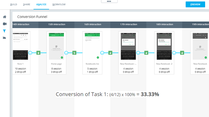
This task proved to be the most challenging task of all 3 tasks for the participants. The hierarchy of the interface confused a lot of users. Most of them struggled to navigate out of the note to find the notebook tab, where they can be created. Here is a session replay of one such user -
Only 33.33% of the users, that is, 4 users out of the 12 could successfully complete the task. Here is the mapping of the drop-offs in the flow of creating a new notebook.
Task 2— “Share it with you other 3 teammates”
The ones who completed the first task, found this much easier. The notebook section has individual sharing feature for each notebook hidden behind 3 dots. But, users did not struggle much with figuring out the sharing feature.
The average time to complete this task was 21 secs which includes the time taken to add the 3 email ids and share it with teammates.
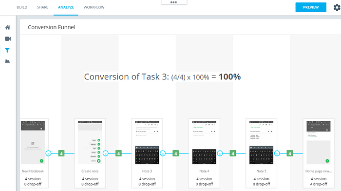
Task 3 — “Create a new note named “Task allocation” in the shared space.”
Creating a new note in the Evernote app is quite intuitive. The new blank screen clearly mentions : Tap + to create a new note.
All the users that started this task (4 users), completed the task successfully.
Design Recommendation
The default landing screen could have thumbnails of all existing notebooks. In addition to these notebooks, this screen can have a “Add new notebook” icon. In the existing app, they anyway have an option of “sort by” in the header. This option is good enough to give users the control whether they want to view thumbnails of notebooks, or of all of their Notes (regardless of which notebook they are in).

Over to you
What do you think about the creating a notebook, notes and sharing mechanism of Evernote? We’d love to know your thoughts. Use the comments section below.
P.S. — If you liked the user experience data used in this experiment, give CanvasFlip a shot and try the same on your app!