Using Gestalt Laws of Perceptual Organization in UI Design
7 Gestalt laws with practical examples
Gestalt is a German word meaning ‘shape’ or ‘form.’ Gestalt psychology was founded by German psychologists Max Wertheimer, Wolfgang Kohler, and Kurt Koffka and focused on how people interpret the world. Wertheimer, Kohler and Koffka established a few fundamental principles, also known as “laws of perceptual organization.” Principles describe the way we perceive the world.
In this article, I want to share seven gestalt laws and show how to apply them in practice.
1. Law of Similarity
Elements that have similar visual appearance seems to be more related.
In the image below, you probably see the groupings of colored circles as rows rather than just a collection of individual circles.
How to apply this to UI design
Elements can visually be grouped together if they have visual similarities. It’s possible to create similarity using size, color, and shape.

2. Law of Symmetry
Our mind likes symmetrical objects because symmetry creates an impression of stability and order.

How to apply this to UI design
When you arrange UI Elements to make them symmetrical to each other, you simplify the process scanning for users. For example, a symmetrical navigation menu tends to be perceived as more stable than the asymmetrical one.

Quick note: Symmetrical layouts can look boring. Thus, you might want to introduce some asymmetry in design to make it more dynamic.
3. Law of Common Region
Elements tend to be perceived into groups if they are sharing an area with a clearly defined boundary.
How to apply this to UI design
By adding borders around an element (or a group of items), you separate it from surrounding elements. Check the cards in the image below. Subtle shadow and clearly visible borders create an impression of individual objects.
4. Figure-Ground
The figure-ground principle refers to the human’s ability to visually separate objects on different layers of focus. We know which elements are placed in the foreground and with ones are in the background intuitively.
How to apply this to UI design
There are a few techniques to distinguish plans of focus: you can use semi-transparent overlay, shadows or blur the elements in the background.
Material design classifies Z-axis of elevation, which can be used to design overlays. The elevation is created using overlays and drops shadows.
iOS app designers often rely on blur to distinguish plans of focus.

5. Law of Proximity
Objects that are near each other seem to be grouped together.
Whitespace plays an essential role in the principle. In the following image, the circles on the left appear to be part of one group while those on the right appear to be part of another.
How to apply this to UI design
Proximity principle helps designers to make content more comfortable to perceive by users. Place related objects close to each other to create a connection.
This principle can also reduce the error-rate for interactive elements because it boosts the relations between elements.

6. Law of Continuity
Our perception tends to see object arranged in lines or curves as related or grouped. It happens because objects connected by straight or curving lines are seen in a way that follows the smoothest path.
On the image below, lines created from circles are seen as belonging together.
How to apply this to UI design
Guide the user’s eye by creating a visual connection between items. Use this principle when you design a menu.
7. Law of Closure
Our brains tend to fill in gaps in information.
In the image below, you probably see two objects (a circle and a star) because your brain fills in the missing gaps to create a meaningful image.
How to apply this to UI design
Every time you design a loading indicator or a progress bar, remember the law of closure.
8. Common Fate Principle
When elements move in the same direction, our brain perceives them as part of the same group.
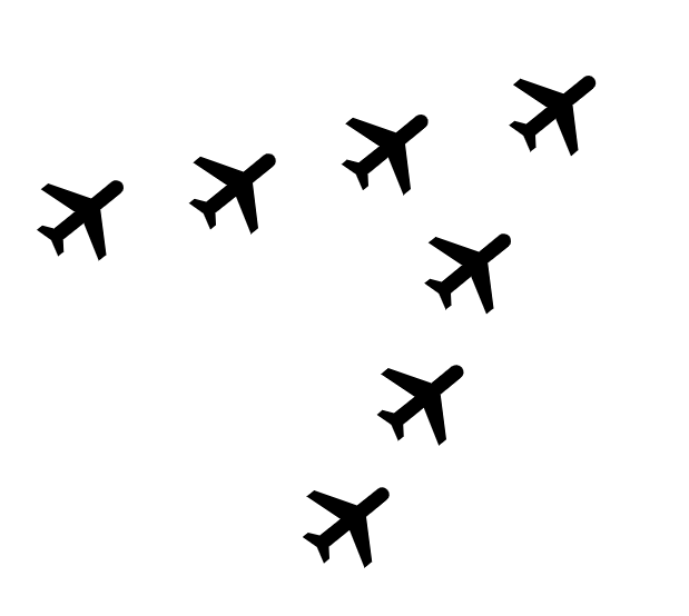
How to apply this to UI design
This principle is fundamental in motion design. Functional animation uses common fate to guide users eye.
Learn how to design user interfaces
Interactions between computers and humans should be as intuitive as conversations between two humans. Interaction Design Foundation will help you to learn how to design for efficiency and persuasion.
Originally published at uxpro.cc