Using UX Law in design
Users often perceive aesthetically pleasing design as design that’s more usable.

Hicks Law
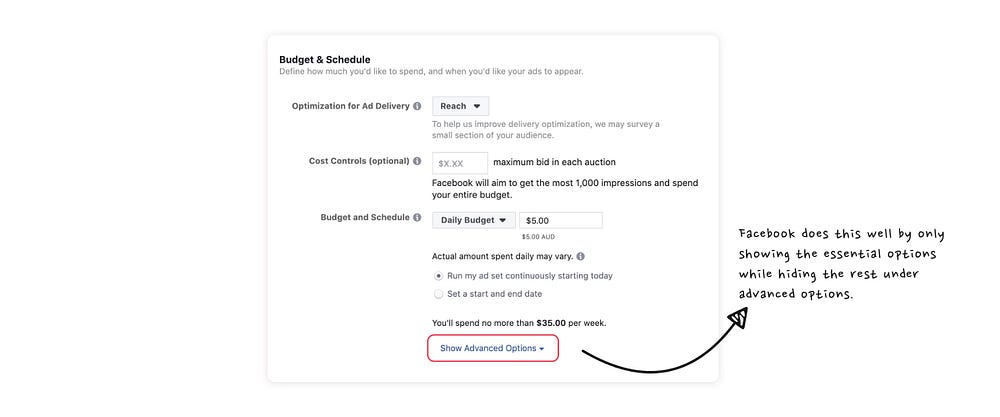
Hick’s Law states that the time required for a user to make a decision increases with the number and complexity of choice available. So basically, the more choices you have, or the harder the choices are, the longer it takes for your user to make a decision.
That is why we as designers have to synthesize information and present it in a way that doesn’t overwhelm the user — after all, good communication strives for clarity.

So how do you apply Hick’s law to your design?
- Breaking up long or complex processes into screens with fewer options (E.g. the checkout process; shopping cart → delivery details → payment information)
- Using progressive onboarding to minimise cognitive load for new users.
- Categorising the options within a navigation system (drop-down menu, filters, etc)
- Reducing the number of choices within an e-commerce site by showing the “latest release” or “popular buys” instead of listing every single product
Miller’s Law
Another key principle is Miller’s Law, which states that the average person can only keep a limited amount of information (5–9) at a period of time. This theory has led to a lot of misinterpretations, like limiting the number of items within an interface menu to seven items.
Chunking
Chunking describes the act of grouping related information into smaller units, making it easier to process and understand.

The simplest example of chunking can be found with how we format phone numbers. Without chunking, a phone number would be a long string of digits, which increases the difficulty to process and remember it. Which of the above is easier to interpret the location of the caller?
This is similar to Gestalt’s Principles which is the law of visual perception. That’s why websites use well-formatted content to ensure less scanning or searching time for users, hence creating a more intuitive interface and a better user experience.
So how do you apply Miller’s law to your design?
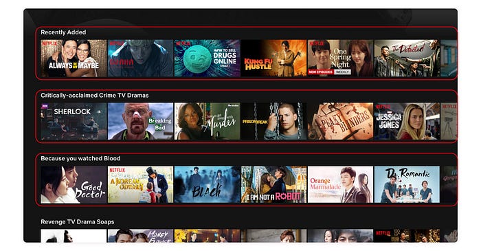
One useful way of using chunking in your design is to categorise information into logical groupings. This allows the user to easily process and understand the information displayed. This is especially useful when you’re a platform with tons of items (Youtube, Netflix, Amazon, ASOS, etc). By categorising and grouping information together, you allow the user to easily find what they are looking for.

Jakob’s Law
The last principle we’ll look at is Jakob’s Law, which states that users spend most of their time on other sites, hence they prefer your site to work the same way as all the other sites they already know.
In 2000, it was put forth by usability expert Jakob Nielsen, who explained that users tend to develop an expectation of design patterns based on their past experience from other websites. This principle encourages designers to follow common design patterns in order to avoid confusing the user.
Mental models
If all websites followed the same design patterns, wouldn’t they all look the same?
The answer is yes, that is probably true to a certain extent.
But there is something incredibly valuable to be found in familiarity for users, which leads us to another fundamental concept in psychology that is valuable for designers: mental models.
A mental model is what we think we know about a system. For example, in a car, the acceleration pedal is always on the right while the brake pedal is on the left. This is the same no matter what brand, size, color, or type of car (at least in the United Kingdom). This allows us to switch between cars without the need to relearn everything by scratch again. In other words, we used the knowledge we already have from the past when interacting with something new.
The task of shrinking the gap between our mental models and those of our users is one of our biggest challenges, and to achieve this we use a variety of methods: user interviews, personas, journey maps, empathy maps, and more. The point of all this is to gain a deeper insight into not only the goals and objectives of our users, but also their pre-existing mental models, and how that applies to the product or experience we are designing.

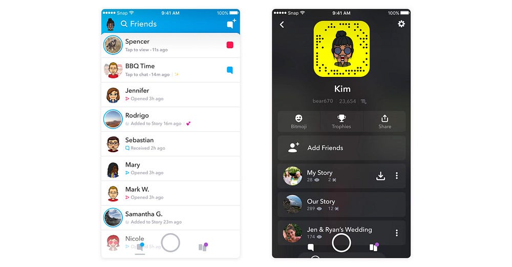
Take for example Snapchat, which rolled out a major redesign in early 2018. The redesigned layout confused users as they had a hard time accessing features which they previously used on a daily basis. This caused disapproval and unhappiness among its existing users and eventually resulted in the migration of users to its competitor, Instagram, en masse.
That is the consequence of failing to consider the mental model of their users while redesigning their app.

But major redesigns don’t always have to result in a backlash — just ask Google. Google has a history of allowing users to opt into redesigned versions of its products like Google Calendar, YouTube, and Gmail.
When they launched the new version of YouTube in 2017 after years of essentially the same design, they allowed desktop users to ease into the new Material Design UI without having to commit. Users could preview the new design, gain some familiarity, submit feedback, and even revert to the old version if they preferred it.
As a result, the inevitable mental model discordance was avoided by simply empowering users to switch when they were ready.

