UX 101 for Virtual and Mixed Reality — Part 1: Physicality
As practical applications of virtual reality begin to replace flat screens, designers need to consider how to adapt the principles of UX to a 3D world. In the same way that the shift from print to digital prompted designers to develop new skills to work in a growing medium, designing for VR requires designers to consider new forms of input, physicality, working with different senses, and how to make UI work in three dimensions.

As someone who has traditionally designed 2D interfaces and experiences, I’m currently getting my head around designing for virtual reality. I’ll be sharing what I’ve found to be the core considerations in this series of articles. These are fairly typical to what many designers and developers currently work with. However there is no real best-practice design approach in this field yet. This article is really a list of pointers to get you started, it’s not intended to be prescriptive or limiting. VR is at a stage where experimentation is vital and should be encouraged if we are to discover the best solutions.
The good news is that most of the behavioural principles you know as a UX designer can still be applied in a 3D world. There’s just more possibilities, and excitingly a lot of unknowns while this field is beginning to be explored.
Mixed Reality: The new normal for UX
Virtual reality refers to a fully immersive experience where a user is put in an entirely new environment, usually via a headset and headphones. It’s great for video games but it’s overkill to replace practical tasks done with 2D screens today with something like this. This is where mixed reality comes in. Mixed reality blends the real environment around a user with virtual objects or content. These virtual elements are mapped to the physical world.
This is close to, but not the same as Augmented reality. What makes MR truly ‘Mixed’ is that it enables both environments to interact with each other. For example a virtual UI might allow a user to change the temperature on their thermostat without being in the same room or walking over to your TV might reveal a virtual TV guide. The key difference is that MR technology uses advanced environmental mapping to anchor virtual elements to the real world. Whilst AR also places virtual objects in the physical environment, like in Pokemon GO, it relies simply on a camera.
The definition of Mixed Reality can vary depending on who you ask and examples of VR/MR/AR can easily blur. I’ve found the most practical way to think about it is to go by Microsofts spectrum of mixed reality:

The reason I think this is so important is because I believe this is where a lot of the work we do as UX Designers will eventually shift to. Apps and Websites could easily transition into mixed reality experiences that enhance people’s daily lives, and the market projections reflect this opportunity:

Headsets like Microsoft’s HoloLens are already making big moves into the broader applications of mixed reality. They’ve partnered with the NFL to change the way fans watch sports. The potential uses of mixed reality are vast.

With that in mind you might see how designing for a 3D environment is closer to what we as UX designers do today than you thought. So here’s what you need to know.
Environments as interfaces
Let’s begin with the physical considerations. Now that you’re no longer designing for a flat screen you have to consider the entire environment around a user as a potential interface. Within that space there are many human factors that shape what is comfortable.
Distance
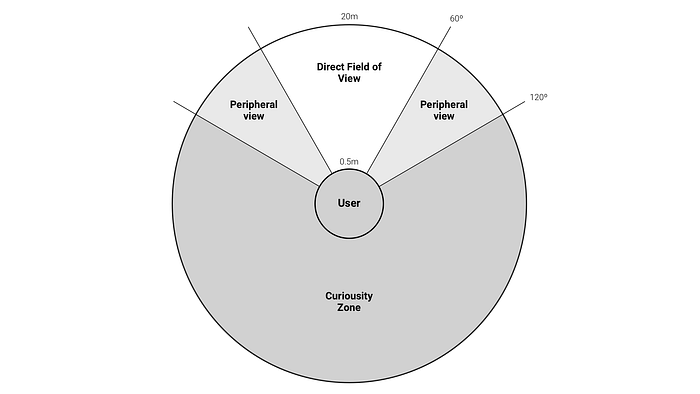
Typically, we are comfortable focusing on objects half a meter to 20 meters in front of us. Anything too close will make us cross-eyed and anything further away will tend to blur in our vision. So the interactive elements you create should live in this space.

If you’re wondering how a user would interact with something 20 metres away that’s where new forms of input come in. VR headsets like the HTC Vive come with two handheld controllers that enable users to interact with objects out of reach using a ray, a bit like a laser pointer.

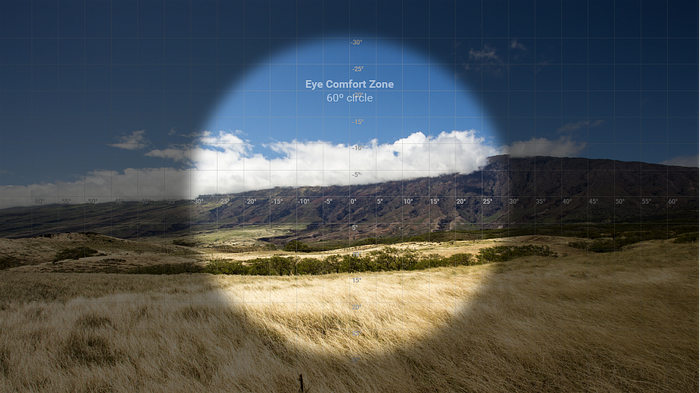
Eye movement
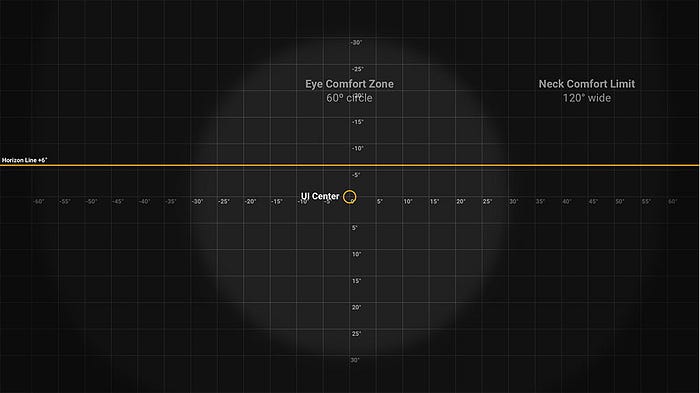
The human eye can look left to right and up and down 30°-35° comfortably. This creates a field of view, sometimes referred to as FoV. A reasonable FoV to work to is about 60°. Even if our VR headset has a wide display, a user’s default field of view will still be limited to at least 60°. (Note that having a wider display is useful because it allows objects outside of the FoV to be preloaded).
It’s a good rule of thumb to keep primary UI elements in this area, where they are immediately accessible. For example if you have a navigation system that can be called when needed, it makes sense to have it appear in the user’s direct FoV.
Below you can see an example from Google of how to place interactive elements in a VR environment. Note that the cards can be swiped in and out of the FoV, much like cards on a touch screen.
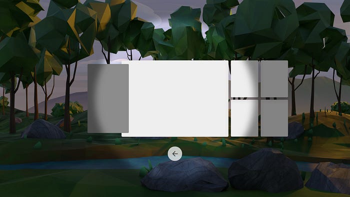
They also use the bottom of the FoV to place a back action. This could likely become a pattern in future, similar to the home button on your smartphone.
Neck movement
Thankfully as well as eyes we also have necks which allow us to move our heads in a wider range of motion. So without having to move our whole body we have a field of view of about 120°. This is effectively the width of our peripheral vision.
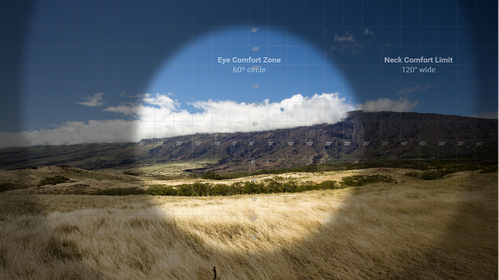
Any elements in this wider view generally need to be indicated. As in Google’s card example above, where they clearly indicate there is content outside of the main FoV.
This space can be used well when designing a virtual workspace similar to how you might use a monitor with your laptop. You look at each screen when needed, but you don’t need both directly in view.
Natural Gaze
Interestingly our heads naturally tilt down about 10°-15° with our eyes looking up. Resulting in our average gaze being about 6° below where you would assume it to be.
360°
Of course we actually have the entire space around the user to work with. The value of mixed reality is that it can overlay your entire environment. While direct and peripheral field of view provides an immediate space to work in we can also design for 360°.
This requires the user to explore so you have to think about why you would place elements here. For example if we were designing a digital workspace users could push and pull elements from this wider space when needed. Any interactive elements you place here need to be actively discovered. Treat this area as a “Curiousity Zone”.
Sitting and Standing
Of course users won’t always be stationary. One of the greatest benefits of virtual and mixed reality is free movement. But generally speaking, we as human beings don’t like to move if we don’t have to. It’s a fair assumption that for many practical uses of mixed reality people will be sitting or standing for long periods of the time.
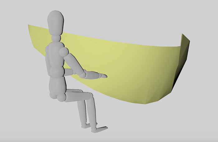
Arms Reach
The length of a user’s arms is a natural limitation for interacting in depth - an important consideration when it comes to UI. An advantage of VR/MR is that we can use other inputs to help us interact with virtual elements further away. This could be with controllers, through gestures, voice interaction and more.
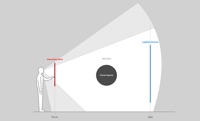
On average arm’s length is 50–70 cm from the user. So you’ll want to place key interactions at this distance.
Designing for distance
In Kharis O’Connell’s book “Designing for Mixed Reality” he splits the areas of interaction into 3 layers:
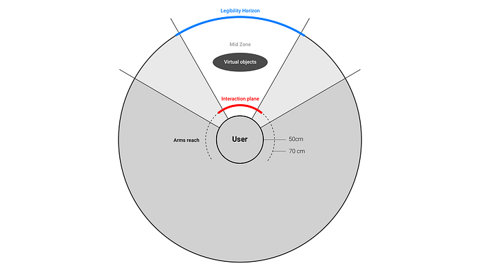
- The Interaction Plane — This is within arm’s reach, where core UI should be placed.
- The Mid-Zone — Where virtual objects are placed in Mixed Reality.
- The legibility Horizon — The distance at which we are comfortably able to focus and read. Which as mentioned before is about 20 metres. O’Connell suggests that after this point only images should be used if needed.
Arm movement
Following the previous point consider how much arm movement your UI demands of users. Imagine if you had to hold your arms up 8 hours a day at work to use your computer. You’d get tired pretty quickly. If you intend to design something for longer tasks you’ll want to create UI elements lower down where the user’s arms already are. For less frequent or important actions, you will want it to require a more conscious effort of the user, placing them further away so they don’t touch them by mistake. It’s the 3D equivalent of being thumb-friendly on smartphones.
Free Movement
Consider why the user would need to move around and what they’ll need. In a fully immersive VR experience they might need UI menus that can appear/disappear when called, they might need to discover interactive elements as they explore the environment, they might even need indicators of objects from the real world, like a wall 😬.
Free movement is a different consideration when designing for mixed reality. In mixed reality UI can appear contextually, reacting to what a user is looking at. In this scenario you would likely be designing UI to overlay things in the real world. This could provide additional information and contextual actions for users.
Solving Real life Problems
Microsoft’s Hololens partnered with Thyssenkrupp, an industrial design company, to aid their repair workers when working on site. When a repair worker arrived on site to fix an elevator the Hololens helped them analyse the problem.
In the demo video made by Microsoft we also see how a specialist working remotely can see what the on-site repair worker is looking at through his headset. The specialist then highlights areas the worker is looking at and talks them through the problem. Although the UI here is a bit over the top the solutions and use cases are a great example of mixed reality solving real problems.
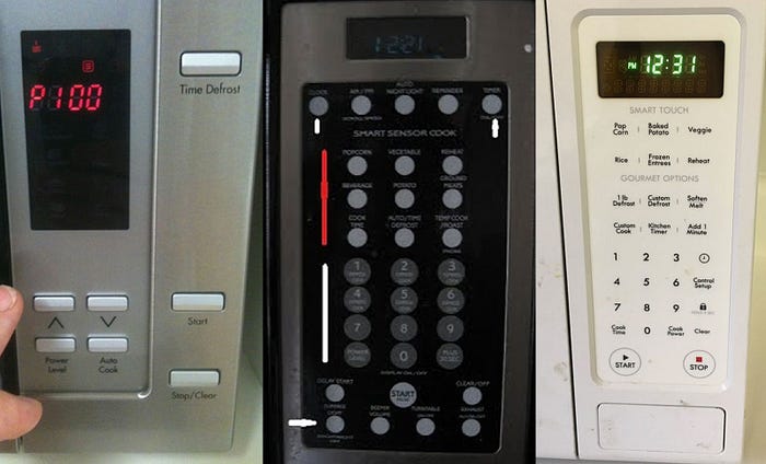
One of my favourite concept ideas for using mixed reality is applying it to a microwave. Microwaves have notoriously bad UI design. They’re rarely intuitive and the space on the product limits the options. With a mixed reality headset a virtual UI could be used to control the microwave. The virtual UI wouldn’t be limited by physical space, it could add options contextually e.g. based on time of day or the ingredients it saw you were using, it could remotely update itself to have new functionality and even learn from how you use it.
Final thoughts: Start Experimenting
Designing for virtual and mixed reality requires designers to reconsider the limits of an interface, and the physicality of user interaction. I think the most important thing for anyone wanting to understand virtual and mixed reality better is to start playing with it. The easiest way to start is by getting a cheap VR headset like the Google Cardboard and trying every demo you can.
Next
The next articles in this series will cover working with the senses, different types of input and how to make UI work in three dimensions.
Further reading
This article was built on work by people much smarter than myself. I’ve linked to their work throughout but if you want to learn more check out the following:

