UX accessibility for elderly — 12 principles

Accessibility is a well-known topic that all designers are familiar with. Moreover, I believe we all try to obey the rules, designing our websites, apps, and services to be accessible for everyone.
While working on a project the other day I dove into this topic quite deeply, and surprisingly I managed to find plenty of information on designing for the heavily visually impaired, or motorically dysfunctional. Don’t get me wrong, it’s absolutely great we account for that, but it was rather challenging to find guides on how to design for something, that even more of us will experience sooner or later — senility.
So I decided to collect data on this topic and have reproduced it as 12 rules + examples to follow.
My hope is that it makes designing for the 60+ age group more accessible for designers. <wink>
Note: Examples of apps/solutions I give relate to described features ONLY. It does not imply the whole app/solution is elderly friendly.

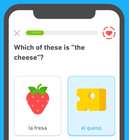
1. Enable users to adjust interface size, especially text
We can see adjustable text size more and more often nowadays which is great. I only hope the buttons to adjust sizing will be easier to find, since not everyone is familiar with keyboard shortcuts.
On touch screen devices, such options should also be available, but gesture controls should be implemented with care. As suggested by C. Stößel and L. Blessing, the elderly are much less eager (and able) to perform multi-finger gestures (eg. pinch to zoom).

2. Text field formatting
Text not only has to be large enough to make it clear to read, but text alignment also should be kept in check.
Avoid text justification — so kerning and tracking are clear, and use line spacing of at least 1.5.
3. Color coding
Colors are often used to communicate information such as errors, interactivity, etc. When designing, supplement color coding with textual explanations so color blindness is not an issue. In addition older users tend to prefer text, over symbols and colors, as a medium for information.

4. Contrast
It’s an obvious one but always worth mentioning. It describes the difference of text color to the background color.
It’s recommended to keep contrast ratio of at least 4.5:1, although it would be best to stay over 7.0:1.
Don’t worry if you don’t understand it at first, you can find plenty of contrast checkers online to confirm you hit those numbers.
Don’t be afraid of using the Material Design Guidelines and ready color palettes as a base for your creative endeavors.
5. Indicate interactivity
The days of Internet Explorer 4.0 are long gone, but the Internet in the 90’s had some benefits over our current standards — clarity of links and interactivity. Always blue, always underlined, always turning purple after a visit.
Now we’re used to different practices, but the lack of clarity in those terms is a problem for users, who can’t adapt so quickly. Add visual cues to clickable elements, both in active and static states.
6. Indicate external links
This one is actually universal for every user, since a sudden change of context is an unpleasant surprise. Period.
Avoid doing this to a less tech-savvy audience, but if you really need to send someone out of your site or app indicate it clearly, and provide an explanation.
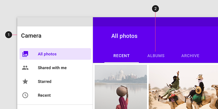
7. Current location indicator
This one is also universal, but its importance grows when designing for older generations, who may often feel lost in the web.
Bread crumbs are out of date, but there are other methods of showing where the user is: ex. clear titles or navigation indicators.
8. Animations
This one can be surprising, but I agree it may be a problem for some users. It’s recommended to keep animations at a minimum. Consider keeping them only when they serve a functional purpose, ex. when they help understand information architecture.
iOS uses animations generously to supplement navigation, but even that can be disabled in accessibility settings.
9. Time limited activities
Some actions in our apps are time sensitive, for a variety of reasons. It’s no surprise that it can be challenging to complete those tasks if one has vision, or fine motor control limitations. It’s highly recommended to avoid time limited activities in apps dedicated to an older audience. If for some reason such a solution has to be implemented, allocate more time to complete the task, and display a notification when they are about to run out of time.
10. Language
In our tech-world we are used to QAs browsing through docs of spec. sheets…
… but this is our world, and users shouldn’t have to guess what it all means!
Be nice and try to avoid abbreviations. Abbreviations are more difficult to process by our brain [source], hence much more difficult for the elderly to understand. Don’t require extra cognitive effort from your users.
Language is also very fluid in a sense that it changes all the time, so new words and meanings arise frequently. Keep that in mind and test your UX writing frequently.
11. High error tolerance
We all know the feeling when you make just one typo in a form field and no suggestions show-up! In many cases it makes a task impossible to complete, and for a less technically advanced users it can make the form completion even more impossible (if that’s even possible <wink>).
Some error tolerance is recommended in every system. When designing for the elderly, consider increasing the tolerance, even at the cost of suggestions accuracy.
Error tolerance does not only apply to form fields, and search engines, hence:
- Consider misclicks, and how easy it is to recover/undo.
- Think about how important information can be brought-up again, if it was skipped too quickly.
12. Find analogies to processes in a physical world
This one is specifically curated towards older users. Over time it will probably become less and less relevant, but for now it can still help when designing for users from the pre-cyber era, or less computerized areas.
Analogies can range from simple ones, like icons clearly referring to physical trash cans, or folders you can manipulate with natural swipes on a screen. Some apps (ex. Pillboxie, although looks dated) take this idea a few steps forward offering digital shelves where you can find jars of tablets — so it is easier for a user to track medication intake.
However keep in mind, that times change, and people change too. Many people adapt to novelties so you may underestimate the abilities of your target group. Always test your designs early and often to find an optimal solution for your target group.
Sources
Aaaaaand that’s it! There is more to add, but sticking to those rules should already make your solution a solid player in the ‘design for 60+’ category.
However if you’re more eager to learn about web/app accessibility standards, take a look at:
- https://www.w3.org/WAI/ — the most complete source about web accessibility with a section dedicated to older users.
- https://www.ageuk.org.uk/ (Age-friendly banking report) — I found it very useful when working on that list.
Szymon Trzepla
Junior UX Designer
at RBL_ by Alior Bank.
I specialize in executing design process, particularly in the research analysis & idea generation fields.

