Note: I am not affiliated with NY State of Health or the NY government in any way. This is a conceptual project I did for practice, and these views are strictly my own. I do not have access to any UX research or other context that may have informed the current design, nor am I an expert on healthcare. I don’t know how big a role web plays in the average enrollees’ experience and what other resources they leverage. So of course, I am working off my own assumptions that may or may not be accurate.
WHAT IS NY STATE OF HEALTH?
When I quit my full-time job, I was introduced to the world of purchasing healthcare as an individual. As a student (and later as a freelance UX Designer), I used the NY State of Health website to navigate my options. It’s a federally funded healthcare marketplace for New Yorkers to browse/compare different options and determine their eligibility for government assistance.
WHY REDESIGN?
- Accessibility. First, I was inspired to redesign the NY State of Health website because I found it difficult to use for something so crucial. I ran into many roadblocks during my application process and ended up leaning on their exceptional phone support to enroll. While I appreciate the hands-on help options, I also believe that having a well-designed web experience plays a big role in making healthcare more accessible.
- Practice. Second, I wanted to practice designing in the two areas I’m most excited about: government and healthcare.
- Constraints. Last, I recognize that many organizations do not have the bandwidth, time, or budget to conduct UX research and rely on heuristic evaluations to make improvements. While I think research should be budgeted whenever possible, I also want to demonstrate my ability to make improvements with limited resources.
CONSTRAINTS
Timeline
10 hours. I wanted to challenge myself to create something in under a week part-time (not including this write-up).
Scope
Homepage UX/UI for desktop+ content design/copywriting. At first, I wanted to redesign the homepage as well as the application flow, but I decided that to remain within my time constraints, it would be better to limit the scope.
Methodology
- Initial Analysis & Secondary Research (2 hours)
- Annotations & Heuristic Analysis (2 hours)
- Competitive Analysis (30 minutes)
- Content Design & Lo-fi Wireframe (1 hour)
- High-fi Wireframe (4.5 hours)
INITIAL ANALYSIS
Exploration

I read all of the copy, clicked on all of the buttons and links, and pasted screenshots into Figma in order to get an understanding of what the homepage was trying to accomplish:
- Insight: The “Enroll Today”, “Login”, and “Get Started” buttons all point to the same signup page for Individuals & Families.
→ Assumption: The most important CTA is getting new users to register.
→ Assumption: Most of these new users fall into the category of Individuals & Families. - Insight: Each section represents 1 of 5 different account types with buttons for their respective signup pages.
→ Assumption: The homepage is intended to teach new users about each account type and direct them to the correct signup page - Insight: Several self-service and customer service help options exist.
→ Assumption: Choosing the right healthcare plan often requires the use of tools and/or human assistance.
Target Audience / Persona
- Summary: Individual New Yorkers who are looking to acquire health insurance for themselves/their families and require government assistance, through programs like Medicaid.
- Statistics: NYS Medicaid, which assists low-income and/or disabled New Yorkers, covers 7.2 million individuals as of September 2021, much of which in response to the economic instability from the pandemic. That’s about 37% of all New Yorkers. Federal standards require states to offer financial assistance to the following populations (at or near the poverty line): pregnant women, (pre)school-age children, elderly/disabled patients, and working parents. NYS specifically also covers childless adults at 200% of the poverty line.
- Emotional state: New Yorkers on Medicaid are in a vulnerable position. If they’re anything like me, they’re coming to the website with a lot of uncertainty and need reassurances that they’ll be supported upfront.
- Accessibility: Elderly, blind, and disabled enrollees make up 21.4% of eligible recipients, which means color contrast is crucial to a good web experience. To accommodate varying levels of technical literacy, the design should prioritize customer service options (particularly to accommodate several languages), make self-service options simpler, and reduce opportunities for error. The principles of universal design dictate that such improvements will benefit everyone.
Goals
I then translated these assumptions into high-level goals. The redesign should aim to make it easier for users to…
- Register for a new account (or log in)
- Learn what services are provided
- Access the tools/help they need
Metrics of Success
- Increased registration rates
- Decreased bounce rates
- Increased click-through rates for all buttons
HEURISTIC ANALYSIS
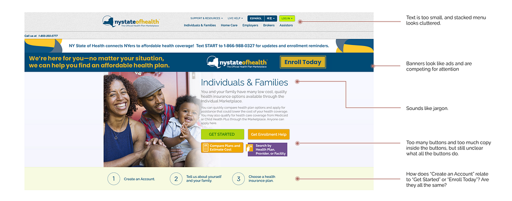
Then, I used the Nielsen Norman Group’s 10 Usability Heuristics for User Interface Design and Web Content Accessibility Guidelines (WCAG 2.0 and 2.1) as guides to annotate and categorize issues I found in the design:
Above The Fold
When thinking about a homepage, the information that the user can see before scrolling is the most important. However, the overwhelming number of banners and buttons obscures the Call to Action (CTA). You can see my annotations above and problems summarized below:
Flexibility & Efficiency of Use:
Shortcuts — hidden from novice users — may speed up the interaction for the expert user such that the design can cater to both inexperienced and experienced users. Allow users to tailor frequent actions.
- The menu is very small (13pt text) and cluttered.
- The login button is important for returning users and should be more prominent.
- The help number is also small and in an unexpected place but very important, particularly for less tech literate users.
Error Prevention:
Good error messages are important, but the best designs carefully prevent problems from occurring in the first place. Either eliminate error-prone conditions, or check for them and present users with a confirmation option before they commit to the action.
- All these buttons compete for attention, and it’s difficult to tell what the CTA is or what the buttons do. There is too much copy inside the buttons and not enough context surrounding them, making it easy to select the wrong option.
- I’ve memorized that “Get Started” means “log in”, but only after repeated use and failed attempts (also Recognition Rather Than Recall).
Aesthetic & Minimalist Design:
Interfaces should not contain information which is irrelevant or rarely needed. Every extra unit of information in an interface competes with the relevant units of information and diminishes their relative visibility.
- Stacked banners compete for attention and make it difficult for the user to decide where to click. Although “Enroll Today” is the main CTA, it looks more like an ad than a button.
Match Between System & Real World:
The design should speak the users’ language. Use words, phrases, and concepts familiar to the user, rather than internal jargon. Follow real-world conventions, making information appear in a natural and logical order.
- “Individuals & Families” sounds like jargon and isn’t particularly meaningful.
- The instructions are helpful, but the language around creating an account varies for the same result. “Enroll Today”, “Get Started”, and “Create an Account” all refer to the same process and direct to the same place. Language should be consistent/familiar, so users know where they are in the process.
Color Contrast Accessibility:
Colors must have sufficient contrast, for example, between the text color and the background color (technically called luminance contrast ratio). This includes text on images, icons, and buttons. Checked with Contrast Ratio.
- The white text on orange fails WCAG 2.0 and 2.1.

Below the Fold
Based on my initial analysis, the information further down the page describes each account type and funnels users into registering for the right kind of account. However, I think there are opportunities to prioritize information so users find what they need faster.
Flexibility & Efficiency of Use:
- The user must scroll to see all the account types. If each user only needs one type, this means most of the homepage will be irrelevant.
- All account types should be visible above the fold, with additional information behind “Learn More” buttons.
Aesthetic & Minimalist Design:
- These yellow sections act as dividers but also contain a lot of text without a clear logical structure or visual hierarchy.
Match Between System & Real World:
- Jargon (like “SHOP”, “certified Insurers”, “Small Business Health Care Tax Credit”) obscures the most important information. These terms should be introduced later, when relevant.
Color Contrast Accessibility:
- The dark gray on light gray text fails WCAG 2.0 and 2.1.

Consistency & Standards:
Users should not have to wonder whether different words, situations, or actions mean the same thing. Follow platform and industry conventions.
- The language here is geared toward non-Brokers. Information for registering as a Broker is, unexpectedly, in the divider. To maintain consistency, language should be geared toward each type of user.
- “Sole Proprietors” and “Interested in becoming…” are not hyperlinked as expected.
- Several different typefaces and sizes are used throughout the footer, making the alignment seem “off.”
Color Contrast Accessibility:
- The blue on yellow fails WCAG 2.0 and 2.1.
- All of the text in the footer fails WCAG 2.0 and 2.1.
COMPETITIVE ANALYSIS
I analyzed a few other insurance and utility companies to see how they organized their homepages. I was most interested in how they handled multiple account types and both new and returning users. Some elements that I borrowed were…
- Splash image/text formatting and “Learn more” cards from Blue Cross Blue Shield
- FAQ and phone number placement from The Zebra
- “Login or Register” language from ConEdison
- Quick links formatting from Aetna Health Insurance

HIGH-LEVEL RECOMMENDATIONS
Redesigned Homepage
Here is the new homepage I created in Figma, which I’ll explain further below:


Content Design

I sketched out a lo-fi wireframe in Figma to get an idea of where I might place everything. Here’s a summary of the big changes, which I’ll explore in more detail below:
- Problem: Users have to scroll to see each account type and may be overwhelmed by the amount of text.
→ Solution: I moved all account types above the fold with a short summary to give the user just enough information to pick one and click the “Learn More” button for more information. - Problem: Most of the information on the homepage is irrelevant, making it hard to find the necessary tools/service options.
→ Solution: I added an FAQ that should be relevant to everyone, regardless of account type. - Problem: There are 4 main buttons in the “Individuals & Families” section that compete for attention.
→ Solution: Below the fold, I expanded the tools hidden behind the 3 non-CTA buttons and contextualized them with help text. - Problem: Banners at the top of the screen also compete for attention which make it harder for the user to find the Register button.
→ Solution: I consolidated the content from the banners and step by step instructions to form a more cohesive CTA without competing elements.
Brand
I mostly stuck with the same brand elements but made some changes to promote harmony and consistency throughout. I wanted the brand to feel warm, trustworthy, and familial.
- Problem: There are too many colors that don’t harmonize.
→ Solution: I removed all colors except shades of the brand navy and gold. Black/white text on top of the brand colors had the best color contrast. I excluded the green, purple, and light yellow since they were distracting and unnecessary. - Problem: Raleway and Helvetica look too similar next to each other.
→ Solution: I only used different sizes/weights of Raleway throughout. (I don’t love it but didn’t experiment with type because of time). - Problem: Elements, including images, sometimes have rounded corners and sometimes not.
→ Solution: I rounded the corners of all the images (and buttons) to maintain that warm feel.
BREAKDOWN
Above the Fold
Flexibility & Efficiency of Use:
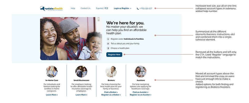
- I bumped the text size up to 16px, put all the items on a single line, collapsed the account types into a submenu, and added the help phone number.
- I bolded and added “or Register” to the Login copy to make it friendly to both new and returning users.
- I moved all account types above the fold and broke out the links for finding and registering as a Broker or Assistor.
Aesthetic & Minimalist Design:
- I removed the banners/dividers and consolidated all of the information into a single element.
- I moved the phone number for text updates to the footer since I didn’t want it competing with the main help number.
- I trimmed the copy to give the user just enough information to know which path to take.
Match Between System & Real World:
- I replaced the jargon with the more welcoming language from the “Enroll Now” banner.
- I moved the instructions up and used the word “Register” consistently so users know how the buttons relate to the process.
Error Prevention:
- I removed all of the buttons except the CTA. I moved the content from the other 3 buttons below the fold with additional context.
Color Contrast Accessibility:
- The CTA button passes WCAG 2.0 and 2.1.
- I used the brand navy for the hyperlink color (only for clickable elements), which passes WCAG 2.0 and 2.1.
- All body text also passes.
Below the Fold

Error Prevention:
- I took the 2 “self-serve tool” buttons and contextualized their purposes by adding consistent headers (“Search Plans By…”) and descriptive buttons. This makes it super clear what each tool does and minimizes the opportunity for users to click the wrong button and navigate away from the homepage.
Help & Documentation:
It’s best if the system doesn’t need any additional explanation. However, it may be necessary to provide documentation to help users understand how to complete their tasks.
- I added help text and included a zip code field to speed up the process of searching for plans.
- I created a help section for the “Get Enrollment Help” button and contextualized it by grouping it with the FAQ.
- I pulled the most general questions from the FAQ (currently in the Help submenu) and displayed them collapsed at the bottom to provide a more organized way to get information that is relevant to any account type.
Consistency & Standards:
- I normalized all the type in the footer.
Color Contrast Accessibility:
- All the footer text passes WCAG 2.0 and 2.1.
REFLECTIONS
Application Flow
My original plan was to redesign the entire user journey from homepage to application submission, particularly because interactive elements are the trickiest and most impactful for applying heuristic analysis. While I’d hoped to showcase my ability to adhere to a “templated” set of heuristics, I ended up taking a looser approach that I think is ultimately more suited for Medium and my time constraints.
Usability Testing
Throughout, I was using my own experience with the website as the basis for the recommendations. That said, I would’ve gotten a treasure trove of useful feedback had I been able to usability test with others.
Case Study
The biggest challenge I had with this project was actually how to format this write-up, which involved just as much design thinking as the redesign itself. I struggled with the best way to showcase the before and after annotations without overwhelming the reader with text or being redundant. I went through 3 iterations before landing on the one you see now; I hope it’s effective! Thanks a bunch to Monica, Zen, and Brandon for their feedback and helping me get this out the door.
CONCLUSION
Overall, I learned a ton from this exercise, not just from doing it myself but also drawing inspiration from other case studies like this one, this one, and this one.
I also learned a lot about the NYS healthcare system, who it serves, and how much effort is required to get help if you’re entering from the web. Going freelance opened my eyes to the complexities and stressors that come with finding healthcare as an individual. I struggled to navigate this website as someone who’s worked in tech for 6+ years; I can only imagine how difficult it would be for someone who’s not on their laptop most of the day.
I believe in Medicare For All (as do most Americans), but in its absence, the government should do its best to help all Americans find affordable health insurance. Throughout the COVID crisis, NYS has been so forward thinking with its use of contact tracing, quarantine resources, and vaccine passport apps. I hope they will continue to apply that forward thinking toward a more accessible healthcare marketplace.
As always, please feel free to reach out if you’re interested in collaborating or just getting in touch: https://www.cattran.design/
Thank you so much for reading!


