UX Design Across Different Cultures — Part 2

In UX Design Across Cultures — Part 1, I discussed why businesses should address cultural differences when expanding into a new market, how culture affects UX, and how to design for international users. In this article, I will share some more tips and tricks to design for international users, and how companies can be in a better position to take on culture-sensitive projects.
Research mobile device usage in emerging markets
Often, we as designers can fall into the trap of designing for ourselves. For example, when we search for ‘mobile design’ on Dribbble, most of the designs are mockups on high-end mobile phones, like these:

If you’re designing an app for high-paid techies based in San Francisco, it may be reasonable to assume that your users have iPhone 7 Pluses. However, when you’re designing for a new market, it’s important to research the devices users have. Keep in mind that not every user on the planet has the newest mobile phones.
Feature Phones
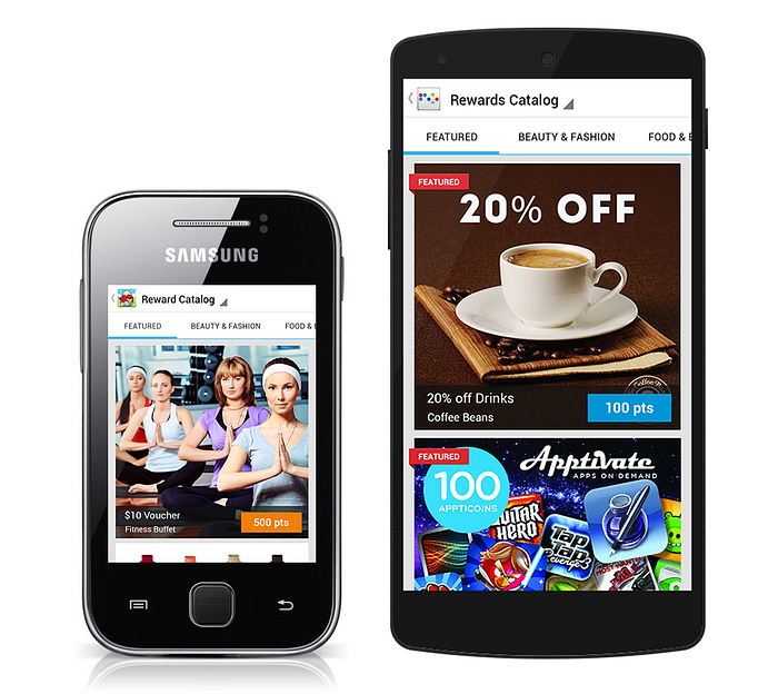
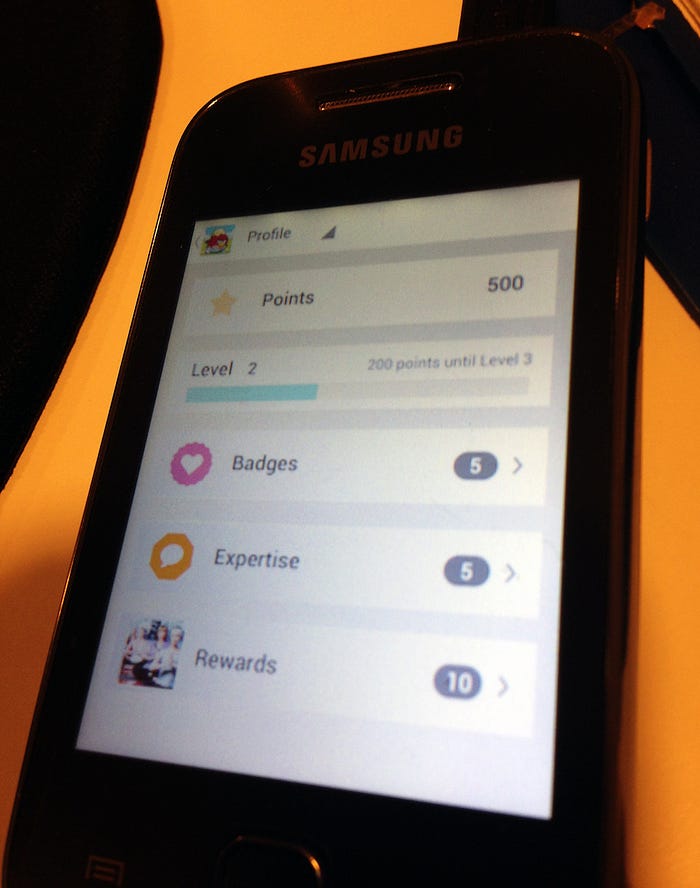
As the UX/UI Design Lead at Gimmie, loyalty CRM provider for digital publishers, I helped SMART design a loyalty program for their Android users in the Philippines.
I assumed that Filipino users don’t have the most high-end phones and are mostly Android users. To verify this assumption, I worked with SMART’s engineers and PMs to uncover which phones users have.
We found out from data that 41% of users use either Samsung Galaxy Y GT-S5360 or Samsung Galaxy GT S5300, which were very similar in device size and screen size.

Other than these two Samsung phones, users were on low-end phones that don’t even run on Android. It was interesting to learn that the phone models that our users currently have are phones that I have seen or used in 2007.

Some designers think that they don’t need to design for specific screen sizes because Android automatically adjusts each application’s user interface to the current device screen by default.
However, according to Android Best Practices,
You should make the effort to optimize your application for different screen sizes and densities. In doing so, you maximize the user experience for all devices and your users believe that your application was actually designed for their devices — rather than simply stretched to fit the screen on their devices.
Since 41% of SMART users had Samsung Galaxy Y or another device with a similar screen size, Samsung Galaxy Y became our main “device persona” in this project. I was able to persuade my team to buy a Samsung Galaxy Y so I can test my designs. Funnily enough, it was actually hard to find a shop in Singapore that sold that particular phone. Many shops told me that it was discontinued!
My approach to designing for feature phone screens includes testing text legibility and tapping area sizes. Similar to the approach of responsive web design, when designing for various screen sizes, make sure that designs don’t end just above the fold. Elements peeking on the fold cue users to scroll/swipe.
I used Skala Preview to preview my designs on my mobile phone directly from Photoshop (now I use Sketch Mirror, which didn’t exist yet in 2013). There are two reasons that I didn’t use prototyping web apps for this task:
Firstly, viewing the designs on the device instead of in the browser helps me understand the user experience more accurately. I tested if the buttons are the right sizes, if the texts are legible on small screens, and if the user flow from screens to screens were smooth.
Secondly, prototyping software including Invision and Marvel do not support older mobile device models.
If I jumped right into high-fidelity mockups without understanding what phones users have, I would have designed something that looks nice on Dribbble, but is totally unusable for the target audience.
When you’re designing for users in emerging markets, first take some time to understand the platforms and devices of users.
Design in the longest translation first
A good development cycle involves developers and QA testers checking and addressing text overflow issues. As designers, we should help our colleagues think of these scenarios in advance and own the experience of users of different locales.
To design a localized product, we should think about: Is the language shorter or longer? How much white space will there be once translated? How long are the names in the local language?
This app download banner was one of my first projects at TravelBird. I started designing with English and Dutch and I thought it looked pretty good. When I translated the English string to Finnish, which is one of the longest European languages, the text was almost touching the button.

Knowing that the real translation could be even longer than the Google translation, I had to address the possible text overflow issue. So I increased the height of the text field to three lines to fit the longest language.
The real copy given by the translator was even longer by 33% — 15 characters longer than the original string — and fitted perfectly in the text field of three lines. Had I not make this change before I hand over the designs, I would be leaving it up to the developer to decide how to address the overflow issue.

When designing a product that’s translated into 17 different languages, don’t just design in English. Check what the interface looks like with the shortest and longest languages. This way, you avoid the non-English translations getting cut off or overlapped when shown to your users.
Research Local UI patterns

We all know the hamburger menu icon and the more button on mobile apps. Both open up navigation links and more options. It’s pretty common in apps, so these got to be used worldwide, right?
Not exactly. At least, not in China.
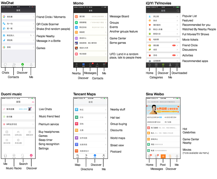
In China, a “Discover” button (usually with a compass icon) is used for not-quite-essential extras. Chinese users see apps as an ecosystem rather than a single functioning product. To Chinese users, the action of “discover” intrigue curiosity, which is more valuable than knowing “here is more stuff”.
Searching v.s. Browsing
Another East vs West example is the landing page. Compare these two versions of Mozilla Firefox’s landing pages, there is much more content on the Chinese homepage, while on the American page there is one clear CTA (call-to-action).


Bram Pitoyo, Design Strategist at Mozilla, researched the most used websites for both demographics. He found that the number 1 most used websites — Google and Baidu — are both search engines optimized for searching. For Google and Baidu, there is one clear user goal and CTA.

However, most other most visited websites in China, such as QQ, Sina and 163 adopt a portal design, optimized for browsing. These portal sites contain more information than a search field and button.

Pitoyo’s assumption of the different design for the Chinese Firefox website:
Typing Chinese takes a long time and finding the precise word isn’t easy. Search sucks, so optimize for browsing.
Whether you design a web or mobile interface, utilizing an UI pattern familiar to locals is more efficient than introducing a known pattern elsewhere and asking local users to adapt to that.
My advice is to research the local UI patterns when you localize your product, also, research the most used and popular websites and apps and study why they adopt specific patterns.. Otherwise, your local users may be confused because they may not be familiar with the UI patterns from the West.
Depending on what your product is, if you’re designing for Chinese users, you may want to test whether or not the portal design or a discovery feature will be well received by your users.
Create Personas of Local Users
Personas are useful when designing for users of different cultures because you can put the users’ cultural characteristics in front of you in the design process.
As with the best practice with personas is to verify them. It is even more important to verify the personas of users of different cultures. The less you are familiar with the culture of the users, the riskier the assumptions (personas) are.
To design personas that reflect local users, research your users and verify the personas with the local team or a user researcher.


When designing personas of different cultures, be aware of stereotypes. For example, adjectives such as lazy, smart, or violent are stereotypes and not cultural characteristics. Cultural characteristics are different from stereotypes, in that these are backed by research and complicated, rather than general and oversimplified.
Mock up real user faces
When designing mockups and personas, designers often turn to avatar generators or Google to find images to use in the designs. When we design for users of different cultures, we should aim to understand who our users are, including what they look like.
Choosing the qualities of my placeholder text helps me make better decisions, and sets better expectations with my clients.
— Matthew Ström, Creator of Datum Ipsum
If choosing the right placeholder text helps us to make better decisions, there are even more reasons to choose better images in our mockups. Our mockups are used in walkthroughs, App/Play Store, press kits, sales presentations, marketing websites and more. If designers can’t see the users of the product, how can our users, investors, and clients?
Currently the most well-known Sketch content generator plugins generate mostly white male avatars and logos. This is a pain for designers that design for non-white-male users.
It shows a few more female avatars than UI Faces on TinyFaces’ website, but when I actually tried to generate avatars with the plugin, most of them are still white males…
A while ago I discovered Diverse UI, made by Renee and Yefim, two techies who realize this issue. It’s a great tool for designers who need avatars of users of different genders and ethnicity.

Using real user faces in the mockups help us relate to users and help the users see themselves using the product. When you’re designing for users of different cultures, first try to understand what they look like, and use avatars that reflect them.
Tools and Tips to Design for Multiple Languages
Language Overview
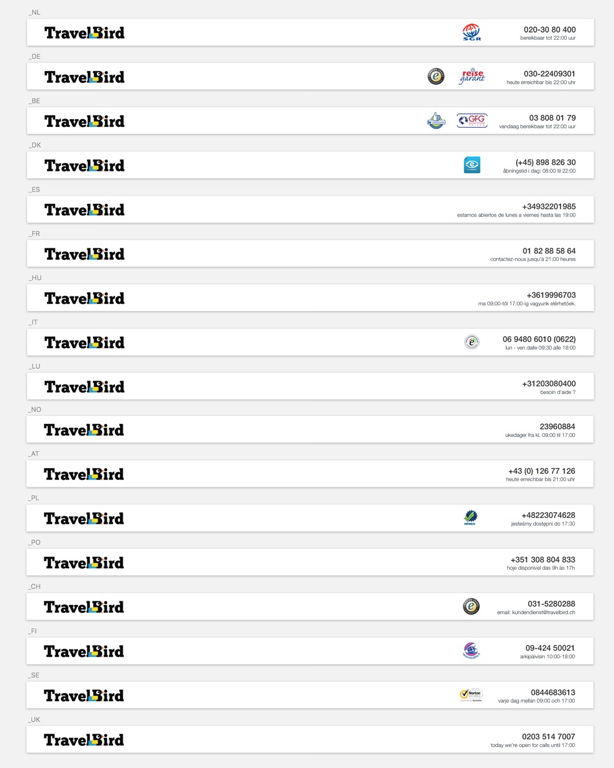
This overview of headers helped us communicate with developers and country managers the consistency standard of our headers, with the logo, legal logos, phone numbers and telephone hours.
Plug-in for Responsive Navigation
If you need to design a responsive site that supports languages of various lengths, but you don’t have the resources to create different designs for each locale, you can use MakeFit — a plugin that resizes the text elements to fit within the confined widths. This tool is made by Aaron Barker, who used it to address responsive navigation for 73+ languages for LDS.org.
It’s a quick solution, but not perfect. While using this plugin, the longest texts/languages will be shrunk, compromising on the legibility.

Localization Character Counter
Inspired by Dropbox Design, Brian Bimschleger built a Localization Character Counter to estimate localized copy length.

This may be useful as a back-of-the-napkin calculation, however, its limitation is that it doesn’t take in account of the sizes of the characters and language nuances.
For example, comparing Italian and Japanese translations, there are 35 characters in Italian but only 16 characters in Japanese even though the two are about the same length on the screen. Also, there are 2 systems in the Japanese language with different translation lengths: kanji and kana.
Use these tools to design for multiple languages, but ultimately, you should work with a local copywriter to make sure your translations and copy are 100% on point.
From observing and working with various companies for the past 6 years, I’ve noticed differences in companies that succeed in designing for international users and the ones that don’t.
Here are my suggestions for companies to be in a better position to take on culture-sensitive projects.
Hire a Diverse Team
If you’re designing for a specific locale, it goes without saying that having someone in your team who knows about the local culture is highly valuable.
If you’re building a product for international users, a team of diverse backgrounds helps to think about the product from different perspectives and generate more creative ideas than a homogenous team can.
At Gimmie, our team is from the U.S., Singapore, Philippines, Thailand, Taiwan, and Indonesia. We use English to communicate across the core team, and each local team communicates in their local languages.
Our local team in the Philippines helped us acquire leads in the Philippines and connected us with local clients. My Thai colleague helped us with the process of exhibiting our product in Thailand.
Because of our international team, we had more opportunities to showcase and sell our product in the Southeast Asia region. As a result, we have a list of international clients, from publishers in Singapore, to telecommunication companies in the Philippines, to game companies in Indonesia.
ROI of Diversity
I’ve seen portfolios of companies that create products for international users. Yet their team is made up of people who look like each other, whose ideas are not much different from one another. Their ideas and work are fuelled by burgers, foosball, and beer, as written on the company’s About page. Their job postings are in the local language, which rules out people who are able to do the work but not skilled in the language.
If I were the client and I want to solve problems for South African users or Indonesian users, I wouldn’t hire these companies. How can I trust the company to have empathy for the users and solve the problems effectively, if the company is not even open to gain different views and voices?
Whether your product is for international users or not, it is dangerous to have a homogenous team and listen to people just like yourselves because a homogenous team often has a narrower view and similar perspectives than a diverse team.
The recent revelations at Uber surfaced the problems of Silicon Valley’s bro culture — an aggressive and unrestrained workplace culture that focuses on growth and revenue targets. Often in this bro culture workplace, views of women and underrepresented groups are suppressed or ignored.
According to Catalyst, research finds that diverse and inclusive workplaces lead to multiple benefits including higher customer satisfaction, higher social sensitivity, and increased innovation.
Studio D, a specialized international design and research agency hired a crew of 13 nationalities, as it reflects the diverse locales in which they operate.
“Having mixed backgrounds is a real asset when you work in a team: ideas bounce back differently, and you end up making interesting connections.”
— Parmigiano & Camembert, London-based creative and advertising agency with clients all over Europe
“Over time, diverse teams surface more creative ideas, precisely because they force shifts in communication style & structure.”
— Sarah Mei, Founder of RailsBridge
As a diversity advocate, I plead startup founders and VCs to increase diversity among their teams and investment portfolios. Project Include is a great place to start acquainting yourself with diversity recommendations and case studies.
Travel & Ethnographic Research
My biggest asset when it comes to designing for users of different cultures is that I learned culture differences firsthand during my travels. So far, I have travelled to 45 countries.
When I’ve been to where the users are, seen their lifestyle, learned how they use online products, met local users, it was much easier to put myself in the users’ shoes and be empathetic to users’ pain points. The more I travel, the more open-minded and curious I become about other cultures and their ways of life.
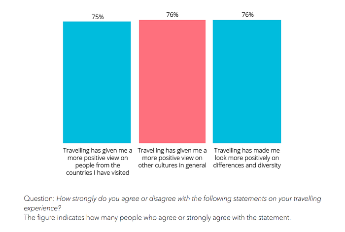
According to a study by Momondo, 76% of interviewees say that travelling has made them look more positively on cultural differences and diversity.
In my experience, learning about other cultures first-hand has served me well to be a more culturally diverse designer than before I started travelling.
In addition, travelling for ethnographic research also helps you design for users of different cultures. You can conduct contextual inquiries to observe how users are actually getting things done. Through ethnographic research, you can truly understand their goals, motivations, pain points, in the right context.
Work with a Cross-cultural UX Expert
Beyond what I’ve mentioned in the article, there’s much more to consider when expanding into new markets. When you work with a UX designer or agency who is experienced in this area, they know what to look for, where to find users and can cut down the project time by a lot.
When you work with a designer who is experienced in working abroad, you get all the benefits of what the designer knows about the local cultures, without having to do all the travel and research yourself.
In this article, I discussed my approach to mobile design for emerging markets, East v.s. West design patterns, tips and tools to design for multiple languages, and tips to become a more culturally diverse designer.
It was fun to write about my experience of living abroad for 4 years and designing for various markets and cultures. Do you have any other tips to design for users of different cultures? Don’t hesitate to comment below or tweet me. I’d love to hear from you!
Do you want to expand into new markets or optimize your product for another culture? I am a UX & UI consultant who specializes in the travel industry and cross-cultural UX. If you want to contact me about cross-cultural UX, on-site or remote user research, please email me at jenny@jennyshen.com.