UX Design course at Kyiv Academy of Media Arts. Case study: Furnify

This article is about creating the e-commerce website for selling furniture and decor named Furnify. Using this case as an example, I’m going to show the process of creating a site.
I worked on this project during the UX Design course at Kyiv Academy of Media Arts (KAMA), led by Aleksey Stiques and Alexander Movchan. The course lasted 2,5 months.
Progress
The classes in KAMA started from theory. Then we got the task from the curators: during the course, we had to design an e-commerce website. This was the brief:
Furnify
There are lots of small teams/companies/manufactures now in Ukraine where people make interesting products for interior, furniture, or minor decorating elements, such as lamps, candlesticks, racks, etc. All these products look interesting, sometimes they are handmade, and ideally, they should be presented distinctively.
The distribution points are now social media, or major classifieds websites, like prom.ua, or olx.ua. But in terms of sales, it’s not very profitable to offer goods there, both visually and reputationally, because goods start to be taken as off-brand.
A separate website for a couple of items doesn’t make sense, too, so we think that this platform would be relevant for the market.
Task:
To develop a website + customer’s personal account + seller’s personal account. Simply put, you have to develop a marketplace for furniture.
You need to research how people buy online, how people buy furniture. Maybe look for someone who manufactures or sells something online. Interview them and find out the bottlenecks, and the needs.
The first phase of work is the research. People often skip it because it’s difficult and takes time. But the worst case is when a designer is sure he or she knows everything about the product, because his or her experience may contradict the real situation. That’s why it’s better to make at least a little research than not to do it at all.
Research
You can conduct research using different methods: customer journey map, interviews, etc. Choose techniques that are accessible and convenient for you. Here’s what we did: we created a Dropbox Paper document that outlined all the information useful for the project. We discussed the ideas, collected the references, signed in to the marketplaces in order to understand how the market works. Using this data, we elaborated questions, created the questionnaire, and gave it to our friends and acquaintances.
Eventually, our questionnaire didn’t work because of the superficial questions. For example, we asked why a person bought furniture, and they answered they needed it to do a renovation or to renew the decor. But the questionnaire didn’t reveal the reason for the renovation, what difficulties there are in the process. It was impossible to draw any conclusions from this data. That’s why we moved on to the interviews with real buyers and sellers of the furniture.

Of course, it is much more difficult to do an interview — you need to find the right person, ask them questions, record the answers, do the transcript, look for any insights. In real-life conditions, it takes from a month to infinity, and we had only one week for research. Besides, everyone had work, private life, and it was summer, by the way.
So, we needed to find any disruptive material for website features but we ended up with basic user problems:
- delivery issues
- desire to touch an item and to know whether it fits the interior
- lack of trust and fear of cheating

Here’s what we offered as a solution:
- Order tracker
- Mood boards in Favorites
- Image search
- Content guides
- Explaining to a customer/seller what’s going on with their order at each step
- Special offers and bonuses
After this, we started developing the information architecture.
Information architecture
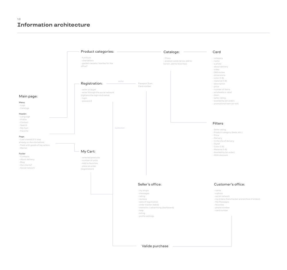
We used the research results to create the information architecture. The architecture is needed to create a website structure. The challenge of this stage is to imagine how everything will work but not to dive into complex mechanics — for example, to start wondering what color of a couch you should use on the main page.
While working on the architecture, we decided to split our efforts, and that was our fault, too. We created many drafts but failed at combining them into one. As a result, we moved the mistakes in the architecture to the next step. The final version looked like this:
Next step: visualize it.
Wireframes + Prototype
During the wireframes stage, we visualized the website’s information architecture. A wireframe is basically a rough draft of a website. It is needed to test the UX and understand whether there are any problems. For example, if you forgot to add a button, it will be easier to add it during the wireframes stage than when the whole design is already done.
On our first wireframes lesson, we drew sketches on paper:
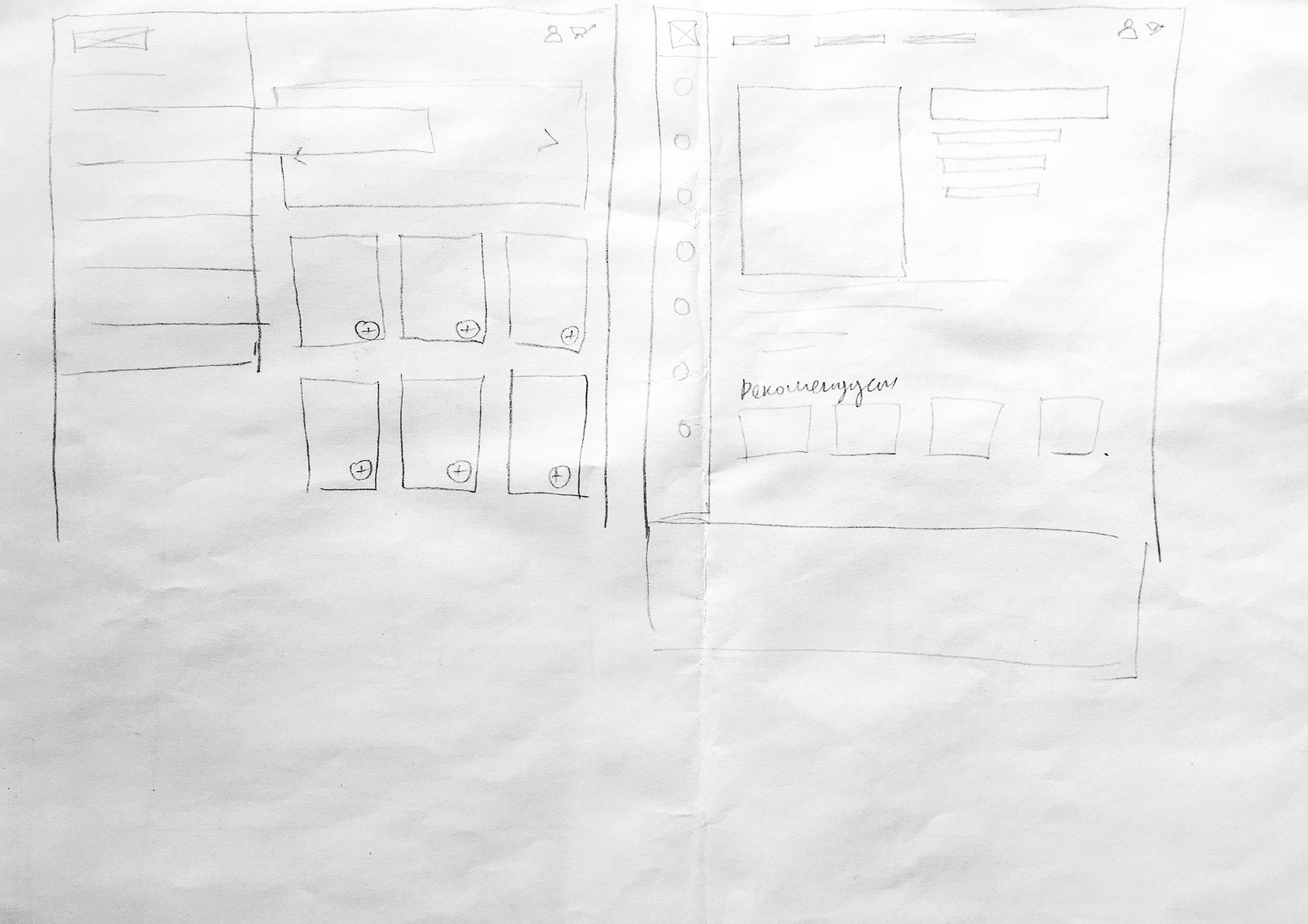


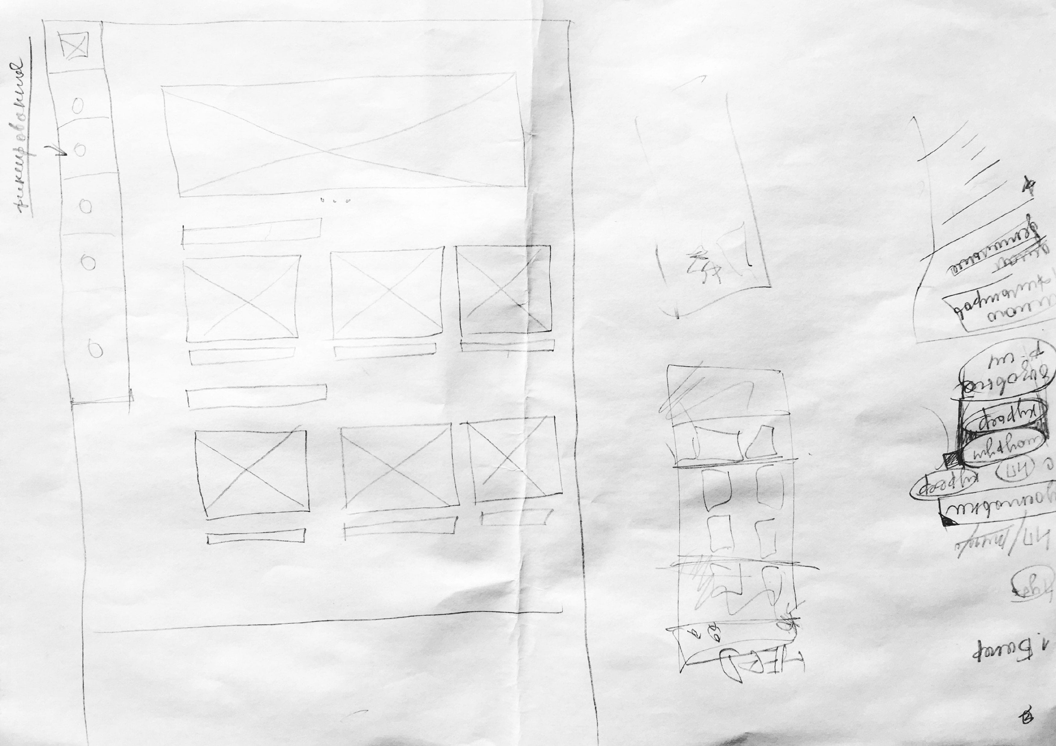
These sketches helped us quickly transfer the information architecture to the wireframes. Then, we put it together in Figma. It’s important to make a prototype out of a wireframe straight away, and to let users test it: this will reveal possible mistakes.
This stage is also good for testing features to quickly understand whether they work. For example, we concentrated on the catalog fixed in the sidebar, not in the header.
But after our friends tested this feature, we understood this is a bad idea: users aren’t used to a catalog in the sidebar.
What did the wireframes and prototype stage end with? We got two prototypes which we later tested on customers and sellers of the furniture.
User testing
During this stage, we tested customer’s and seller’s user journey. Our friends who buy furniture and decor frequently became our test subjects.
The biggest fault on this step was that we sought to create a perfect prototype and delayed the testing. But in fact, users understood everything, even if not all links worked. Because of this, we had less time remained to correct the mistakes we had found.
It’s also important not to just let a user test a prototype, but to give them a precise task in order to check different features of a website. For example, you can ask a tester to buy a red couch without using the search. This will help you understand whether the catalog filters work.
We made several adjustments to our project based on the information we got from the tests. Within the course, that was it. The presentation went perfectly but I also wanted to work on visual design to show the final project.
UI / Visual design
Before creating the UI, I made a mood board from the references I like. Then I designed the main page, which style determined the other screens. After this, I prepared the case study on Behance.

And finally
While working on this project, not only did we conduct the research and make the prototype, but we also chased furniture sellers, drank beer after classes and Red Bull before it, didn’t sleep at night, and worried before the presentation. I’m very grateful to Aleksey Stiques and Alexander Movchan for their guidance and teaching, to my team for a great job, and to КАМA for the course.
