Member-only story
UX Design Evaluation: Google Maps
Diagnostics from an external perspective
Note: I did not work on the flow featured. Designers balance tradeoffs based on business needs and engineering constraints. This assessment does not take those tradeoffs into account.
Context
Today, I’m evaluating the experience of searching for a destination on Google Maps. There’s a regional park that my partner and I visit often to go hiking. We don’t need directions but like to pull up the destination to check if there’s traffic.
This process is way harder than it should be, so I’m digging in to understand why. You’ll see there are 7 screens in the flow, which is already a huge red flag for a basic job.
End-to-end experience
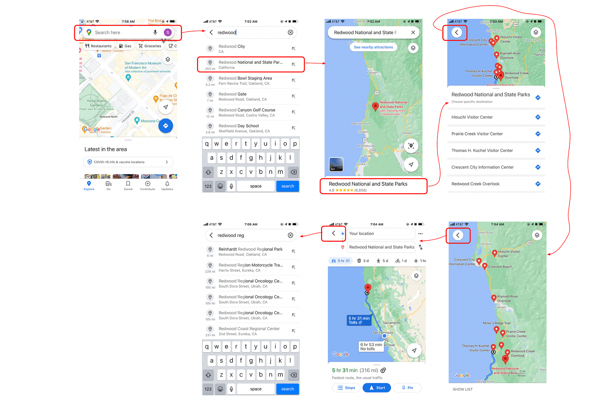
User flow
- Open app and tap “Search here”
- Search and choose (wrong) destination
- View map
- View options
- Tap arrow to go back
- Tap arrow to go back
- Search for right destination
User POV
Ok, there’s definitely human error involved, but design is supposed to anticipate and help people avoid errors. I feel kinda dumb, but I also know this is a whole team’s job at Google, so it’s not my fault for being human.
Here are a few things that stand out immediately:
- Why are the results all out of order?
- Why doesn’t the back arrow actually take me back to where I started?
- What does Google Maps think I want to do?
Screen by screen analysis
The more I study this flow, the more questions have. So let’s go screen by screen to break down problems and opportunities.
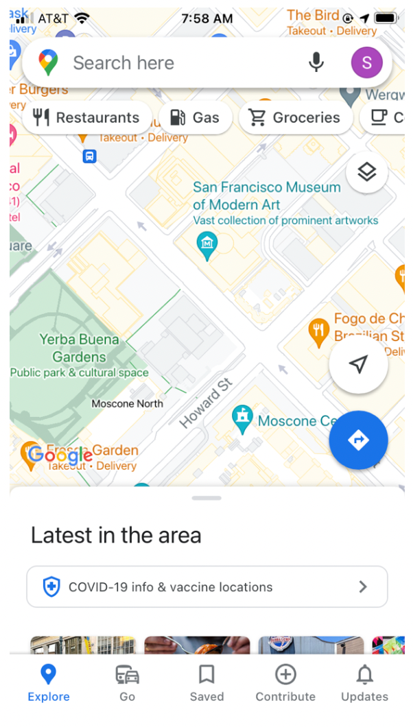
Screen 1: Home
This screen is trying to do a “traffic control” job, giving people different options to serve different needs. Here are the options offered:

