UX design for the all-you-can-eat data customer
Why are data-intensive websites and apps so unusable?
Proven user experience techniques such as personas, information architecture, visual analytics, dashboards, detail-on-demand discovery, and using plain language turn raw data into information for digital consumers.
There is an accounting for taste
When choosing an accountant, the adage was to find someone stereotypically boring, committed to a long, unadventurous career journey, but who was good with the numbers.

This is an outdated view of the accounting profession. Accountants even use digital media for reporting, filing, audit trails, collaborating online to close the period books, and so on.
“Anyone could draw the underlying database schema just by looking at the UI’s field labels.“
The “safe and boring” advice is all too often applied towebsites and digital experiences intended for data entry or information consumption by citizens, journalists, storytellers, students, call centre teams, and more.
That’s not good enough anymore.
Expectations about data interactions for all digital user experiences have evolved.
“The day air traffic controllers start doing their job on Apple iPhones from Starbucks is the day I stop flying.”
Don’t worry (just) about the government
And let’s not blame the government and administration for being behind the times with those terrible UIs. There are governmental UX resources available for public sector digital transformation (whether they are used is another debate).

The Higher Ed, HR, Financial, CRM, Retail, and healthcare worlds also have plenty of IT examples out there that demonstrate how basic design thinking and user experience basics are alien concepts.
“The customer is not the test team for the IT team, but the boss.”
The impact of “not invented here”
All too often, we still see a green-coloured UI with dozens of illogically laid out data fields on each page designed by an IT department, who, bless them, think they know best and the customer is the testing team.
Those CRUD (aptly named) UIs inflicted on the world are not because of a choice of tools, but because of the wrong assumption made about what digital participation means.
We will know those online “forms” to fill out with data. Anyone could draw the underlying database schema just by looking at the UI field labels.
Empathy? The customer experience terrifies people about doing the wrong thing, makes training and support a nightmare, staff retention a fantasy, and is a productivity killer. Death by a thousand cuts.
Here’s the news for IT teams:
Your customer is not the test team but your boss.
So, like all bosses, it’s critical how you manage them. Make no assumptions, but discrete explorations and observations about how they currently work and how they’d like to work instead. Be surprised nicely early, rather than rudely later.
It’s not always mobile first
It is possible to provide a compelling user experience for data-intensive and dense-screen websites. AI and ML will do the heavy lifting on thinking and data analysis, sure, but big screens are not going away soon. Some roles demand them.
The day air traffic controllers start doing their jobs on Apple iPhones while sitting in Starbucks is the day I stop flying.
10 go into an office: Do it better
Here are 10 things you can do to help design and deliver a better data entry and consumption experience; one that enhances productivity and satisfaction, even for those old sit-down jobs.
- Lay the foundations of your experience with grounded information architecture. Used a task-based approach to structuring how real people, doing real jobs, in real places organize their world of work onscreen. Simple techniques such as using card sorts of topics, arranged by customers, let you in on mapping the mental model of real customers when they’re working.
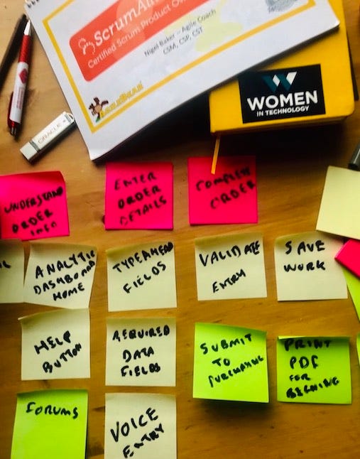
- Understand how real roles actually behave when getting the job completed by observing and listening. Create a persona to remind you of a typical day in the life of a customer as you design, including their pains and gains along the journey. A data-entry person might work a lot faster by using a keyboard to select fields using tab navigation instead of clicking around the screen in any order with the mouse. But that then requires page-level data validation at saving and submission time rather than validating each field on entry. A “Save As Draft” or “Save” page option before “Submit” may be better than an implicit save model. If the customer role likes to navigate back and forwards across steps in a guided process (another solid idea for complicated journeys) before finalising a data entry task, then ensure the saving and validation of already-entered data enables that seamless navigation. A good agile user story includes the persona’s “wants to” and “so that” as mantras.
- Simplify the experience. Move closer to perfection when you have nothing left to take away from each screen, not something more to add.
- Offer a role-centric journey for your data throughout. When your persona approaches the initial screen, provide an immediate visual answer for such questions as, “what’s going on here?”, “what do I need to do next?”, or “how can I discover more?” So, hiding key actions and information “beneath the fold” is a no-no. Think dashboard glances at visual analytics.
- Use plain (or everyday) language for content and interactions. Avoid abbreviations and jargon. Domain-specific terminology is fine when it makes sense, but surfacing IT terms to customer roles does not. When did you last see hear of anyone using a “wildcard character” in Google Search? You might get lucky today but probably won’t. Hire a professional information developer. Keep IT developers away from writing UI labels, messages, and any user assistance.
- Offer consumer-like, familiar time-completion saving experiences. Need to do stuff fast? Use search suggestions or auto-fills to speed up entry. Need to get sign-off on something or collaborate on it? Offering options for different devices and media. Think about social media sharing and “Save as PDF“ or “Send to Apple Wallet” instead of “Print Document”.
- Invest in a visual designer if you can. The first bite is taken with the eye. We form impressions of UIs faster than we blink, true, but don’t overdo it. True, beautiful experiences can be usable, but more often it’s the experience of usable ways of getting the job done that’s considered the real joy. Wikipedia anyone?
- Bring work or information to the role, not the other way around. Alerts, notifications, messages, visual indicators about exceptions, and outliers across devices let customers know if there is anything more to do or of interest.
- Understand how people actually “read” screens online. There is still huge value in knowing that F-shaped reading pattern when it comes to user experience and content design.
- Allow for shortcuts and deep-dives by more experienced roles. These kinds of usability heuristics are as old as the hills (OK, since 1990). Seasoned business journalists or sociology lecturers might remember those NAICS codes off-hand, but who knows when a newbie will start or when someone might turn up a hangover? Using contextual details-on-demand patterns allows the reader to discover more when needed.
“When did you last hear of anyone using a ‘wildcard character’ in Google Search?”
Makeover time?
Is it possible to update legacy UIs to something resembling a modern UX? Yes, but it’s all too often just lipstick on a pig. It’s better to redesign your digital solution from a UX perspective and understand the job to be done.
That’s not always possible of course. Luckily, there are useful ways of improving the UX of data-intense legacy systems worth considering; a UI refactor can be considered. Like with bosses, it’s much better to be surprised nicely, early in the engagement.
Hence, agile methods for UX.
Try it.
Like this? Dive a bit deeper with these
- Socializing the Finance Department
- Cryptocurrency Adoption and Financial Literacy
- UX Design Guidelines for Content Heavy UI
- Refactoring UI
- Lean UX: Applying Lean Principles to Improving UX
Ultan Ó Broin (@ultan) is a user experience design consultant and writer. With over 20 years of enterprise product development outreach in Silicon Valley and Europe in enterprise and healthcare, he writes and records extensively on design thinking and product innovation.