UX Design Framework
The nuts and bolts of designing and documenting user experience
Experience design is a complex, versatile and time-consuming stage of the product development. The well-organized process takes the pressure off the team by reducing misunderstanding and making results predictable. In this article, I’d like to focus on mapping the mainstream method to real-life projects and putting together deliverables.
If you want to learn more about the method itself, I recommend reading “About Face 2.0: The Essentials of Interaction Design” by Alan Cooper and enrolling Interaction Design Specialization on Coursera.
Stage 1. Ideation
The goal of this stage is to figure out how the client’s business works and what are product objectives. A low-fidelity prototype is a tool which helps to confirm your mental model of the product with stakeholders and discuss general design approach. At this point, we are looking for an answer on “What are we building?” question.
Side note: I like the wording in “what are we building?” better than in “what problem are we solving?”. It’s broader since it covers the cases in which we continue existing projects or aim to take user experience from good to great. But if you’re going to start a project from scratch or have an interest in the topic, I recommend taking a look at Need Finding Tools by Stanford University and learning about The Google Ventures research sprint.
Deliverables
- Business process diagram
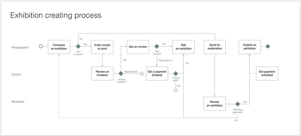
It’s important to paint a big picture before heading deep into weeds, so focus on the flow rather than particular features. Also, this diagram will help developers to design software architecture later on. I recommend using simplified BPMN or similar approach. Don’t overcomplicate it though: the only reason to make a diagram is to spare your teammates and yourself some time needed to “read” the process, not to look smart for clients or the management.

- Low-fidelity prototype
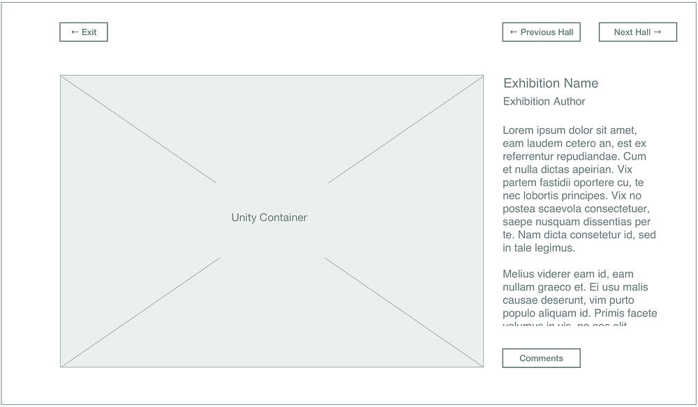
The sole purpose of this deliverable is to illustrate our approach to the design of the particular product. At this point, all we need is to clarify the navigation for the central scenario and define design patterns (e.g., wizard, set of cards, a WYSIWYG editor and so on).

Common pitfalls
This stage is usually gets squeezed to an insufficient minimum or omitted entirely because of three things:
- The false impression that everyone understands everything because they said they do.
- This stage with all its entourage like little papers and hand-drawn buttons may look like a joke from some perspective.
- One may think this step is going to be time-consuming, especially the part where we make business process diagram, and it makes more sense just start drawing screens right away.
Another problem is that designers sometimes get carried away with their ideas. They tend to dig too deep into details instead of focusing on a big picture, so the stage is fading away before designer has a chance to acknowledge that.
Typically suggested hand-drawn style may be dazzling too: one may confuse a rustically-looking hi-fi with an actual lo-fi. We can easily replace paper prototypes with lo-fi based on UI kit. Initially, paper prototyping was to spare designers some “machine time.” There weren’t too many pieces of designated software out there at the time, so iterating with a computer took up too much time. Nowadays we have user-friendly apps and UI kits (Google and Apple provide those resources). Pasting controls from one document page to another is way faster than drawing them with a pencil. Take it from me — I’m a trained artist.

As for visual style, I’d recommend using the same one as you are going to use for the hi-fi. In this case, you won’t spend extra time to evolve the wireframe from the bare skeleton to the fully-developed deliverable.
Stage 2. Prototyping
At this stage, our goal is to think through every aspect of the interface and put together thorough documentation for visual design and development.
Common principles
- Keep navigation obvious for users: make sure they grasp where they are at the moment and what is going to happen next.
- Design according to the platform guidelines when making a mobile app. Ensure that you have a good reason to break them if you do so. Document that reason for future discussions;
- Don’t invent new controls and patterns if it’s not necessary, use most common ones when possible;
- Use real or real-like data, including names, texts, and pictures. But don’t use names of well-known people, offensive or ambiguous content — keep it as neutral as possible;
- Consider different density of content on the screen and different states of the system;
- Mind the keyboard designing inputs for mobile and leave enough space for it in your design. Use the numeric keyboard for numeric fields.
Project documentation
First thing I’d like to say on the subject: end users of a wireframe are your peers, software engineers, and managers. Make sure documentation is friendly to them.

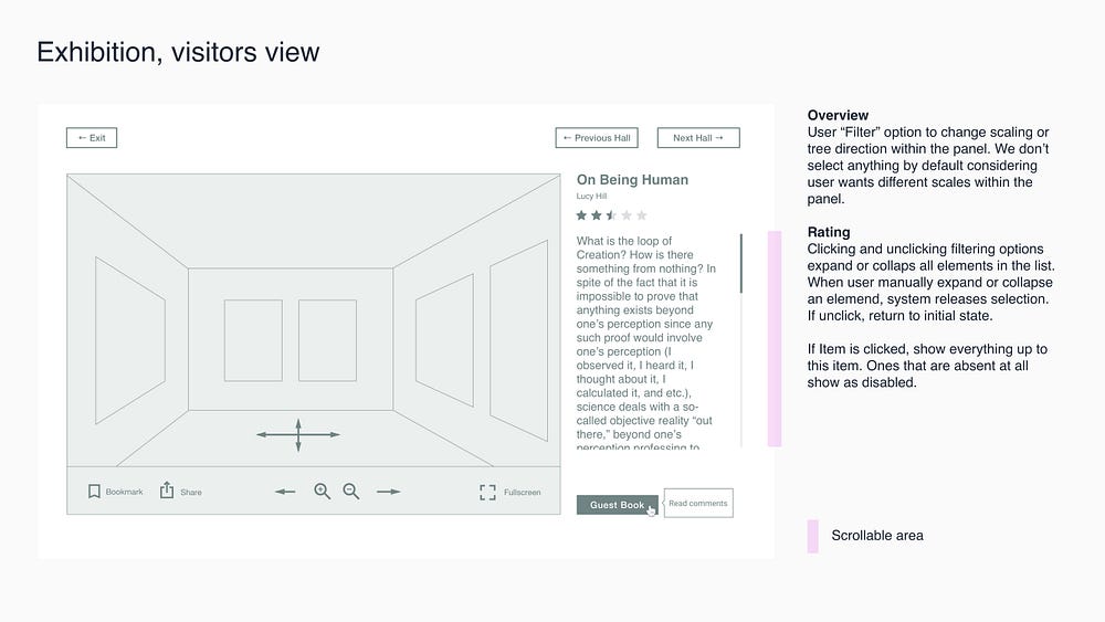
- Keep in mind that a wireframe itself is not a self-sufficient deliverable. It’s is an illustration which helps you communicate your ideas to the team. Use text annotations, links to references and so on.
- Keep it structured: sequence pages meaningfully and make sure they reflect the business process. Avoid placing all the screens to one page: that force software engineers to scroll the picture back and forth.
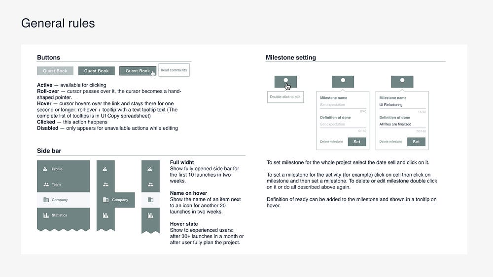
- Place standard rules to a designated page rather than hide them within the wireframe. For example, if you have tooltips, note how they work and link the file with UI copy instead of drawing them wherever they would appear.

- Interactive prototypes are useful for presentations, but in most cases, they aren’t enough for development. It takes an extra effort to click through the whole thing and create a mental model of how the product works. Don’t make engineers’ job harder than it should be. Don’t limit your deliverables to an interactive prototype.
Documentation checklist
Everyone makes mistakes. The most experienced designers do it too but on a different level. Here is a short checklist designed to help you troubleshoot your deliverables on the basic level before passing it further.
Here’s the UX checklist to assist you. Once you download it, checkboxes will be interactive.
Common pitfalls
- “People don’t read”
True. But it also true that people like to be self-sufficient doing their job. Every time engineers don’t get your design they forced to ask you for clarification, then wait for the response, write it down and, finally, build. Otherwise, they risk misreading a wireframe and building the wrong thing. That means you make engineers responsible for documenting your solutions.
One more thing: nobody ever asked me a question, if the answer could be found in the commentary. I guess we shouldn’t underestimate the diligence of engineers after all. The developer even corrected my spelling once. - “It’s obvious” and “it’s default behavior”
Here’s the thing: as designers, we tend to prefer some solutions over others due to a broad set of reasons from measured performance to personal taste. And it’s ok: ask two distinguished experts — chances are you’ll get different answers. That means what we believe to be the best practice, is one of the billions of patterns from the engineer’s point of view.
Even native iOS and Android apps are custom designed, so designing a calendar feature within your Android app, you can’t say: “make it default.” Because — guess what — there’s no such a thing as a default calendar. You can copy a native app (which is ok, by the way), but you should mention that to developers not to expect them getting anything from the context. - “We don’t have time for this”
We are all work in a creative and fast-paced environment where time is a lacking resource. But the truth is you are going to spend time on commenting your design either way. You have two choices here. First: you plan some time for annotating in advance and pass the documentation when it’s ready. Second: you give comments vocally (in messengers) every time developers need clarification. In the second case, you get repeatedly distracted from your current task.
Also, you can’t adequately estimate the time you need to finish the project because it doesn’t have a definite ending. Hence, you risk underestimating the time you need to complete your next project and, as a result, failing to meet the deadline. Also, making sense of the uncommented project in a few months becomes close to impossible.
Validation
When it comes to validation, you have some options.
- Peer review
The simplest way to get feedback fast is to ask your fellow designer for it. The second opinion may come in handy and also you may spot some tweaks why presenting your design. However, your peers probably have the same set of cognitive biases as you so they may struggle to find conceptual issues. - Technical feasibility evaluation
The primary goal of this kind of review is making sure your design is fit for development. But you could also benefit from engineers’ feedback since they see the project from a different angle. Also, if you have missed something important, they are likely to remind you. - Usability research
Methods vary by approach and purpose depending on a question of interest. You can do it cheap and dirty or slow and thorough, but no matter what kind of resources you have you will find insights given you ask the right question. I’ll tell about my personal experience with UX research in the next article. Meanwhile, you can read on the topic from Nielsen Norman Group.
Conclusion
Oxford dictionary defines experience as “something that happens to you that affects how you feel.” That’s why designing UX takes way more than sequencing screens and laying out controls. If you don’t have dedicated UX writer on your team — you’re the writer; if you don’t have a researcher — you’re the one. Since you’re the experience creator, it’s in your power to make people feel miserable and incompetent or qualified and empowered.
And with great power comes great responsibility.

