UX Design: Making of user flow
Hi readers, a new day with a new blog for you guys to read. Today I help you guys in understanding the user flow in UX and how to create a perfect user flow. So let’s get started.
User flow is a process or path taken by a prototypical user on a website or app to complete a task. The user flow takes a user from an entry point through a set of steps towards a successful outcome and final action, such as completion of order.
As a designer, you must be clear about what you’re working on. A simple login page cannot be designed without a user flow. Before you begin, you must first develop a mental blueprint. This is a common mistake made by designers in their early stages. They pick a domain at random for a website and begin designing wireframes without conducting any research or considering user flow. As a result, they are in a complete chaos and need to start over. However, if you’re duplicating software, it’s fine, but only to a certain amount. Let’s take a look at how to make an excellent user flow.
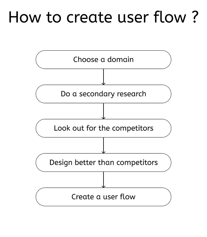
Process to create a user flow in a most efficient way.

Step 1 : First choose a domain of which you need to create a website or an app. Every product has their own way for providing services, so you need to have a clear understanding of the domain you are choosing.
Step 2 : After selection of the domain do a deep research in that. Look what is the market trends, the demand of services and products in that domain.
Step 3 : Look out for your competitors in the market. What are the services you are providing and what you can do better in that.
Step 4 : Final step is to create user flow. User flow can be complicated to look at, but it should be in a flow in which you as a designer should understand.
Step 5 : Making of user flow completed.
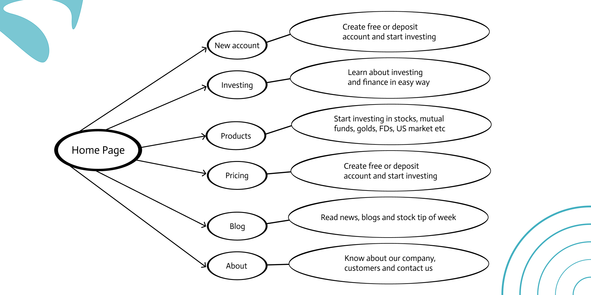
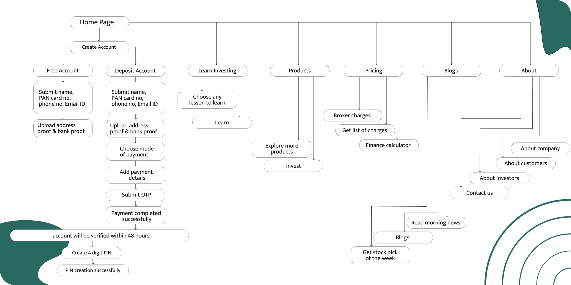
If I have to explain it visually, it somewhat looks like this image shown below. But creating a user flow is not as easy as you think. As you look at this image properly, you will see that there is no clarity in this flow.


Look at the left image; it is basic, but it lacks content and description, whereas the right image is long and somewhat sophisticated, but it contains all the information that the designer needs to create wireframes.
Thanks for reading.

