UX design lessons from Ireland’s COVID-19 mobile app
“Winning trust with people’s personal data is vital”
Ireland has released an official government mobile app for people to check in daily about their COVID-19 symptoms and to track and trace any contacts when a suspected case is reported.

Lessons
The app is available for Android and Apple O/S at present. As one of over one million people who have downloaded it; as I used the app I found some important UX design considerations to learn from:
“Modern and conversational”
- The app was developed and designed by a collaboration of stakeholders; including end-user, the private sector; academics; and government bodies.
- The app is simple to set up, and uses device-level Bluetooth features, contacts, and familiar mobile gestures.


- The app has been released by Ireland’s National Health Service, approved by the official Irish Data Protection Commission, and its development (including source code on GitHub) is transparent for all. Winning trust with people’s personal data is vital, and the app has a neat section on data privacy and protection. When symptoms are reported, permission to proceed to contact others is done by a confidential, anonymous code provided by the health service.
- The app uses a modern, conversational-style language (the use of contractions and sentence case prompts may have OG copywriters in need of other medical attention).
- The app uses emojis (what?!) and personal daily greetings and confirmations to make people feel using this app is as easy and natural as putting on a seat belt before driving.
- The app has a very simple navigation. Checking in takes seconds.
- The app’s simple mobile analytics tell the user how the rest of the community is doing and has a great sense of empathy throughout in tone and style.

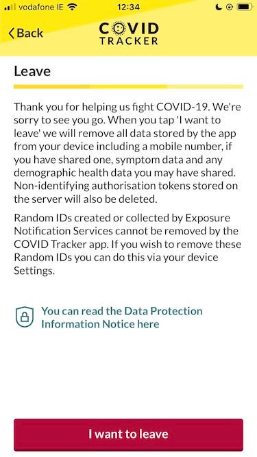
- I especially love the use of the “Leave” metaphor instead of the outdated enterprise-speak of “Log out” or “Sign out”!
Prescription
Overall, a great example of how to do an app for this audience. Kudos to Ireland’s NearForm and to all responsible. We are all in this together.
There are other UX lessons beyond the UI. The app reportedly puts a heavy demand on smartphone batteries (exhaustion in 5 hours); a reminder to test apps in context. Battery performance is a critical part of the mobile UX.
The inside story of the app’s development is explained by the Irish Times. The power of cloud APIs — every mobile UX designer’s hidden friend. Supported by great communications and outreach launch, the lessons from the COVID-19 PP are clear:
Go beyond pixels.
(Other countries could learn from the Irish experience too!)
Ultan O’Broin is a UX consultant based in Ireland and engaged in the digital health and enterprise spaces.