
UX/UI case study: Career Compass — A career orientation mobile app
Project date: 12 weeks from Aug 10 to Oct 18, 2020
Roles:
Binh Nguyen (me): User Research, Data Analysis, Ideate, Prototype, UI
Loc Tran (teammate): Product Research, Business Analysis, User Flow
Huy Truong: Mentor
Project Summary
There are many people who make their decision on choosing a college major randomly and end up choosing the wrong career that frustrates them in the long run, especially young people. We designed a mobile app to help students access career information and support to make the right decisions. We started by conducting semi-structured interviews to define the core problems, then designed and tested our hi-fi prototype with the target users.
In the end, we got some good signals that showed the applicability of the idea. However, there was still a lot of room to improve our solution. The value proposition needs to be delivered faster in the onboarding process to help users reach the aha-moment. Besides, the career information model should be refined to fit their needs better.
Understand the challenge
Why is it important: Being in the wrong line of work not only ruins professional life but also harms personal life as well. We saw a lot of talented students wasted their four years in studying a major that they don’t enjoy, get stressed, frustrated that they could have used more time, energy on the fields that fit them.
We strongly believe the relevant job always plays an important, or rather, an indispensable part of each person. So, choosing a suitable job truly bears tremendous values of life such as enjoyable, meaningful, and happy. Unfortunately, it is really hard to evaluate whether your selected job is relevant to you or not in reality. Therefore, we have come up with a Career Compass solution that not only helps you to understand your expertise, personalities, and inner greatness better.
Research
Methodology
Our observations were mainly subjective. We wanted an in-depth understanding of our target users, so the semi-structured interview method fitted perfectly.
Process:
In the early stages of research, we created our participant criteria to make sure they represented our target users, then interviewed 15 participants with a carefully prepared script to cover all the themes we needed.
We recorded the interviews and extracted all the information as original as they were to make the affinity diagram.

Here are some quotes from users:
The career orientation activities in my high school were failures and untrustworthy
I picked this major because I just wanted to make a lot of money
My current major is not the same thing I knew in high school
I don’t know what would become of me if I continued self-learning
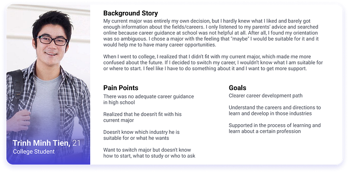
User Personas:
The results of our interviews suggested that there were two common types of users with diverse needs. The accumulation of different insights and common patterns that came from the users’ answers helped us create personas which were the manifestation of that data in a character. We found two types of users:
- Unsure of whether they are suitable or not to the current major, they don’t like it and don’t know which field they should switch to, where to start or who to ask.
- Found the fields they are interested, but different from the current major. Desiring to get more knowledge, experience in other fields but lack of educational condition.
Although they have different pain points and goals, they have a similar background story and are on the same way of finding a career development path in different stages, so these two personas don’t conflict with each other. Therefore, we decided to combine these two types into one persona to help us focus.
Define
It was not enough to merely identify the core of the user’s pain points. We must also ensure that we had a deep understanding of why we were doing this, and what end objectives we were solving. We wanted to tie our project to the larger context.
With the problem space, we did some online researches about career planning framework and found out this framework was accepted broadly.
Besides that, we considered the context of timeframe, available resources,… by answering the following questions:
- What is our end-goal? — We want to help young people find the career that fits them and help them know what to learn to get their foot in the door.
- How can we know if we’ve succeeded? — Users find enough information they need to choose a career
- What enables us? — Design team members also had the same experience as end-users, our mentor experienced in Ed-tech.
- What restricts us? — Design team members lack career orientation knowledge
Final scope: Focus on the first 2 steps of career planning by allowing users to explore themselves and all information they need to make career choices.
Concept sketching — Product backlog
We sketched our overall ideas to clarify how users go through our app to achieve their goal
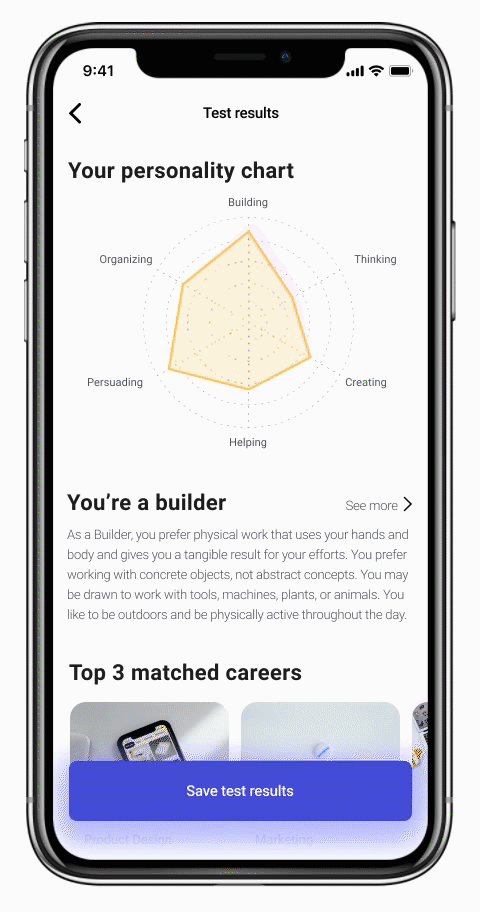
- Users take the career assessment test (we used the Holland Code model) to get the report about which jobs will suit their interests, talents, and aptitude.
- Users start to explore the recommended jobs, each job will include information about the detailed job description, resources to learn, terms list, available roadmaps created by experts, experts list.
- Users choose a career that they are interested in and make a roadmap.
- If they fill out all required information in the profile they can start to find a mentor and set up meetings with their mentors.
From our concept sketch and research result, we create a product backlog that contains job stories to identify all necessary features.
Design
Note: Since the application focuses on Vietnamese students, the original content was written in Vietnamese. I switched the interface language to English to present easier.
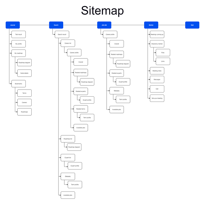
Sitemap
Key features
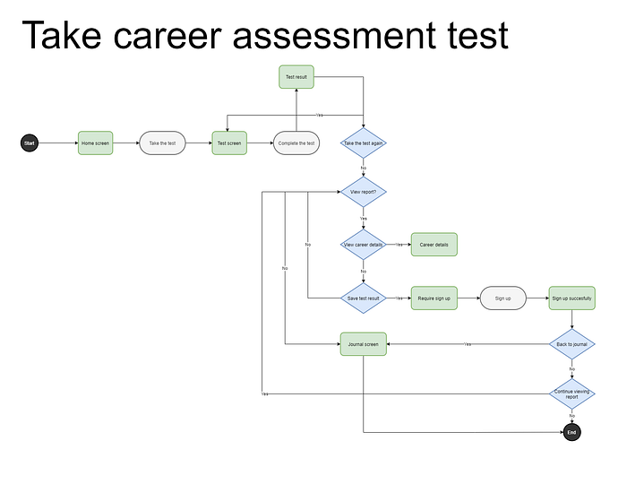
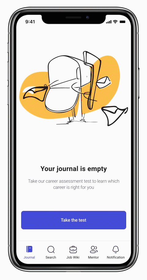
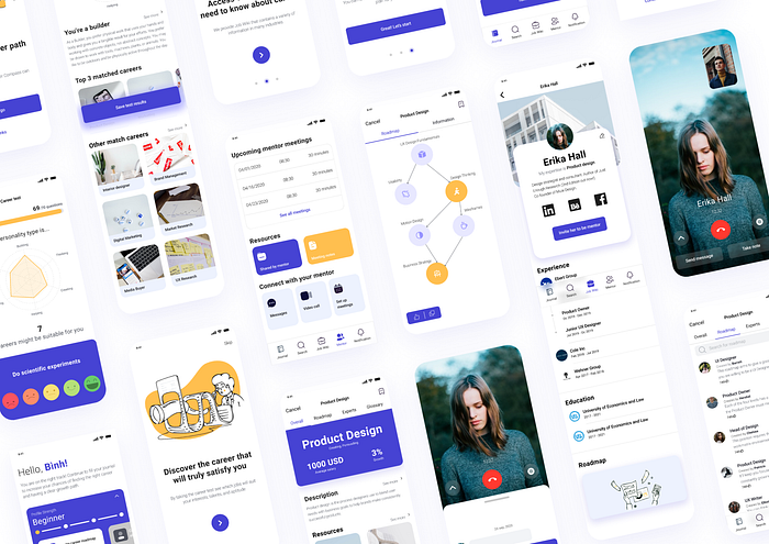
Career assessment test
Taking the test is the users’ first step for enhancing the possibility to achieve the long-term goal, but the Holland test is too long. Hence, we gamified the taking test experience to make it more enjoyable by adding some key essential game elements:
Goals: Complete the test and narrow down the number of jobs that might be suitable for them — The more they keep moving on, the more chance to find suitable careers.
Rules: Choose the adequate emoji in each activity shown in the test
Provide progress feedback: Progress bar, number of career job narrowed down as users complete the test.
Rewards: The test result, congrats card with badges, and clear value explanations.
Onboarding gamification
To get the value proposition from the app, users have to move through many tasks. Having too many steps can make users feel overwhelmed, complicated, and cluttered, which doesn’t inspire confidence. This is also one of the main drivers for the drop-offs. We have considered this with Hick’s Law [1] of usability in mind. We used the gamification technique for each task that was primarily focused on key features in the onboarding process.
How we did it:
- Created a separate flow for new users to avoid complexities.
- Added an engaging core loop consisting of multi separate session loops. Smaller “inner” session loops (for each task in the onboarding process) resulting in a minor reward, larger “outer” session loops resulting in a major reward (value proposition)
- These shorter inner core loops exit to lower the barrier to investment, provide a lot of initial progress towards expansion, and can be chained together & done more often compared to outer loops.
- The combination of having inner loops and outer loops allow users to spend as little or as much time as desired using the product while still feeling productive.
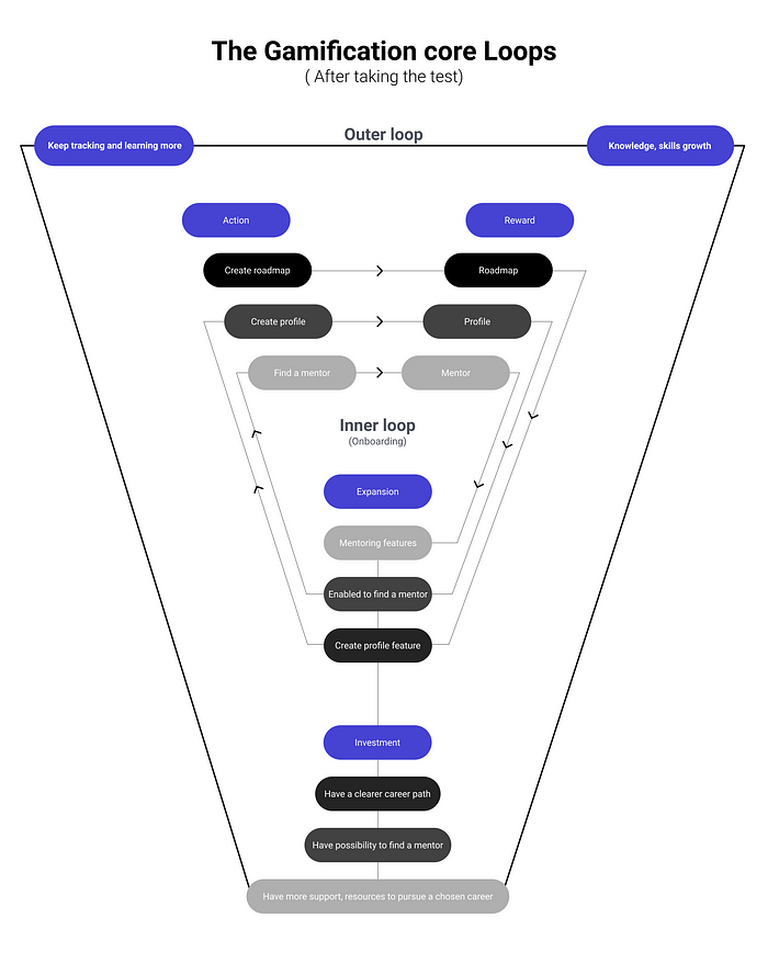
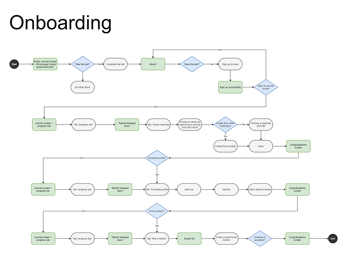
After taking the test, users put in some investment and got rewards. So, they might engage more because of the increase in perceived value, users’ investment load the next trigger to use the app. We leveraged that opportunity by asking them to sign up to get more chances for delivering value and increasing retention rates.
In addition, we designed the onboarding flow to ensure all tasks (creating roadmap — complete profile — finding a mentor) are performed constantly to help the user get Aha-moment as fast as possible. In case users stop, we added a profile strength level bar to set goals for users as a sense of purpose to the app. We want to make them feel pleased after they completed, empower them with a feeling of accomplishment, and help users to see their progress of the goals we set for them.
After users complete each task, we reward them with badges and explain the value they got clearly, then encourage them to move on to the next task.
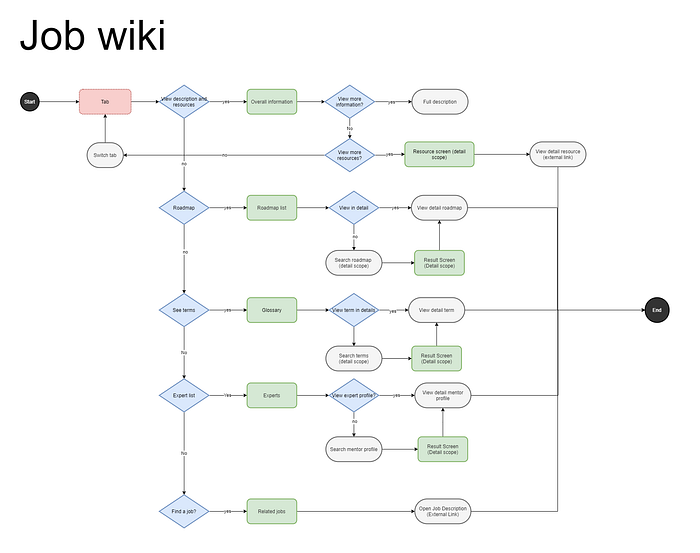
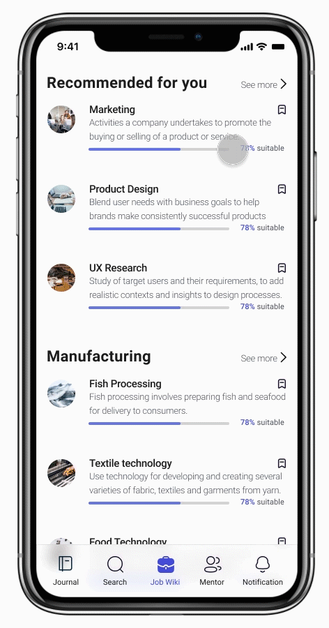
Job wiki
Job wiki is one of the key features which allows users to explore all the information they need about careers.
In each career profile, users can find career descriptions, industrial experts, career roadmap created by other users, related terms, and related available jobs.
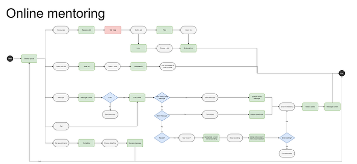
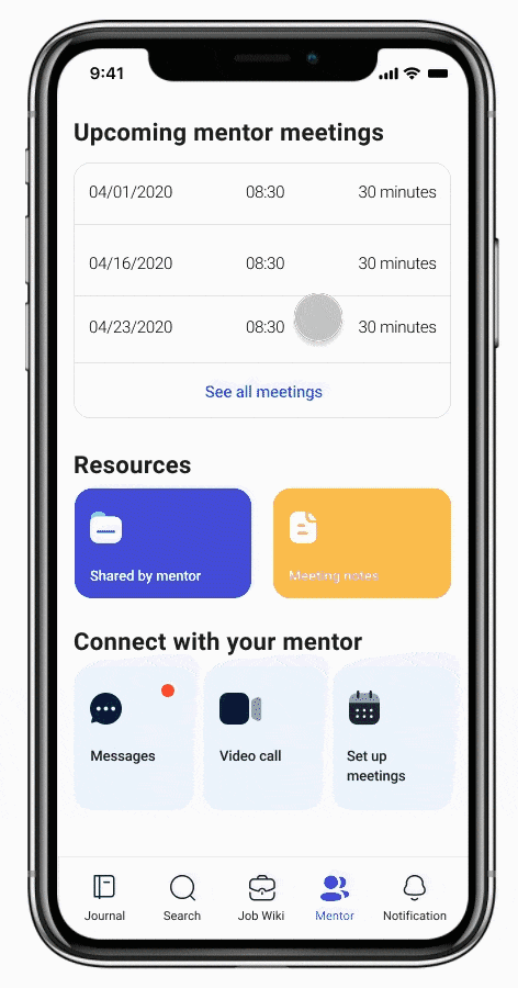
Mentoring
Once the invitation is accepted, users can start to set up meetings with mentors.

Our app makes it as easy as possible for users to keep up with their mentors during the meetings by providing video call, recording, taking notes features. Users can also access all artifacts created from the meetings such as audio files, resources shared by mentors, notes. Because of mentors’ privacy and helping them avoid annoying, the call features will only be enabled when it’s time for the meetings.
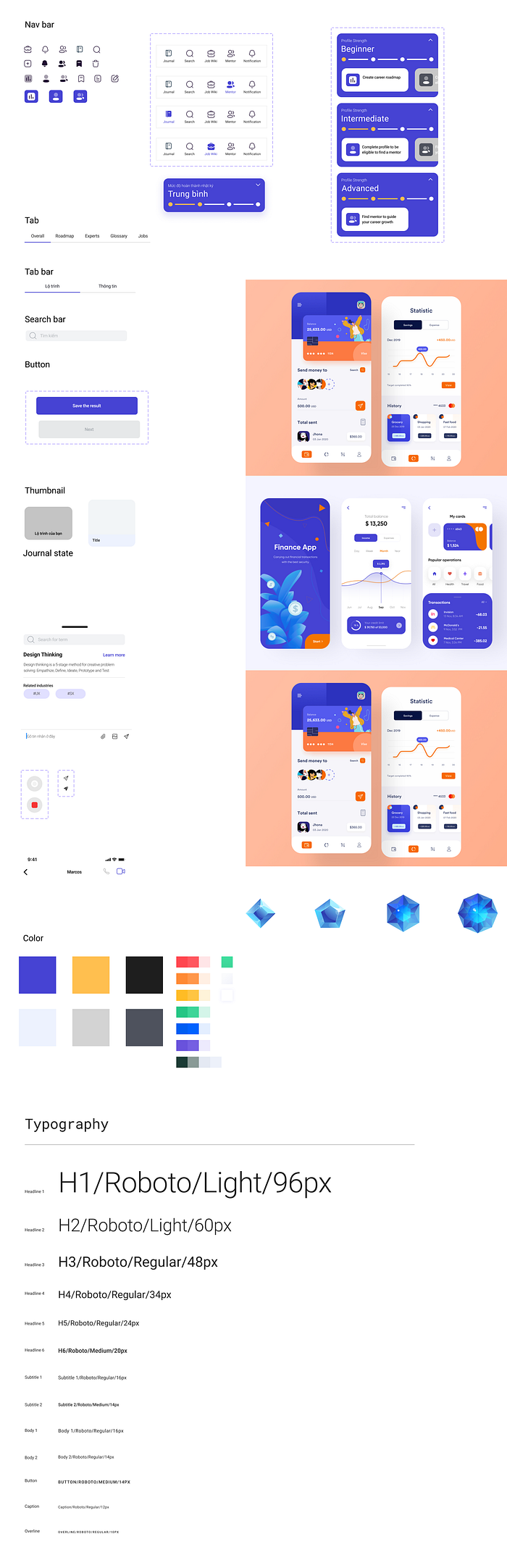
Visual design
Because of time constraints, I decided to refer to the available design systems to design key repeatable components and typography system quickly.
The color blue symbolizes education, youth, growth. Hence, a blue and yellow color palette is suitable for an app that promotes exploration and career development. Additionally, I used grey for the text and included a great deal of white to give a clean appearance. In addition, I leveraged a free illustration kit, this saved a ton of time thanks to rich resources from the Figma community.
Usability test
We wanted to run usability testing to see if our solution works well, so we built a hi-fi prototype, then we shared it with our participants who’ve never seen the app. Here’re the scenarios we gave them:
- You want to change your career but you don’t know which career you would want to switch to. According to Career Compass, how can you find careers that might be suitable to you?
- You found a career that you are interested in, and you want to learn more about it, what to do with the app? Is there enough information you need?
- You have chosen a career, you want to plan for it, what will you do?
- You have your career plan, you want to find a person to support you. How can you do that according to the app?
Here’re some key findings:
- Users tended to ignore subtexts in value explanations screens, so they didn’t fully understand the app’s value proposition until they went through all required tasks during the onboarding
- Users wanted to know how the recommended industries in the test result were suitable for them.
- Users expected more detailed industry information include as follows: skills required, how long it takes to learn a particular skill, salary by geography.
What to do next?
- Research furthermore about user needs of industrial information and refine information model
- Improve onboarding flow to help users understand and get the value proposition faster
- Increase the ability to propose more accurate careers by doing more research and applying science-based models to the app.
- Simplify the functionality of the app to avoid users being distracted from the key features
- Test, improve constantly
What did I learn
Good documentation system matters: Documentation can be a great source of retrospection of our work process. We can go back to the beginning and follow the story to understand all decisions we made. Therefore, a sufficiency document system is crucial to capture all information throughout the project frequency.
Too much argument and iteration might be useless — just test it: In a constrained timeframe and data resources, it’s time-consuming and not the optimal way to make too many assumptions and design based on that. You can consider using heuristic evaluation in uncertain situations and testing the design as soon as possible.
Related domain knowledge matters: We started our project with zero career orientation knowledge, then we found that there are so many models that can be applied. So, it was pretty hard for us to choose the best model and build the solution in the scientific approach. We cannot design a powerful product without proper knowledge about the field where problems from. The less we know about the problem, the more difficult it is to solve it.
Reflection
I started to kick off my UX journey with a yearning to know who I want to become. I read some case studies on Medium, came up with a lot of ideas, set high expectations, drowned in a vast ocean of knowledge where it felt hard to know what to do, then ended up in failure and doubted myself a lot. But when I started to expose myself to UX communities, I realized that failure is not the end — every mistake and failure is an MVP to learn something new and get better.
Finding creative solutions for design, strategy, and business was what kept me up at night. There were so many nights I had turned off the laptop, tucked in the bed but my mind kept racing and rushing me get out of bed and back to my desk. Now I am sitting here, proud of how I pushed myself and appreciated everything that came up to me along the journey.
Push yourself beyond your comfort zone. You’ll grow beyond your current abilities, and surprise yourself how good you really are.
To my mentor, teammate, and UXMP Vietnam. It would be impossible to count all the ways that you helped me. Thank you so much for all that you’ve done — I only hope I can return the favor sometime in the future.

