Vessel of Knowledge in Grid👏
Hola!! If you are a first-time visitor Welcome! 🤩 First and foremost, let’s begin this with a small quote.👇
You should never view your challenges as a disadvantage. Instead, it’s important for you to understand that your experience facing and overcoming adversity is actually one of your biggest advantages. ~ Michelle Obama~
You might question why I begin the article with this quote. Let me tell you why. As for myself, the grid is a somewhat challenging thing to learn. But once you get to know it bit by bit, you’ll end up loving it. If you are a person like me 👊 thought it would be helpful for you to begin this article with a tiny motivation.

Alright alright, we have talked a lot, there are a lot of amazing things for us to walk through. Shall we begin the fun part then?💪
Some of you might have a thorough knowledge of grids, some of you might not have heard of grids in CSS, and some of you need to enhance your knowledge of grids. Do not worry, this is an article for everyone who learns it for the first time and for the ones who already know but came here to read the article to sharpen their knowledge.
So the goal of this article is to cover all the mandatory CSS grid properties we use often. So for that, the content has been divided into main four categories.
We will first walk you through the introduction to the grid. Then we move to the grid container. With that knowledge, we move to grid items and last but not least, we will end this article with the special units and functions we use in grids.

01) Grid Intro 🔥
🔴1.1) What is Grid?
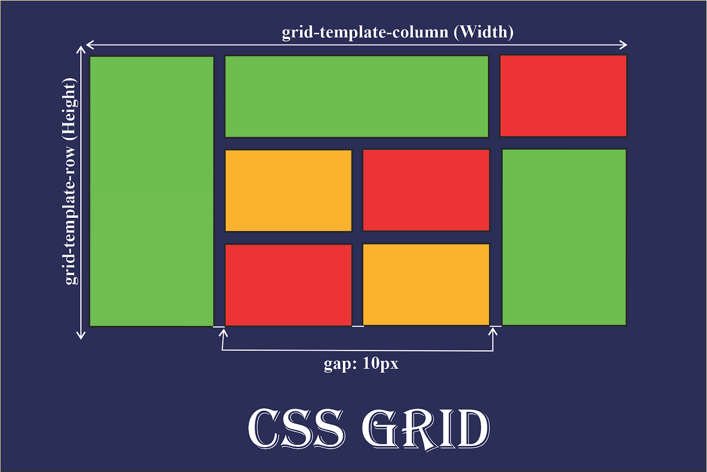
Let’s start with a small definition of the grid. A grid can be defined as an intersecting set of vertical and horizontal lines.CSS Grid Layout is a two-dimensional grid-based layout system that separates a page into major- sections.
Having rows and columns in a grid-based layout system would make designing web pages easy. Therefore, we can style without positioning, floating, tables and inline-block.
So when we dig deep, we can declare the grid container on an element using display: grid. Moreover, We can define columns and rows on the grid by using grid-template-rows and grid-template-columns properties. Last but not least we can get the space between properties using grid-gap.
Here only we have walked through a brief intro to the grid. Moving forward, we’ll go deep into each section.
🔴1.2) Why and When do we use Grid?
Why we use Grid:-
CSS grid comes in handy when we excel at dividing a page into major regions or defining the relationship in terms of size, position, and layer, between parts of a control built from HTML primitives.
When should we use Grid:-
🔸 When you have a complex design to implement:-
The two-dimensional layout system here is perfect to create a complex design, we can use it in our favour to create more complex and maintainable web pages.
🔸 When you need to have a gap between block elements:-
Without using margin properties, we can define the gap between our rows or columns very easily in the grid-gap property.
🔸 When you need to overlap elements:-
You just need to use the grid-column and grid-row properties and you can have overlapping elements very easily.
🔸 When you need a layout-first setup
Imagine we have the layout structures, using the rows and the columns together we can position the elements in the way we want.
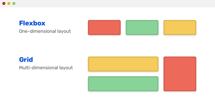
🔴1.3) Difference between Flexbox and Grid Property?
01) Layout
🔸 Grid:- CSS Grid Layout, is a two-dimensional grid-based layout system with rows and columns.
🔸 FlexBox:- CSS Flexbox, is a one-dimensional layout system.
Before moving to the next point let us briefly explain what is two-dimensional and one-dimensional layouts? 👇
Two-dimensional Layout:- If you can take the components in your layout and draw a grid over them, complete with rows and columns then what you have is a two-dimensional layout.
One-dimensional Layout:- A one-dimensional layout is a layout in which you position items on individual rows and columns without respect to the next row or column.
Note:- This simply means Flexbox can work on either row or columns at a time, but Grids can work on both.
02) Overlap
🔸 Grid:- Grid easily permits the overlapping of items. Thus we have the freedom to place items across grid lines or even within the same grid cell.
🔸 FlexBox:- Overlap of flex items can be achieved but not without its cons. To overlap flex items, one would have to use negative margins or absolute positioning. Which invariably removes items from the flex layout.
03) Dimensionality and Flexibility
🔸 Grid:- Grid allow flexible widths as a unit of length. This balances the limitations in Flex.
🔸 FlexBox:- Flexbox offers greater control over alignment and space distribution between items.
04) Alignment
🔸 Grid:- CSS Grid deploys fractional measure units for grid fluidity and auto-keyword functionality to automatically adjust columns or rows.
🔸 FlexBox:- Flex Direction allows developers to align elements vertically or horizontally, which is used when developers create and reverse rows or columns.
05) Item Management
🔸 Grid:- Grid supports both implicit and explicit content placement. Its inbuilt automation allows it to automatically extend line items and copy values into the new creation from the preceding item.
🔸 FlexBox:- Flex Container is the parent element while Flex Item represents the children. The Flex Container can ensure balanced representation by adjusting item dimensions. This allows developers to design for fluctuating screen sizes.

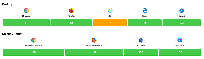
🔴1.4) Browser Support
NOW LET US MOVE TO THE MAIN CONTENT OF THIS ARTICLE🚀

02) Grid Container 🔥
🟡2.1) Display Property?
Display property sets an element's inner and outer display types. Therefore, using the display property we can define the elements as a grid container.
For that, we can use the following values
🔹 display: grid:- The element behaves like a block element and lays out its content according to the grid model.
🔹 display: inline-grid:- The element behaves like an inline element and lays out its content according to the grid model.
🟡2.1) Template Property?
The grid-template CSS property is a shorthand for defining grid columns (grid-template-columns), grid rows (grid-template-rows) and areas (grid-template-areas).
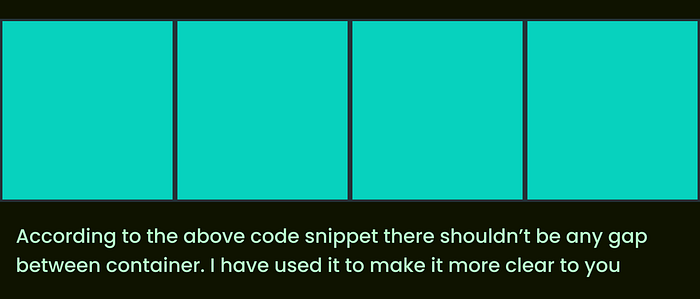
🔹 grid-template-columns:-
- The grid-template-column property defines the number of columns in your grid layout, and it can define the width of each column.
- The value is a space-separated list, where each value defines the width of the respective column.
<!-- Eg:- Imagine you need to have a grid layout which contained same size 4 columns.-->
.grid-container
{
  display: grid;
  grid-template-columns: auto auto auto auto;
}
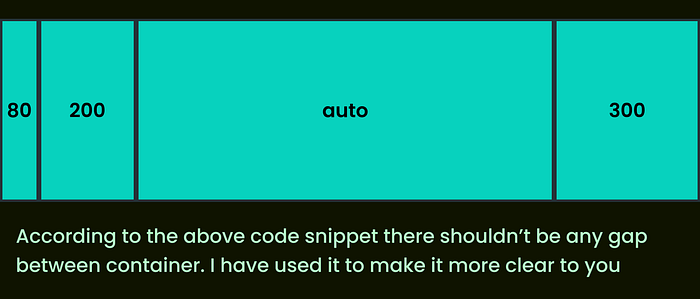
<!-- Eg:- Imagine you need to have a grid layout which contained 4 columns with specified width size.-->
.grid-container
{
  display: grid;
  grid-template-columns: 80px 200px auto 300px;
}
🔹 grid-template-rows:-
- The grid-template-column property defines the height of each row.
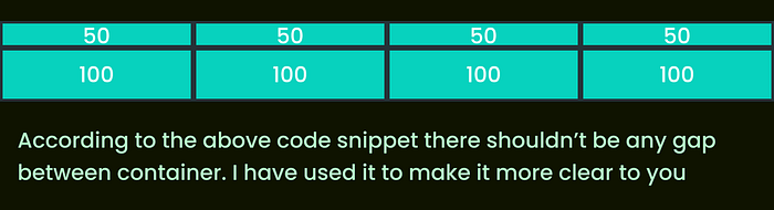
<!-- Eg:- Imagine you need to have a two rows with 4 columns which has different heights but same width.-->
.grid-container
{
  display: grid;
  grid-template-columns: auto auto auto auto;
  grid-template-rows: 50px 100px;
}
🟡2.2) Gap Property?
The gap property uses to set gaps between rows and columns.
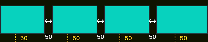
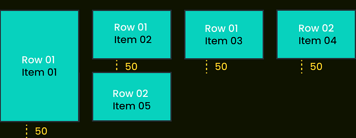
🔹 grid-row-gap:-
- The grid row gap property defines the size of the gap between the rows in a grid layout
<!-- Eg:- Imagine you need to have a grid layout which contained same size 4 columns and the gap size between should be 50px for both row.-->
.grid-container
{
  display: grid;
  grid-template-columns: auto auto auto auto;
  grid-row-gap: 50px;
}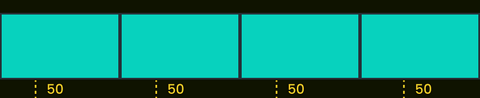
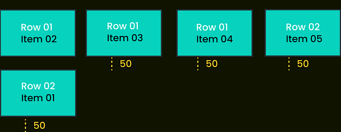
🔹 grid-column-gap:-
- The grid row gap property defines the size of the gap between the column in a grid layout
<!-- Eg:- Imagine you need to have a grid layout which contained same size 4 columns and the gap size between should be 50px for both column.-->
.grid-container
{
  display: grid;
  grid-template-columns: auto auto auto auto;
  grid-column-gap: 50px;
}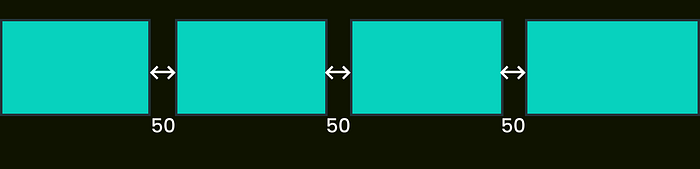
🔹 grid-gap:-
- The grid-gap property is used to set the gaps between rows and columns. It is a shorthand for row-gap and column-gap
- When you say grid-gap, it means without specifying either row or column we specified the gap for row and column in both
<!-- Eg:- Imagine you need to have a grid layout which contained same size 4 columns and the gap size between should be 50px for both row and column.-->
.grid-container
{
  display: grid;
  grid-template-columns: auto auto auto auto;
  grid-gap: 50px;
}
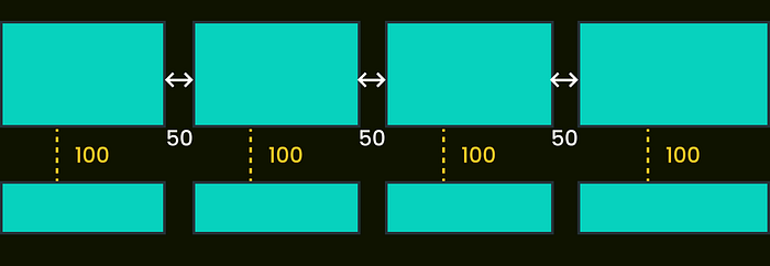
<!-- Eg:- Imagine you need to have a grid layout which contained same size 4 columns with 2 rows aand the gap size between should be 50px for column and 100px for column.-->
.grid-container
{
  display: grid;
  grid-template-columns: auto auto auto auto;
  grid-gap: 50px 100px;
  grid-template-rows: 310px 100px
}
🟡2.3) Align-items and Justify-Content Property?
Since we have talked about these properties in the Flexbox article, I won’t be explaining them to you again. If you haven’t checked the Flexbox article, do not hesitate to have a quick peek.😉
I hope you have checked the flexbox article and now you are familiar with the align-items and justify-content properties. Before moving forward, let me give you a quick note.
- There is a tiny differentiation between the flexbox and grid I want to highlight for you. We use flex-end and flex-start in flexbox, but in the grid, we use end and start.
- Keep in mind only the names get differ. How it works is the same as in flexbox.
03) Grid Items/Elements🔥
🟠 3.1) Grid Column Property
Grid Column Property specifies a grid item’s size and location in a grid layout
🔹 grid-column-start:-
- grid-column-start property defines on which column-line the item will start.
<!-- Eg:- Imagine you need to have a grid layout which contained same size 4 columns and the gap size between should be 50px for both row and column.-->
<!-- And this time the container start from second column-->.item-b
{
  display: grid;
  grid-template-columns: auto auto auto auto;
  grid-gap: 50px;
  grid-column-start: 2;
}
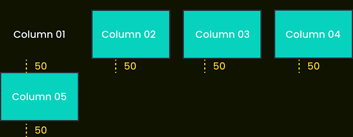
Note: Column 01 and column 02 etc have been defined for each column, not the item name
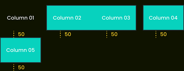
🔹 grid-column-end:-
- grid-column-end property defines how many columns an item will span, or on which column-line the item will end
<!-- Eg:- Imagine you need to have a grid layout which contained same size 4 columns and the gap size between should be 50px for both row and column.-->
<!-- And this time the container will span/stretch to second column-->.item-b
{
  display: grid;
  grid-template-columns: auto auto auto auto;
  grid-gap: 50px;
  grid-column-end: 2;
}

Note: Column 01 and column 02 etc have been defined for each column, not the item name
🔹 grid-column:-
- The grid-column property specifies a grid item’s size and location in a grid layout,
- It is a shorthand property for grid-column-start and grid-column-end
<!-- Eg:- Imagine you need to have a grid layout which contained same size 4 columns and the gap size between should be 50px for both row and column.-->
<!-- And this time the container start from second column and stretch to two columns-->.item-b
{
  display: grid;
  grid-template-columns: auto auto auto auto;
  grid-gap: 50px;
  grid-column: 2/span 2;
}
Note: Column 01 and column 02 etc have been defined for each column, not the item name
🟠 3.2) Grid Row Property
🔹 grid-row-start:-
- grid-row-start property defines on which row-line the item will start.
<!-- Eg:- Imagine you need to have a grid layout which contained same size 4 columns and the gap size between should be 50px for both row and column.-->
<!-- And this time the container start from second row-->.item01
{
  display: grid;
  grid-template-columns: auto auto auto auto;
  grid-gap: 50px;
  grid-row-start: 2;
}
🔹 grid-row-end:-
- grid-row-start property defines how many rows an item will span, or on which row-line the item will end
<!-- Eg:- Imagine you need to have a grid layout which contained same size 4 columns and the gap size between should be 50px for both row and column.-->
<!-- And this time the container needs to stretch till second row-->.item01
{
  display: grid;
  grid-template-columns: auto auto auto auto;
  grid-gap: 50px;
  grid-row-end: span 2;
}
🔹 grid-row:-
- The grid-row-start property specifies a grid item’s size and location in a grid layout.
- It is a shorthand property grid-row-start and grid-row-end.
<!-- Eg:- Imagine you need to have a grid layout which contained same size 4 columns and the gap size between should be 50px for both row and column.-->
<!-- And this time the container start from first row and stretch to two rows-->.item-b
{
  display: grid;
  grid-template-columns: auto auto auto auto;
  grid-gap: 50px;
  grid-row: 1/span 2;
}
🟠 3.3) Grid Area Property
The grid-area property specifies a grid item’s size and location in a grid layout and it is a shorthand property for the above mention grid-column-start, grid-column-end, grid-row-start and grid-row-end.
<!-- Eg:- Imagine you need to have a grid layout which contained same size 4 columns and 3 rows, and the gap size between should be 50px for both row and column.-->
<!-- And this time the container start from 2nd row and 1st column and span 2 rows and 3 columns-->.item-b
{
  display: grid;
  grid-template-columns: auto auto auto auto;
  grid-gap: 50px;
  grid-area: 2 / 1 / span 2 / span 3;
}

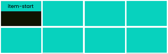
🟠3.5) Aligning Item
🔹 align -self
- align-self is used to align a grid item inside a cell along the column.
- The align-self property overrides the container’s align-items property.
Type 01:- start
<!-- Aligns the grid item to be positioned with the start edge of the cell-->.item-start
{
  display: grid;
  align-self: start
}
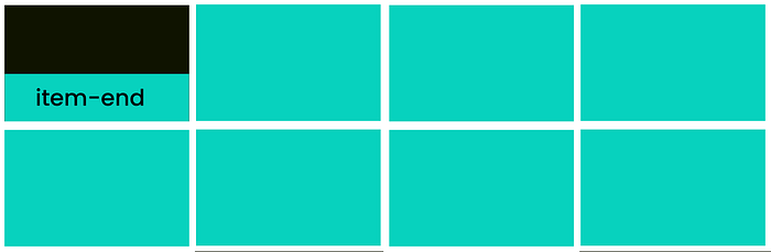
Type 02:- end
<!-- Aligns the grid item to be positioned with the end edge of the cell-->.item-end
{
  display: grid;
  align-self: end
}
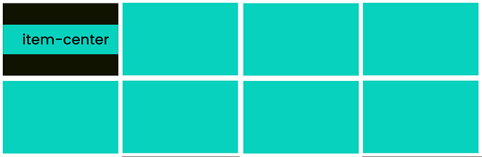
Type 03:- center
<!-- Aligns the grid item to be positioned in the center of the cell-->.item-center
{
  display: grid;
  align-self: center
}
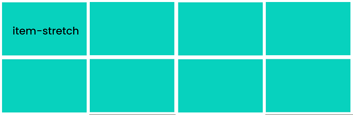
Type 04:- stretch
<!-- Aligns the grid item is positioned to fit the container or  fills the whole height of the cell-->.item-stretch
{
  display: grid;
  align-self: stretch
}
🔹 justify-self
- justify-self is used to align a grid item inside a cell along the row.
- The justify-self property overrides the container’s justify-items property.
Type 01:- start
<!-- Aligns the grid item to be positioned with the start edge of the cell-->.item-start
{
  display: grid;
  justify-self: start
}

Type 02:- end
<!-- Aligns the grid item to be positioned with the end edge of the cell-->.item-end
{
  display: grid;
  justify-self: end
}

Type 03:- center
<!-- Aligns the grid item to be positioned with the center of the cell-->.item-center
{
  display: grid;
  justify-self: center
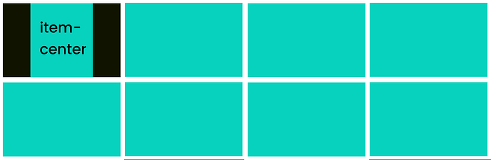
Type 04:- stretch
<!-- Aligns the grid item is positioned to fit the container or  fills the whole height of the cell-->.item-stretch
{
  display: grid;
  justify-self: stretch
04) Often Used Special Units and Functions🔥
🔵 4.1) fr units
- The Fr Unit is a fractional unit.
- The Fr unit is an input that automatically calculates layout divisions when adjusting for gaps inside the grid.
<!-- Let us take our very first example and see how we can get the same output using fr unit.-->
.grid-container
{
  display: grid;
  grid-template-columns: 1fr 1fr 1fr 1fr;
}
<!-- Very First Example ( grid-template-columns: auto auto auto auto;) -->
<!-- Same output different method-->
🔵 4.2) repeat ( ) function
- Repeat() is a notation that you can use with the grid-template-columns and grid-template-rows properties to make your rules more concise and easier to understand when creating a large number of columns or rows.
- And it saves some time as well.😉
<!-- Let us take the above example and wrie it using repeat() function.-->
.grid-container
{
  display: grid;
  grid-template-columns: repeat(4, 1fr);
}
As I always mention learning Fundamentals is fun, but what’s cooler is applying them to real-world apps. I hope now you are ready to apply them to build real apps. With this knowledge transfer let me end this article with a final thought.
Final Thought
Since the grid is a huge topic that contains a lot of things to learn. Here I have mainly focused on the fundamentals of the grid which starts with the introduction and walks you through the properties of the grid which would give you a heads up to apply them to build real apps.
If you like this give one or more claps and feel free to leave your thoughts and feedback in the comment section.
Thank you for checking this out and feel free to checkout my other articles by clicking the following link 👇
🔸Follow me on Twitter👀: @NathashaR97🔸
🔴Be ready to walk through a few exercises using grids in upcoming articles.🔴
And finally, if ya interested in learning more about HTML & CSS do not hesitate to check out the following articles as well👇:-
Check the following for one of the tutorial sessions that would walk you through each component in a grid with exercises.


