Wallpapers App — How did we increase engagement and motivation?
We (I and @narendravaghela) were at a design meetup and discussing the mobile app designs with the fellow attendees. It was a good discussion, otherwise, sometimes a meetup sucks.
A person came next to me and joined all of us. Once the discussion got over, he joined me. He wanted to show us an Android app that he got built and wanted to know how it can be improved.
I started playing with the app and gave some points on the UI & UX. Things were not working in his app’s favor, and he was seeking help.
Here is how I proceed with it.
Overview
It was an Android app allowing people to explore and download wallpapers. He was planning to start his startup which was a mobile app. So before that, he wanted to experience how the mobile app domain works.
We feel it was great thinking! It’s good to have a little bit of knowledge about the domain you want to start work in.
So he did hire a freelance Android Developer to built this Wallpapers app. He built the APIs for the app as he was a web developer.
He launched the app on the Google Play Store and Amazon App Store two months back before meeting us (almost 1.5 years ago). The app already had 2.5k installs (he did Google Adwords and Facebook Ads campaigns). Please note that the developer has taken the app down, so it won’t work.
Out of the 2.5k users, only 35% of them opted to dive deep into the app by registering (!).
Other points that he said were, 1) users are making less engagement, and 2) they do not download the wallpapers/photos even if he’s uploading good quality hand-picked photos.
Interview
The first question that I asked was, who designed the app? He said — XYZDev (the Android Developer that he hired).
Well, not all developers have UI/UX sense.
I asked, “What was the strongest reason to hire him?”
He said, “XYZDev offered the lowest cost.”
Hmm! What I strongly feel is that never hire a cheap developer. It costs you more than a qualified developer who quotes a higher price. A cheap developer will cost you more by not producing quality code, quality app, leaving your app with issues and bugs, etc. As a result, you will lose time, money, and users.
The second question that I asked was, did you prototype and test it with your friends or colleagues or unknown people before starting the development.
He said, “No!”
(You can’t expect that.)
An example:
Now just think, what would be your reaction if your parents decide to get you married to an unknown person without knowing your interest or choice? If you don’t know, many marriages happened in ancient India and other parts of the world like this. 😳
What would you do if your parents start planning everything about your wedding without getting your thoughts, interests, feelings, etc.?
You will get furious. Right?
Remember that, when you’re building a product, you’ve kind of got to get people married to your product. So before launching it, it is vital to know people’s feedback on your product idea and design. Always build prototypes first and do user tests before starting the production or development. It will save you from the initial failure, negative feedback, and downtime. It will increase chances of success for your product.
If you don’t do user tests, people (supposed to become users) may get furious and reject your product after trying it.
I also asked some questions related to the app’s screens, features, and flow.
Objectives
- Analyze the available data to see which are the pain points. I had the Google Analytics data of the app, yeah!
- Explore possible solutions to kill the identified pain points.
- App admin user was used to uploading wallpapers manually from the web back-end. It was a bit long process. So he wanted to shorten it.
- To bring motivation to the app so that users engage with it more.
- Validate the solutions through prototyping and user tests.
- Analyze the feedback from user tests and iterate (if needed) to start the development.
Approach and Process
Google Analytics Data
I reviewed the Google Analytics data to find which are the points at which users are stopping.
Study Current App’s Flow
I tested the app and also asked 2–3 friends to check it. I collected feedback from them.
Both of the above activities helped me to identify the pain points. I was able to sense why users would stop engaging with the app.
We drafted a set of questions that we wanted to answer at the end.
- How to get rid of the mandatory registration or make it useful to the users?
- How to motivate users to upload more photos?
- How to increase the engagement from all the possible screens?
- How to get people spend less time exploring wallpapers?
This was good for users’ productivity, but not for the app. Because on the other hand, we wanted people to increase engagement and spend more time with the app. The basic idea was to save users’ time; because exploring wallpapers and applying new ones were not going to take them anywhere.
Now, here are the major changes, solutions that solved these pain points.
1) Registration
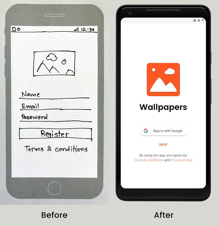
Okay, why do I need to register to the app to download wallpapers? Right? This was stopping users from going ahead with the app. That means, for many users, the registration screen became the last screen into the app.
We removed that forceful & manual registration, and we replaced it with Google Sign-In. We also made it optional, so that if users want to opt-out of registration, they can. If they’re going to register, they can do it with a single tap.

2) Wallpaper details screen
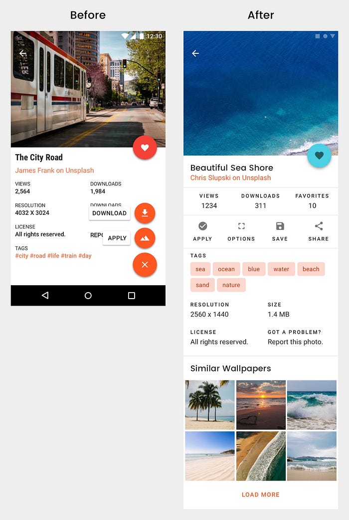
The wallpaper details screen was showing sufficient details along with a floating action button. Taping that button was presenting two more options, one to download the wallpaper, and another to apply the wallpaper. This kind of trigger might be confusing users. So we redesigned it — we made main triggers easily available and understandable.

We added “Similar wallpapers” section to it, so that users can find more similar wallpapers; and they don’t need to search for those wallpapers from “Search” feature of the app or anywhere on the web.
We highlighted the tags of the wallpapers so that they’re easily readable, reachable, and users can reach to more relevant wallpapers.
3) Rewards program
The app already had a feature which allowed users to upload photos of their choice, and Admin can make it available for everyone on the app. But a very few users were uploading photos to the app. Most of them were lousy quality photos which you can’t call wallpapers.
We introduced a rewards program to solve two pain points.
First, wake users’ motivation to make them upload more photos as wallpapers. We introduced rewards for the users who upload quality photos and get them approved as wallpapers.
Second, adding wallpapers from the web back-end was a long process. With this rewards program, users were supposed to upload more photos as wallpapers. Admin required only to review and approve them to make available to all the users of the app.
Also, the app was not showing quality checklist to get the user uploaded photos approved as wallpapers. We introduced upload quality checklist so that users can have an idea about why a photo uploaded by them may not get accepted as a wallpaper.
4) DO NOT open the app
We found that users were spending more time to explore wallpapers on the home screen. Maybe they were scrolling down a lot to find wallpapers of their interests. Well, this was a drawback of the app that makes users pay a lot of time to find and apply a photo as a wallpaper. We felt that it is a waste of time for them.
So we introduced the “Jazz Up Screen” feature. With it, users would be able to apply wallpapers of their choice of categories without opening the app. All users had to do was, enable this feature, then choose categories they want the app to use wallpapers from, and then select a time interval at which they desire the app to change the wallpaper automatically.
We thought if we add this feature, we’re going to lose the user engagement. Still, we agreed on to give it a try.
Like Google and Apple sensed that users have become addicted to the smartphones, they’re distracted by it. And so, they are bringing features to save them from this distraction. 😉
5) User profiles
We introduced the user profile to give app users more personalized feeling. A user profile would present photos uploaded, favorited and downloaded/saved wallpapers from the app. App users can follow each other to know when they upload new wallpapers or mark any wallpaper as favorite or download any wallpaper.
The profile was supposed to motivate users and make them more engaging with the app.
User Flow
Once we decided with these five significant changes and additions, we decided to move forward with building high-fidelity prototypes.
Before that, we prepared a user flow so that we could bring focus and get a bigger picture.

We were used to drawing user flows using Sketch App. And then, we tried the Whimsical. It’s a new tool launched in February 2018, and it’s too good.
Prototype and User Testing
We used Sketch App to build the prototype. We prefer to use native platform elements so that the prototype looks and feels like a real app and users can understand it easily.
So, we decided to use Material Design System that comes inbuilt in the Sketch App. It helped us to move forward faster because we didn’t have to spend time in choosing fonts, colors, etc.
Just recently, we wanted to try the new Material Design Theme Editor for Sketch App. So we rebuilt the prototype using it after Google I/O 2018. The new Sketch plugin by Google is excellent. We insist you try it.
Here I’m sharing its high-fidelity prototype (quite final design).
Then we reached to 5–7 friends and friends-of-friends to test the prototype. We did get some inputs and issues from them. We did fix the problems and applied the inputs that were useful to the app.
A notable success for us was, they understood the “Rewards program” and “Jazz Up Screen” feature. They also liked the user profile as it was having a history of uploaded photos, downloads, and favorites.
Outcome
The final prototype that we had as an outcome was a significant change to the app. Still, that developer decided to move ahead with the development. He launched the updated app in a month and launched an ad campaign. The app got more 1.5k installs.
This time, it increased user registrations by 5x.
It increased the user engagement and time spent on the app by 3.5x.
Wallpaper downloads got increased by 3x.
Users started uploading more photos to the app to earn the rewards. But they were still uploading lousy images more. Maybe the userbase that the app got was not relevant. Targeting photography lovers people could have worked better for the app in this case.
18% of users started using the “Jazz Up Screen” feature. Not bad! 👏
Conclusion
When you build a product, always think of people in the center of it. Design your product, features in a way that people can understand and use it. It doesn’t matter if you’re building a small app with 2–5 screens or an enterprise app. People are going to play a vital role in the success or failure of your product. Your product has got to convert people into users and keep them engaging.

