In the era of scanning and skimming through content, it’s vital to catch the eye of the potential customer. Even if you have a good product or service and an excellent copy, without proper presentation, it risks being passed by a potential customer.
The team behind the innovative website builder Tilda continually researches the best practices of web page design to apply in our product. Together with Icons8, we decided to share ways of applying icons in landing pages to make your offer visually outstanding.
The article is full of examples. We provide links to all of them, so you can take a look at real pages, get icons from examples and even try them out easily and for free with a landing page builder.
So, let’s get started!
Make a List Look Good
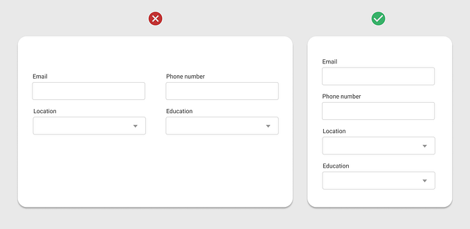
Structured information is easier to read and memorize, that is why lists are a part of web page design language HTML. We use and see lists every day: features, services, advantages, why to choose us, how it works, plans and options.
The simplest way to use the web page estate effectively is to spread your items horizontally. Here is an example:

However, without visual anchors and lack of contrast visitor skims through that list. If a designer didn’t spend the time to decorate that block, why a reader should spend his time to consume that information? Is it so important?
Let’s compare 2 ways and you can tell which one is more memorable and friendly.
A structural block of facts without icons:

Or a structural block of facts with icons:

As you can see visual information representation is more eye-catching, that is why Apple uses it.

Make unordered lists look nice
The obvious way to make a list look nice is to use a checkmark:


Highlight features
If it’s hard to find metaphors for your items simple bold ordering will help.


Even if you can put items in the order consider emphasizing items with a horizontal list.

If you don’t want to bother with the creation of a circle in any graphics editor just search for “filled circle” on Icons8 and recolor it easily.

Give emotional touch to advantages
Visual metaphor catches the visitor’s eye and helps understand the meaning of your message.

Give visual synonyms to services

Let’s quickly redesign the world-class consulting company website.
Here is the page section before redesign:

And here is the redesigned version with icons. We will use Windows 10 style icons. Which one do you like more?

Apply branding color to your icons
Take an extra step and colorize icons for your landing page like this:


Icons8 has multiple color schemes for any icon. Colorization dialog allows you to change any color of multicolored icons.


Add some weight to the icons with background shape
Sometimes there’s not a lot of words in your list of advantages, but don’t worry, just add a background shape to each icon to make them bold and consistent.

Shopify uses circle shapes to unify different form of icons on their home page:

Use flexible background configuration in Icons8 to fit your style.

Separate Blocks
Visual anchor of a section
If we think about page sections as a big portion of our offer it becomes clear that these parts are actually lists, so why don’t to catch a visitor’s eye with icons for each section?


Original divider
Everything new is well-forgotten old 😉 Originally used in book design, text breaks aren’t often seen now, probably only in long reads:
“Text breaks — those places where the author wants to insert a space, but not a new chapter or section — lots of authors use them, and they often create problems for book layout.“ (8 Solutions to the Text Break Dilemma)
However, the part separator is one of the Medium formatting options:

And Tilda Publishing has a whole range of them:

Basically, any simple shape in material style (filled and flat) like 3 dots or asterisks, leaf or starscould be a part separator.
Clarify pricing plans with metaphors
Pricing plans is a very popular block type on landing pages. It’s very important to communicate pricing clearly to a potential customer, that is why companies use icons for the better separation of pricing plans.


Don’t Be Boring
“You cannot bore people into buying your product” (David Ogilvy, an advertising tycoon)
Construct attractive hero images
If content marketing is king you want your articles to outstand because sometimes an article is a landing page.


To create a simple preview of your content for social networks consider Cosmic Pedro by Icons8 or Emoji Pics Composer by Amplifr.


Create meaningful clickable buttons
Buttons are a crucial part of any call to action block in landing pages. Many marketers prefer clean big CTA buttons without distraction. Chances are you have many buttons on the landing page and they would better be different and have clarity on what happens after clicking on them.
A simple arrow means another learning more page.

Even with clean custom made photos Square uses icons to illustrate the meaning of the links in the list of landing pages.

Among many CTA blocks and forms, Tilda has a button with icons for popular cases like downloading a file or watching a video.

File type icons could be used to show what kind of the file the user will get or what type of the media content will be shown by the link.

Get positive feedback
For any product or service, a customer feedback is a signal if a business does things right or wrong. Collecting customer feedback might be not easy, but you should ask for an assessment of the work/newsletter/article/product. Here is how Medium does it with an applause button:

According to Hubspot getting a comment is much harder than a “like”.

But even a “like” button is worth of designer’s attention. Would you rather click on a button with an icon or without it?


With Tilda’s vote block you can customize images and use feedback icons from the Icons8 library:

Make ordinary look attractive
Icons add a taste to any dry content.


Use Icons as Logos
Sometimes you don’t need a logo but the page looks solid with it. Many small businesses or sub-products of big brands have a simple logo for differentiation and just to be clear.


Conclusion
Creation of attractive landing pages may not require huge efforts if you have just some inspiration and a couple of good tools:
- The icon library with search and icons customizations like Icons8
- Webpage builder with a good blocks library like Tilda Publishing
Try to apply the cases from the article on your current or the next landing page, measure conversion and tell us about results!
Find it useful? Share with those who may use it too.
Originally published on Icons8 Blog — check it for more design stories from our team
About the author: Tilda Publishing team, the creators of the easy-to-use and elegant website builder.