What is Glassmorphism

Glassmorphism is a design style that, as the name suggests, is known for featuring glass-like effects. All elements in this design style have a translucent/transparent look. When these elements are placed on colorful backgrounds, the glass effect is accentuated.
The goal of glassmorphism design is to create an interface that looks like an assortment of glassy panels hovering in the background space. By “glass-morphing” the design elements, UI designers give them an “airy” feeling. They have the appearance of frosted virtual glass and look like they are floating in the background.
Glassmorphism adds a touch of minimalism, modernity, sleekness, and a futuristic appearance to web and app interfaces. It makes interfaces appear simple yet sophisticated. Like neumorphism design in UI, glassmorphism is a relatively new app design trend. But it is already one of the most popular app design trends of the 2020s.
Glassmorphism helps designers add visual hierarchy to their creations and create focal points for the content they want to highlight. That is why popular brands like Microsoft and Apple have embraced the glassmorphism design style. The inclusion of glassmorphism design in MacOS’s Big Sur in 2020 is a good example of the popularity of this design trend.
Let’s see an example:

Notice how the transparent card appears as if it is floating in space? The same effect that you see in this card, can be recreated for CTA buttons, dashboards, onboarding screens, and more. It can also be used to design windows or widgets. For example, this redesign of the Messenger App for MacOS illustrates the perfect use of glassmorphism:
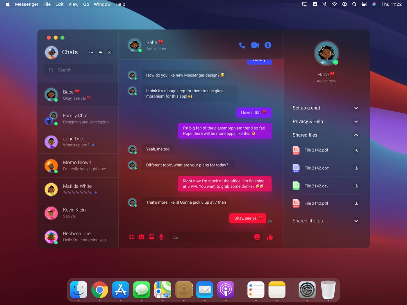
This app window with its frosted glass-like appearance and semi-transparent elements looks so much classier than a traditionally designed app window, right? It is no surprise that this modern app design trend has been embraced by tech giants like Apple. In fact, Apple used the frosted glass effect long before this design style was given the status of a certified trend.
If you have an iPhone or iPad, just look at the widgets on your home screen. Do you notice the semi-transparent elements and the frosted glass effect? Here is an example:

Do you notice the traces of glassmorphism? Now that you have a clear idea of what glassmorphism looks like in app design, let’s lay down the key principles or characteristics of this design trend.
Key Principles of Glassmorphism Design

Unlike age-old design styles and trends like Brutalism or Neubrutalism, glassmorphism is relatively new, and it does not have a fixed set of design principles. But, there are certain features that can be immediately identified with glassmorphism. They are:
- Frosted Glass-Like Appearance: Icons, buttons, windows, and other UI elements look translucent or semi-transparent. They look like they are made of frosted virtual glass.
- Multi-Layered Style: Glassmorphic designs are inherently multi-layered. Typically, these designs feature a translucent background over a vividly-colored background. This multi-layer style gives the interface elements a 3D effect.
- Colorful Background: Choosing bright colors for the background is an easy way to further highlight the glass-like appearance of the interface elements. The bright, vivid colors in the background contrast with the glass-like, semi-transparent elements. This contrast creates a visible blur around the interface elements. The blurring adds depth to the design and boosts the visual hierarchy of the UI design. Light colors will also work but won’t give the depth that bright, busy backgrounds do.
- Shadows: If you add a shadow effect to the different layers in the multi-layered design, you can create a sense of depth and give each layer a three-dimensional appearance.
- Border Highlighting: Interface elements in Glassmorphic UI designs typically feature border highlights. These highlights/accents help define their shape.
These principles of Glassmorphic design will be easier to understand once you review the history of this app design trend, particularly its name.
A Brief History of Glassmorphism: Why is it Called Glassmorphism?

The term “Glassmorphism” was coined in 2020 and popularized by the well-known UI designer Michal Malewicz in the same year. According to Malewicz, when users see a Glassmorphic design, they see different layers on top of each other. Each of these layers looks like pieces of “virtual glass.” Hence, naming this design style “Glassmorphism” made sense.
But, the idea of giving UI elements a glass-like appearance dates way back to the 2013 iOS update. In this update, the iOS menu (check the previous image) was re-designed. It now featured semi-transparent interface elements with the frosted glass effect. The seeds of Glassmorphism as a design style were planted.
Four years later, Microsoft launched the Fluent Design System: a design language for creating UIs that are visually appealing and accessible. This design system came with a background effect called “Acrylic Material.” This semi-transparent, blurred background effect was inspired by the look of glass. Some key characteristics of this blurred background effect include:
- Semi-transparent backgrounds to create a sense of depth.
- Giving the UI elements blurred edges and other features that make them look like they are made of glass.
- Light and shadow to make the UI elements look like they are floating in space.
In other words, by using the “Acrylic Material” effect, designers could easily add Glassmorphic elements to their interface designs. Three years later, Apple launched the macOS Big Sur update and added similar translucent and glass-like visual elements to its operating system.
These changes made the OS look more modern and elegant. Pretty soon, UI designers from across the world were raving about how good glass-like visual elements looked on UI designs. By 2020, the status of Glassmorphism as a certified app design trend was solidified. Here is a brief chart detailing the evolution of the Glassmorphism app design trend:
- 2017: Microsoft introduces the “Acrylic Material” feature in its new design language called “Fluent Design System.”
- 2020: Apple incorporates similar visual elements in macOS Big Sur. The term “Glassmorphism” is officially coined.
- 2021: Glassmorphism keeps surging in popularity among web and app designers.
- 2022: Glassmorphism is featured in a number of popular apps and websites like Canva.
In 2023 (and beyond) glassmorphism will only keep increasing in popularity. Why? Because employing this design style makes a lot of sense in a variety of scenarios.
Why Use Glassmorphism in Web or App Design?
Employing glassmorphism or certain aspects of this design style makes a lot of sense in a variety of scenarios, such as:
Adding Visual Hierarchy
Glassmorphism can be used to create a sense of depth in an app UI. This sense of depth adds visual weight to certain interface elements. Hence, a visual hierarchy can be formed by using Glassmorphic effects. For example, you can make a button stand out from the background in an interface by giving it a Glassmorphic effect.
Highlighting Content
Glassmorphism can be used to draw attention to important content sections. For example, you can make a notification appear as if it is floating above the background.
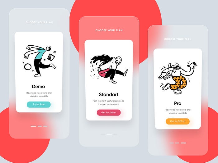
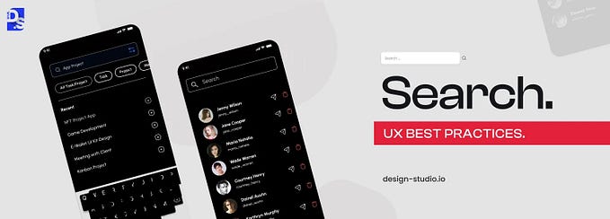
Designing Onboarding Screens
Since Glassmorphism gives users a sense of depth, visual appeal, and immersion, it is ideal for designing onboarding screens for mobile apps. Here is an example:
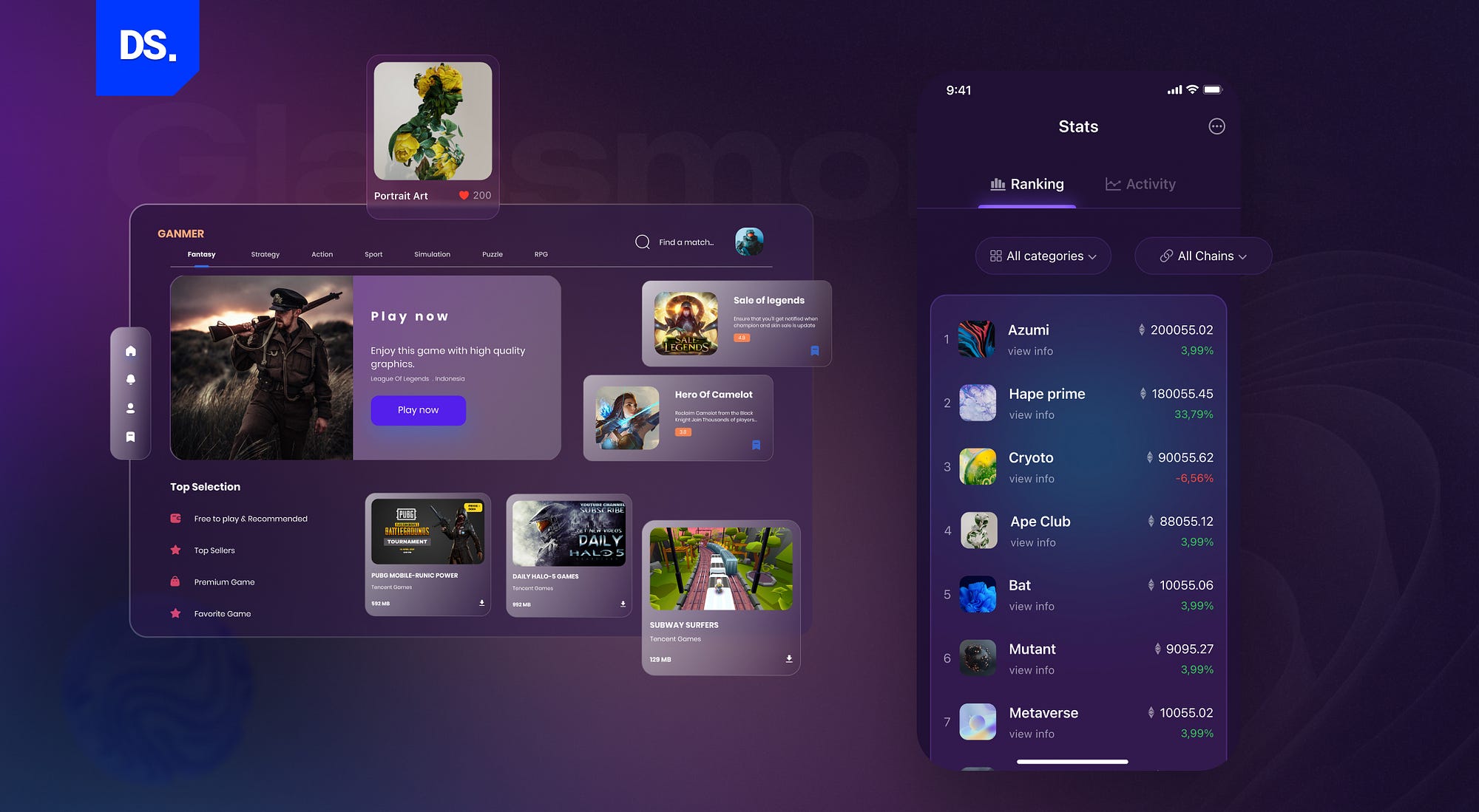
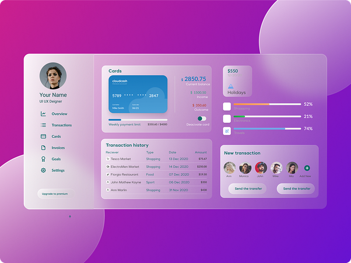
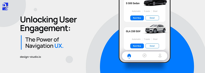
Designing Dashboards
Picture a translucent dashboard that appears to be floating on a colorful background. Sounds visually stunning, right? It is. When glassmorphism is used to design dashboards in apps, it makes them visually striking and easier to scan. Here is an example:
Overall, Glassmorphism is an ultra-versatile design style that has many use cases. It can be used to create engaging and interactive interfaces. Aspects of this design style can also be used to create various effects in UI and web design. We hope that this article was helpful in breaking down the key aspects of the Glassmorphism design trend!
This article was originally published on Design Studio.


