What is wrong with flag icons for languages, according to UX designers?
Following Apple’s example, why should they be replaced on multilingual websites and apps?
A few months ago, Apple replaced the multicoloured country flag icons used to identify keyboard layouts, language selection of content display, and monochrome square icons with letters that denote the language. An example of the replacement can be looked at below:
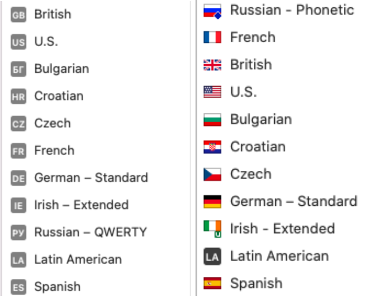
Of course, for those users who are used to flag icons, the option to use them via YouType , Keyboard Switcheroo, Colorful Input Menu Flags and Ukelele has been retained.
Why NOT flags for languages?
Multilingual websites should use language negotiation to display content in the user’s preferred language. But sometimes, language negotiation does not happen in the browser. Therefore each web page should display a language menu for easy switching.
So what’s wrong with flag icons? Take a look at the example below.
- Because the call to action is written in a specific language (in the example in English) or when there is no call to move, users may not understand what the menu is or its function is.
2. People who confuse the flags or do not distinguish colours correctly (suffer from colour blindness) may make the wrong choice and leave the page.
3. Not all flags coincide with the languages spoken in particular countries. China, for example, has Cantonese, Chinese and Mandarin. In which language will a user see the content by clicking on the Chinese flag icon? Canada has two official languages, English and French. In what language will the website display when the Canadian flag is selected? Spanish Castilian is not the only language spoken in Spain. There are many examples to give.
4. Flags are linked to politics. For example, the UN recognises Taiwan as an independent country. However, China considers Taiwan as a region of China.
Of course, a selection of flag icons could be based on the target audience of a website or app. But why complicate things when there may also be problems when scaling up or entering a new market? That’s why it’s best to avoid using flags, even in this variant:
What and how better to replace flag icons with?
Following Apple’s example, you could use letters that stand for the names of languages. This way, the user will likely find the correct link to the language version of the website or application.
By the way, as everyone should notice the icon for switching to their language, it is better to display all available options at once rather than as a drop-down menu.
Nevertheless, here are some excellent options with drop-down lists:
- With Size attribute
2. With different fonts
3. With explanation in brackets in the language of the current page
As for the icon, which denotes the language menu, there is no standard here. A globe or world map is predominantly used:
What do you think about the use of icons for flags? When are they appropriate?