What to think after reading “Don’t make me think”
Usability: A person of average (or even below average) ability and experience can figure out how to use a thing to accomplish something without it being more trouble than it’s worth
— Steve Krug

Web usability is a challenge that designers and product managers are dealing with every single day. We build products with heart and soul only to find that the user cannot figure out a “simple” back button.
The book “Don’t make me think — A Common Sense Approach to Web Usability (Voices That Matter)” unfolds different aspects of usability and tells us ways on how to build great UX. Here are a few points from the book about which I will think every single time I am building things for my users.
1. Show me what I want
When I hit a URL to open a site, I already have a goal in my mind. Now, if I have to put additional effort into understanding how and where to find my interests, I may not return very happy from your site.
Removing cognitive overload creates an effortless UX

2. Scan and Go
No matter how much we assume that our users pay attention to details in our product — it is likely that a major part of it will just be skipped!

Now, that we know the fact that the users are whizzing by, we are left with no option but to make full use of their every glance. Here are a few mantras from Steve:
- Being conventional is the new cool — It is tempting to break the conventions to innovate. However, conventions, when applied well, makes life easier for the users because they won’t have to constantly figure out about things.
- Clear visual structure is easier to scan — Distinctively placing important elements of the site, breaking the content into organized sections, keeping the paragraph short and keeping the pages clutter-free makes it easier to grasp.
3. The Web Navigation
Navigation is a powerful tool for any user. If well designed, It empowers the users to go on a garden walk throughout the site and return “safely” to any point without additional effort.
Navigation should help answer the following questions:
- Which site is this?
- What page am I on?
- What are the major sections of this site?
- What are my options at this level?
- Where am I in the scheme of things?
- How do I search?
4. The Home page
A lot happens over the home page — the trailer to your movie. Any small inconvenience to a user will continue haunting on all his further experiences on your site. So basically, it is like that mistake in the past that your girlfriend keeps reminding you about now and then. But following pointers are there to rescue:
- The bigger picture should be clear — Homepage should answer the following questions quickly and clearly: What is this?, What is this site about?. This can be done by an effective tagline and a brief description. If a product requires a more detailed explanation, short videos and tutorials can be used in a dedicated Learn More section.
- The starting point — Amidst the noise of all the promotions of deals and products, the real questions should not go unanswered
- Where do I start?
- Where to start if I want to search?
- Where to start if I want to browse? - Suprise elements — Home page is a great opportunity to slide in interesting stuff to the users in which they might be interested even though they are not actively looking for them
5.Usability
“All web users are unique and all web use is basically idiosyncratic”
“Most” users do it like this is a myth. While building things, we tend to think that most users like the same things that we like and the users are like us. However, individual behavior is based on multiple variables like their intentions, motivations, thought process, etc. What may be very obvious to us may just not strike the user.

The best way to understand this is through usability testing.
- Fail Early — It is never too early to start usability testing. The earlier you start, the earlier you fail, the earlier you learn and move on.
- One is greater than Zero — Something is better than nothing. Even if the participant user is not a core user of the product, usability testing will help in getting a few improvement points always
- Make > Test > Debrief > Fix > Repeat — Usability testing should follow the same path as functionality testing. It should be followed by debriefing and prioritizing all the usability issues. While all the serious issues must be shortlisted immediately, feature requests can be parked for later to brainstorm.
The good news is that we have a lot of products which are built to help us in usability testing like hotjar, crazyegg, etc.
6. Love thy users
Empathy, Empathy, Empathy
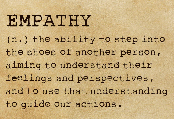
While we are building for our users, being considerate to them helps retain their goodwill. A few things suggested in the book that may help:
- Don’t hide important information — Pricing, customer contact number, shipping charges, etc are a few things which are concern points for the user. Showing them upfront sends the users in a comfort zone where they feel free to play around
- Make Clickables your hero — While the majority of clickables push up the engagement metrics, users must know about them. A clickable must be raising hands in the crowd of all the other content.
- Make your users do as less work as possible — Well, we are dealing with users who are lazy to go out and eat and instead prefer ordering at home. We really cannot afford to ask (and expect) them to do many tasks. Keeping the UX effortless and smooth makes the experience better and most importantly faster.
Why doesn’t amazon.com allow me to apply all the filters at once? - Own errors and help users recover from them — Errors are bound to happen because of different reasons like lack of resources, technical glitches, a mistake by the user, etc. We must try to reduce the agony of the user due to these errors irrespective of the cause. Owning, apologizing and showing a way forward mitigates the impact of the error.
While I have tried to cover most of the key points from the book, there is a lot more that cannot be summed up in an article. Do give this book (~200 pages) a nice weekend read.
Happy Reading!
Connect with me on Twitter (I am seen blabbering her quite often)
Also, I love love love feedback and people who give feedback.
Tell me what you think about this article at rashmishukla1808@gmail.com 💛

