Where’s The Pie? Integrating Pie Menus In Existing User Interfaces

Summary (TL;DR)
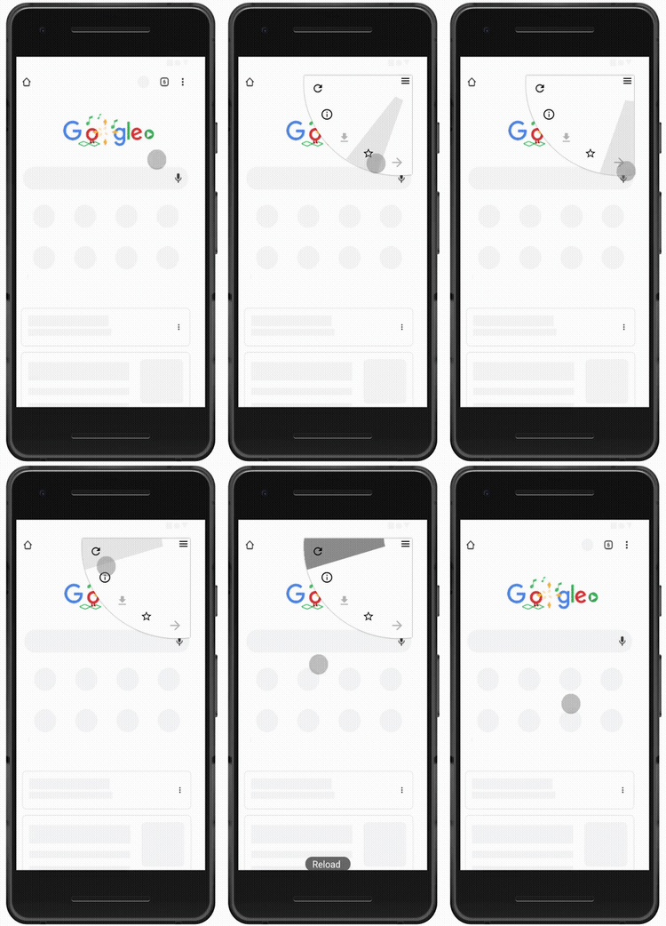
I was intrigued by how the Chrome app for Android implemented a menu such that you don’t have to lift your finger and tap again to make a selection. This inspired me to look at and study how a pie menu could be integrated into existing user interfaces to improve speed and accuracy of accessing menu items.
Inspiration
An update I recently spotted on Chrome for Android allowed menu selection without having to lift the finger off the screen. I’m not entirely sure what this design is called but it was the spark that kindled this project.
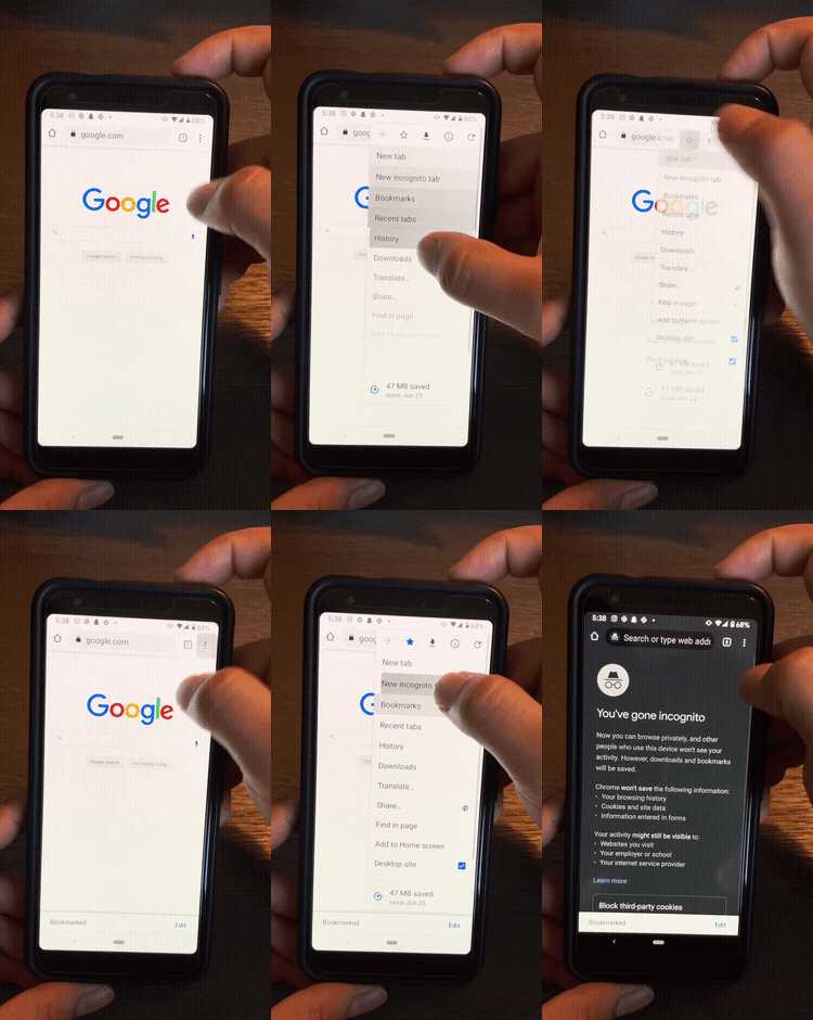
It got me thinking along the lines of integrating the pie menu into a traditional menu workflow, mainly because of the speed and accuracy advantages. In order to inform my design decisions in a proper way, I decided to design with a specific use case in mind — How could the pie menu be implemented in the Chrome app? Even though this design pertains to a specific scenario, the design principles used can be generalized for any touchscreen based pie menu interface.
Most screen interactions we have with digital devices involve a menu of some sort. Menus are a vital component of a graphical user interface (GUI) and are typically used to access commands or options that are not currently visible on the screen. They enable access to information beyond what the physical constraints of the screen hold.
The concept of the menu was developed along with the initial design of the GUI pioneered by Xerox PARC through the 1970s and 1980s and although the visuals might have changed, many of the concepts and design metaphors developed during that period are still relevant to menu design today.
Since its inception, the design of the menu has gone through several iterations and there are multiple design versions available, the drop down expandable menu (also called a linear menu) is the most prominent. It provides a rectangular list of options on click, which can be further navigated through submenus. Interactions with these menus is usually done through tap / mouse click or hover. Ribbon menus are a variant of linear menus which combine linear organization with a two dimensional layout. These are most prominently seen in Microsoft Word and similar software [1]. Megamenues are large rectangular menus (typically seen on website navigation) that take advantage of horizontal and vertical area [2]. The Pie Menu is a unique kind of menu that arranges elements of the menu in a circular manner around the start or click point. Pie menus have several advantages over linear menus, the most important being time of access, especially for proficient and expert users. This advantage comes from knowing which direction to go to even as the menu is being initialized. The second advantage that affects speed of selection is realized through the application of Fitts’s Law. The pie grows larger the farther away you go from the center. Users do not need to make a selection based on a bounded box but rather a direction. Where they end up in that particular direction is irrelevant. These add significant advantages for pie menus, especially for touchscreen devices. For a more thorough read-up on menus, I’d highly recommend reading this article — Expandable Menus: Pull-Down, Square, or Pie?

In terms of interaction design with respect to a touchscreen, to select a element in a linear menu, a user would need to tap the menu icon and then tap the option again. With pie menus, the user is required to tap the menu icon only once and then drag the touch in the direction of selection, lifting to select the option. Due to several reasons, pie menus are still underused in mainstream UI (see here) but now that some of the original constraints are lifted, designers should revisit the use of pie menus in mainstream touchscreen design.
In Android, pie menus have been a part of specialized apps and can be installed for specific use cases, but they are rarely used as an integral part of the UI experience.
Here I put forth an implementation of pie menu in traditional touchscreen interfaces. I develop a prototype for an interaction design that retains all benefits of existing linear dropdown menus while at the same time enabling proficient users to perform tasks faster through the use of a pie menu. I hope that this provides the basis to renew the discussion about pie menus and someday such interfaces might be adopted and integrated into design frameworks.
Ideation
The focus of this design is on the following characteristics, these were derived from a literature review on existing UI frameworks and the advantages of using a pie menu:
- Usability
- Speed of access
- Non-disruptive
- Keeping the existing workflow (mental model of users) constant
The fact that a selection can be made just by moving in a particular direction makes pie menus particularly useful for touchscreen devices. Tapping on a touchscreen occludes a part of the touchscreen that the finger covers. In order to make the next selection, a user is typically required to remove their finger from the screen, and then tap again. In case of a pie menu a user is not required to lift their finger. After touching the screen to activate the menu, dragging in a particular direction can be used to for selection. Thus by reducing interactions and making selection easier, pie menus can be significantly faster as compared to linear menus. One disadvantage of pie menus is that they are confusing to novice users. Which is why, I propose a unique design that does not replace but integrates them into the existing menu.
The parameters based on user interactions defined the design constraints:
- Pie should start at the center of touch
- For best usability limit number of items in the pie
- Limit screen space occupied by the pie menu
- Design interaction along with existing menu (do not replace linear menu)
- Give feedback on selection to users
Initial Prototype

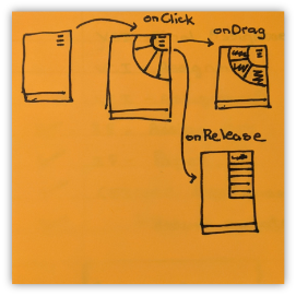
The interaction design of the prototype had to be intuitive and fit into the existing design. The pie menu would open on touch, and the linear (existing) menu would pop open on tap. The UI an animations for the pie menu were inspired from the design of the existing linear menu which aligns with Material Design Principles.

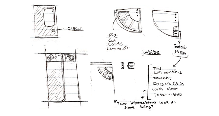
Based on this, an initial digital version was made, it laid the foundation for the visual design of the pie menu. It also took into consideration ergonomic principles, heatmap and reach of finger when using the menu. Based on pilot testing, the shape of the pie was changed from completely circular to slightly elliptical.

Revised Design
Feedback from a pilot test on the initial prototype helped further refine the user interactions.
Implementation
The final interaction design involved
- Touch to activate pie menu
- Tap or release touch to open linear (original) menu
- On touch, drag finger in the direction of an option and lift finger to make a selection
- If finger is lifted at the menu icon, it opens the linear (original) menu. This gesture is the same as tapping the menu icon
Based on this, a high fidelity mockup was designed. It was a challenge to design in high fidelity because the UI animations and interactions required for this prototype were unconventional. I used InVision Studio because of its ability to make custom animations. In spite of it being a powerful tool, I had to use certain unconventional methods to make the prototype function as intended. By default in InVision Studio, all hotspots are rectangular boxes, even circular hotspots are actually a bounded box. While this does not hamper conventional screen design by much, in the case of the pie menu, the hotspots had to pie slices, hence the rectangles ended up overlapping each other on the sides. To overcome this, I used a combination of multiple overlapping small squares and rectangles such that the entire area of the pie slice shape was covered (this did make me appreciate the calculus of integration). The second interaction that was not possible was to provide feedback of the pie option which would be selected on hover before an actual selection tool place. The interface design has this functionality for clarity and learnability for novice users but it was not possible to implement in the interactive mockup.
Final Prototype

All basic screens from the prototype
All screens along with interactions

The working prototype was designed in InVision, here is the working of the pie menu to quick select downloads from the pie.

Accessing the main menu by tapping the menu button, this functionality is the same as the one in the existing UI.
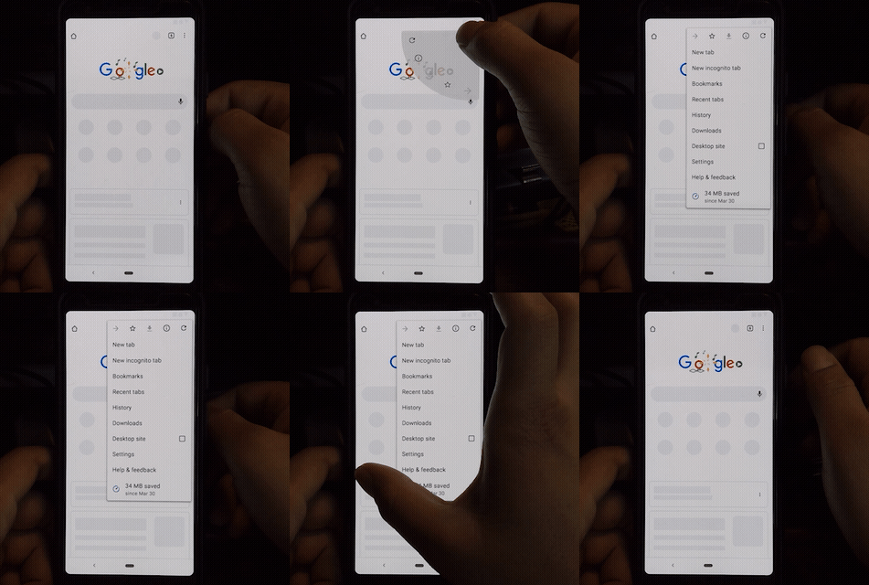
You can have a look and test out the full prototype at this link
Limitations
I made this to explore a novel direction interaction design could possibly take. The primary feature is a design solution that could enable use of pie menus alongside linear menus and thus derive advantages of both.
This was a side project I did to develop a deeper understanding and practice interaction design, there are limitations like adoption, effect of customization that I was unable to address in-depth. I hope this serves as something to kindle the discussion on the use of pie menus in UI design. I would highly appreciate any feedback on the design and process I went through. It was an incredible learning process. Thank you.
References
Ahlström, D., Cockburn, A., Gutwin, C., & Irani, P. (2010, April). Why it’s quick to be square: modelling new and existing hierarchical menu designs. In Proceedings of the SIGCHI Conference on Human Factors in Computing Systems (pp. 1371–1380).


