White space in UI design
White space is like the supporting cast whose duty is to make that the star of the show stands out more by not standing out so much themselves.
In interaction design, white space or “negative space”, refers to the empty space between and around elements of a design or page layout — between paragraphs, pictures, buttons, icons and other items on your web page. It is often overlooked and neglected.
Well, despite its name, whitespace does not need to be white! It can be any colour, texture, pattern, or even a background image.
Dissent between designer, clients and mangers
Designers love it, website owners want to fill it. Whitespace seems to be one of the most controversial aspects of design. — Paul Boag (Click to tweet)
Designers believe in using white space for elegance and ensuring a quality user experience. Sadly, many clients and managers consider white space as wasted space.
This article would talk about how to wisely use white space and make this a habit while working with a design team.
Best practices while trying to design with whitespace
Honestly, whitespace as a concept differs from purpose to purpose. For example, there might be a plenty of whitespace on a landing page so that the focus is maintained on the call-to-action (download button or “Learn More” type of button) or the primary messaging.

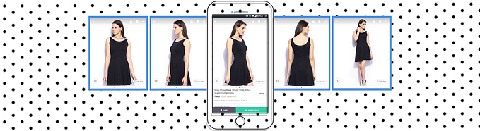
But on the other hand, an eCommerce website does not have the option of so much whitespace — there’s so much content that needs to be squeezed in. There is still need for whitespace, maybe not as lavish as the previous case.

Not just a fashion eCommerce such as Bill Blass, but a heavy eCommerce platform such as Walmart also beautifully manages to maintain the whitespace to make the offerings more legible, readable and inviting.

In a nutshell, we need to use white space within context, which means there aren’t many hard-and-fast rules to apply onto every website. But here are some general tips to keep in mind:
1. Allocate ≤ 15 points of user attention
Designer Paul Boag suggests you limit a page to 15 points of attention. He says, each item you add to the page costs 1 point. If one screen element is more important than another you need to assign it additional points to make it stand out. With only limited points available it quickly becomes obvious you cannot say everything on the homepage and so whitespace does not need to be pushed out of the equation.
Let’s take an example of the MailChimp website. I personally love their website, and I tell you why!


Now that’s how 14 points are placed on the website for user attention. Any additional points should only replace something lesser important. That’s how one makes sure that there are not TOOOOOO many things stuffed on the webpage.
2. Prioritise Legibility And Readability
Before starting with the design, one must create an interface inventory. Interface inventory is a comprehensive collection of the bits and pieces that make up your interface. This not only lays a groundwork to a sound design system and promotes consistency, but also informs a designer about the scope of the content.
The following step is to create rough content wireframes to assess how much space is required for legibility (how well you can discern the letters and words) and readability (how well you can scan the content).
Two important things to keep in mind when optimising your text content are paragraph margins and line spacing (the space between each line). Line spacing can drastically improve the legibility of a body of text. Generally, the larger the spacing, the better experience the user will have whilst reading, although too much can break the unity and make the design disconnected. Again, it’s just about finding the perfect balance.
Medium is the best example of this.

3. Break out of the vacuum
Using contrasting colours, disparate font sizes, and asymmetrical white space to add extra style into a layout. White space is a reactive design element and affects the perception of all surrounding elements.

When in doubt, I always check out how other designers put together white space in layouts. Awwwards is my personal favourite for inspiration.
4. Validate if the whitespace serves the purpose
Aesthetic pleasing is only one aspect of whitespace, the bigger concern is to make a messaging or a call to action more prominent. Whether or not one is able to achieve this can only be validates by a user test.
CanvasFlip is one such tool that helps designers validate whether their designs did the miracle that then intended to do! A heatmap with a high interaction on the call to action is obviously an A+ report card for a designer :)

Conclusion
Whitespace isn’t an empty canvas, it’s a powerful design tool. Whitespace can be hard to master: the application of whitespace is both art and science. Truly understanding how much whitespace should be used to create a good layout requires practice. The more you design, the more you’ll learn.