We built a new design system in Voog. And made it free to everyone.
Giving back to the community of product people.
When building Voog, the easiest platform for creating online stores and websites, we also came up with a comprehensive design system that we decided to open-source to the world. Why?
Because building and implementing it made us comprehend how tricky it is to get the process right and how you need all the help from the community you can get. There are fantastic stories and materials out there that have helped us tremendously. Now we are adding to this repository of knowledge to make the path easier for the product people out there.
This is a story about how, through trial and error, we arrived at that conclusion. And what went into building our new design system.

Why did we decide to build a design system?
When we released our e-commerce tools for Voog, we started thinking about our “next big thing.” Instead of adding another round of new features, we decided to review the core user experience of our product. We looked into how we can make our product even easier to use and bring down the learning curve for our user. And that is how we understood, we need to take on the redesign of some of the core experiences of the product.
A design system can be a powerful tool once it is built and implemented. But for many companies, it might seem like a wasteful project that eats up a lot of resources. So, building one just for the sake of having it doesn’t justify the cost.

We see three main benefits of creating a system like that :
- It helps to make your product look consistent, thus offering a better experience for your customers.
- It helps your team work smarter. Instead of solving solved design problems, the team can focus on the jobs your client wants to get done.
- It gives your team a unified product vision. Otherwise, it tends to be distributed across files, specs and heads of people.
Going deep with these questions, a renewed design vision was born. We decided to bring in a new and innovative text-editor (also used by the New York Times), add to what users can do with their site design and improve the way we do front-end.

The plan
Based on this renewed product vision, we created a prototype and UX-tested it. This got the team excited. Now, all we had to do was to bring the concept to life.
The plan was simple:
- Work out the design details in Figma.
- Draw and code flexible UI components, keep the number of new elements and patterns low and get rid of exceptions.
- Organise design principles, UI components and layouts into a design system.
- Build a React JS based prototype.
- Adapt the prototype into the product.
- Release the updated version of Voog to our customers.
All we needed was about 6–12 months of hard work. Or so we thought.
The failure
Despite all our enthusiasm and preparation, by the end of 12 months, we were nowhere near the release.
We had initially set out to bring changes to the user experience primarily on the front-end side of things. At one point we got convinced that we need to also make major updates on the back-end and even bring in a newer type of database. We saw (and still do) that this would form a perfect foundation to realise the intended updates to the tooling. The problem was, that this meant that we need to rewrite more layout building tools and other components of the product than we intended. Stuff, that was working fine and was not part of the problem. The scope of the project blew up. What was meant to be a mostly a front-end project ended up going after the full stack.
To make matters worse, while we were working on our grand vision, the existing product had been sitting idle, and it was hurting sales. Despite the warnings from the community, we found ourselves on a similar path that had killed Netscape 6. We pulled an emergency brake.
Getting back on track
Our goal was to figure out whether to go on with the project and how. For that, we turned to the community to learn what they were actually trying to say. Sure, they warned that redesigns suck and design systems are notoriously difficult to implement.
We knew all this beforehand, of course. Still, we had to undergo the whole experience ourselves — from the peak of euphoria to the valley of despair before finding a realistic path of bringing our vision to life.
Here’s what we needed to do to get back on track:
- We curbed our ambition. We realised, in the words of Josh Clark that “the most exciting design systems are boring” and opted for step-by-step evolution instead of revolution.
- We accepted the losses and threw away a bulk of new code.
- After an extended period of quiet, we started delivering a string of wins. Our team and clients needed to feel that we are alive and moving. As they say at Intercom, shipping is your company’s heartbeat.
- We let go of perfectionism to be able to start shipping again.
Are we done yet?
No, we’re not.
Much of the design system we built still only lives in Figma and ReactJS-based prototype. Bringing in a new visual style step-by-step has actually increased the visual clutter of the product. Old and new design languages are currently living side by side. We still find ourselves writing several versions of code for the same UI components. We even have built some new functions based on old design just to get them out to the customers faster.
But it’s okay, because:
- Our design system gives us the guiding principle. Despite drawbacks, we have a clear path in front of us.
- We spend less time on fine-tuning the front-end. We are gathering speed and the work of our developers is smarter.
- We refrain from inventing new UI tools to solve upcoming user stories and stick to a limited set of tools.
- There’s a power in moving slow — we have found shortcuts to solve problems with less effort, and we’ve saved money by cutting some ideas altogether.
- We’ve learned our lesson how to do a redesign of an existing product.
Key takeaways
Having gone through all that, we decided to make lemonade from lemons. And help other companies by not forcing them to go through the same thing. That is why our new designs are all public and available to everyone.
We also look at it as a learning experience. We got a lot of valuable new lessons that strengthened our own team:
- It’s exciting to get started. It’s a struggle to get through.
- Before starting to build something new, read and study the experiences of others. Talk to people who have made design systems before. Hire them if you can.
- Don’t rush. Take your time to prepare, prototype and test. Don’t put your first iteration to production.
- On the other hand — don’t prepare for too long. Avoid perfection. Getting your system out there is how you get the ultimate proof if the thing you’ve built really works and you’ll learn what you’ve been missing while planning.
- When redesigning a digital product, evolution is the only way forward. Don’t start rewriting features from scratch. Refactor.
- Opt for small wins, avoid extended deadlines.
The critical thing to remember is that your design system will never be ready. You’ll never fully implement it, and there will be exceptions. That’s okay.
Extra: Specs of the Voog’s design system
When it comes to the technical side of Voog’s design system, we wanted to aim for longevity. Defining an excellent unified process and smooth handover between different teams was a critical success indicator for us. Also, creating something that could be easily modified and updated in future without redoing everything in code & Figma.
The design system consists of 6 strong pillars which are:
- Styles
- Components
- Assets
- Motion
- Accessibility
- Naming Convention
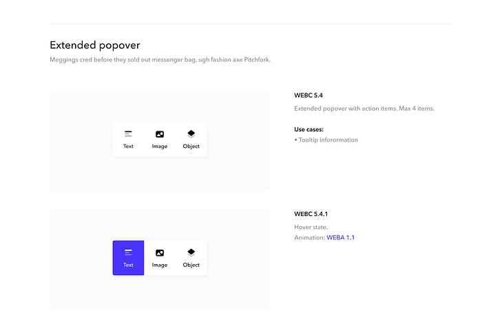
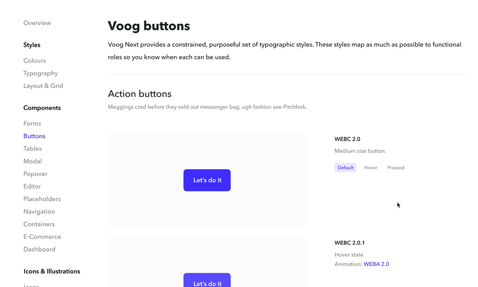
Under each pillar lies a whole universe. Each section is linked to each other to form a robust and cohesive system. Here is a small peek to some of your principles and methods used in Figma.
Deeply linked components
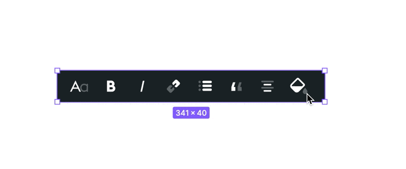
Each component variations was built on single mother component that can be easily updated and tweaked if needed. All of the changes were automatically pushed to all instances.
Never break it apart
Most of the components were extendable if required so the designers don’t need to break them apart in Figma and can always use the master component.
Watch out for the obsolete
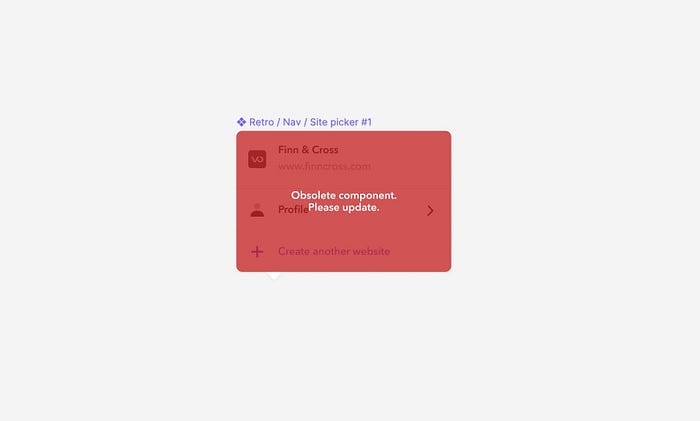
Keeping our components up to date, we set in place a system that lets people know when the piece is not in use anymore.
Assets bucket
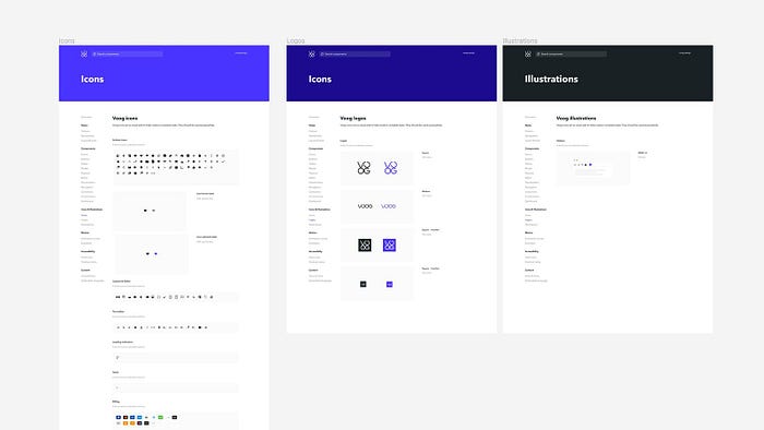
Every single icon & creative asset was on the record. With a single click, the developer could update the whole assets library.
Also, crabbing icons & illustrations from the library made the whole process seamless.
Where is the component?
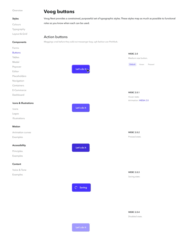
The unique naming convention helped us to reference all the components in the user stories and improved the overall communication. Each component has it’s on unique record number that’s part of a bigger system.
We love eights
Grids & layouts help us to keep elements nice and tidy when working on different screen designs. We are huge fans of the 8pt grid system.
Download the designs
We are releasing Voog Design System’s designs as a Figma Community resource. You can duplicate it to your computer at https://www.figma.com/community/file/892341847258436769.

