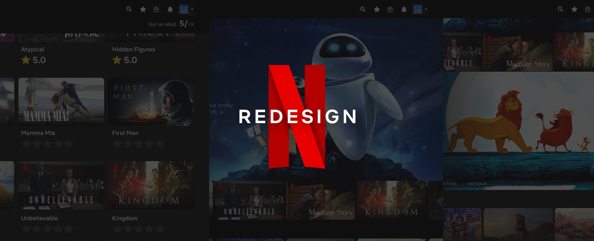
Why Can’t We Find What to Watch on Netflix?
If you are a Netflix user, you must have experienced looking for content and spending time to choose what to watch next. People spend a large amount of time browsing for content in Netflix. Thus, it is very important aspect of the user experience. This article is about redesigning the user’s content browsing experience.
For this project, I redesigned Netflix’s TV & Web version instead of mobile. This decision is based on research that suggests most of the viewers watch Netflix through TV and Web.
Introduction
Netflix is one of the widely used content platforms in the world and contains thousands of movies and TV shows. But because each user has different tastes, how to recommend appropriate content to the user has been always the biggest challenge for Netflix.
From the users that I interviewed for this project, I heard many complaints about Netflix’s ratings & score system and content browsing experience.
While conducting research, I approached my redesign in three steps.
- Ratings & Scores
- Content Browsing
- Additional Adjustments
1. Ratings & Scores
Content’s ratings are an important factor when users decide what to watch. However, through user interviews and research, I received many complaints about Netflix’s current rating and score system. That’s why I began this redesign with those features.
In 2017, Netflix changed the rating and score system from star ratings to thumbs up/thumbs down ratings and from Star Score to Match Score.
They cited three reasons for these big changes: First, Netflix claimed that thumbs up/thumbs down ratings are more intuitive than star ratings. Second, they claimed that the thumbs up/thumbs down ratings increased users’ rating participation.

Lastly, Netflix explained that the users often misunderstood their star score as a reflection of a content’s popularity, when in reality the star score was always a personalized score for the individual user. For these reasons, Netflix changed their ratings and score system.

But the chief complaint I heard from the users about Netflix was about the Match Score. The users complained that the match score isn’t really accurate in predicting the content they like. Because the match score is based on the thumbs up/thumbs down ratings, it only can predict whether you may like a specific content or not. But people want to know how much they would like this content.
Clearly, users doesn’t like the Match Score.
Expected Score & Average Score
For those reasons, I decided to bring back the star scores but in a different way, Expected Score and Average Score.
Expected Score is the prediction of how much you would like the content.
Average Score is Netflix users’ average rating score which means it reflects the content’s popularity.

As you can see, once you open Netflix, the Expected Score and Average Score comes up at the same time. In this way, users can distinguish clearly between the two.
When you hover over the container, Expected Score and Average Score show up. By doing this, users can check content’s score immediately. For a less cluttered appearance, the score icons in the containers are simplified.


Rating Stars
What was Match Score has been changed to a star score. In addition, the rating system has been changed from thumbs up/thumbs down ratings to star ratings. I simply replaced the thumbs up icon to star icon so people can rate intuitively.
Users can rate in both the hovered and selected containers.


User Type
One of the things that I discovered through user interviews and research is that Netflix users generally fall somewhere on the following spectrum.

Settlers:
- Have a clear idea about what content they like to watch
- Tend to search for content similar to what they enjoyed watching before
Explorers:
- Like to watch various types of content
- Consider other people’s opinions or ratings when they choose what to watch
Based on the understanding of these user types, I wanted to make a design that satisfies both types of users. Expected Score is a personalized score, because it is based on the user’s personal ratings. Therefore it is appropriate for Settlers. Average Score shows the average ratings from Netflix users. Thus, Average Score is appropriate for Explorers.
External Ratings
I discovered that the Explorer type of users often visit review aggregation websites such as Rotten Tomatoes, IMDb and Metacritic. This means Explorers will leave Netflix to see those ratings no matter what. If that’s the case, then why can’t we just provide this information on Netflix?
I put the Ratings Icon (star shape) on the navigation bar, so users can simply choose which ratings that they want to see with the content.

When the user clicks the ratings, it directly reflects on the screen. With this feature, users can personalize their own rating setting.
As you can see below, users can make various combinations of ratings with this function.


2. Content Browsing
When we don’t know what to watch on Netflix, we naturally browse the website. Through user interviews and research, I discovered various issues that users had while browsing.
There were three main complaints from users which are:
- Content Presentation on the Screen
- TV Shows & Movies Browsing
- Homepage Scrolling
Challenge: Content Presentation on the Screen
Many users complained that it was hard to focus on the individual content on the screen because the overall number of content shown was overwhelming.


Solution: Redesigned Content Presentation
First, I increased the containers’ size, which decreased the number of content shown in a row from 6 content in a row to 5.

Therefore the maximum number of content on screen decreased from 18 to 15. The reason why I reduced the amount of content is based on research that choice overload reduces neural signatures of choice set value. Simply put, having too many choices increases our inability to make a decision.

Also, I changed the shape of the containers and the gap between them. The pointed edge is changed to rounded edge and space between containers became a little lager.

By doing this, users can recognize individual content more clearly.

Challenge: TV Shows & Movies Browsing
On the navigation bar, there are TV Shows and Movies sections. Here the user can browse content in detail by choosing a genre.
But when the user browses content, often they have a vague idea about what type of content they want to watch. Such as,
Today, I just want to watch something sentimental.
Hmm.. maybe something funny or a feel good movie.
Even when our idea is vague, it is still describable with adjectives such as exciting, witty, sentimental etc… not just as a simple genre.

Solution: Keyword
I designed Keyword as a solution.
Once the user chooses a genre, the keyword box appears next.
When you click the keyword box, the genre related adjectives show up so that the user can choose in detail of what type of content that they want to watch.


3. Additional Adjustment
Search Experience
Some of the interviewees had complaints about the search experience as well. When the user wants to search for a specific title, the search result screen doesn’t clearly show whether the platform has that content or not.


I know Netflix’s searching system is different from the common searching system. In Netflix, user can search various types of keywords (content title, genre, director’s name etc) in one searching box. Which is why, when there is no result for the searched word, Netflix shows related results.
However, users most often use the search function to search for content by title. So I felt it was necessary to show clearly if that content exists on the platform or not.

The redesigned searching screen clearly shows if the searched content exists or not. Content related to the searched word appears below.
My List to My Page
The My List section is relatively simple in comparison to the other sections. I wanted to redesign My List in a way that reinforces the connectivity to the other redesigned features.
First of all, I added the Rate Viewed Content feature where users can rate viewed content, and placed My List on top of the screen. By doing this, the name of this section has changed from My List to My Page, because this section isn’t only about My List’s saved content but also user’s viewed content.

Users can simply rate the content by hovering and clicking on the gray stars. On the right side, users can review the content they have rated. I hope this feature encourages users to rate content.


To Sum Up
I do appreciate Netflix. Watching Netflix with my wife is source of great joy in my daily life and it’s all thanks to the employees in Netflix who work to create a better service. I applaud their passion and effort. I want to say that this redesign project began with respect for these people.
As Netflix is a great joy in my family’s life, I hope one day my design can be a joy in someone’s life.
I would like to thank you very much for reading the long article and I thank Jason for inspiring me.
Thank you.
Doyoung Lee
Product Designer