Summary: nowadays online checkout processes are too complex and cannot be compared with the real-life cash checkout. But they definitely can be better.
In this article on example of 4 services I overview the checkout process to understand and “feel” the problem itself. It is the 1st chapter out of 4. All of them are linked together by one topic and goal, where you will find the insights of what I’ve learned and used to design the completely new checkout process for our B2B project called Fluix.
2nd chapter. You will find out 18 must-do principles of how to design a better experience for your checkout form (or any other form) and dramatically increase the success rate, and decrease the completion time.
Chapters 3 and 4. The complexity behind the new checkout form for Fluix. You’ll learn the relationships and dependencies between fields, their input & visual constraints, and a lot of insights about the way I’ve designed the new checkout form for Fluix by Readdle.

Just imagine. Friday night. You’re at one of the coziest restaurants in the city with a panoramic ocean view. Eating your best ever ribeye-steak (or whatever you like the most) mixed with a glass of gorgeous red wine. You feel full, relaxed and peaceful. You ask the waiter for the bill (no, the point is not in the money). And instead of a simple piece of paper with a total price, you get a form with 27 fields that must be filled. 😨

“WHAT?!! WTF?” — you will probably ask yourself. And will repeat the same question to the waiter, and then to the manager…
SUCKS! Right?
Let’s rewind, how do we bought everything before all these plastic cards and digital transactions? You just take what you want, give the cash to the seller and… that’s it! Done. Minimum time spent. Minimum actions made.
In an online world, it’s not so easy. At all. Tons of fields, questions, buttons, checkboxes, redirections between the bunch of pages, of services, emails with confirmations, passwords, suggestions of other related (most the time they are not) products, tons of additional options, and God knows what else.
Let’s take a look at a few examples.

A few weeks ago I have tried to buy NETATMO gadget. In the end, I didn’t order it. And here is why.
To order Healthy Home Coach you should:
- Tap Buy Now on the gadget page.
- You will be scrolled down through the entire page till the last box where you should tap Buy Now once again.
- You will be redirected to a new page with all products where you should scroll through it once again and tap Products button in the related Air Care block.
- Redirected once again on another page with all gadgets related to selected group on the previous page where at the end of the page you should find Healthy Home Coach gadget and tap ‘Add to Cart’ button.
- Redirected to your Cart page where you should tap ‘Checkout’ button or PayPal Checkout (it’s not even the button…).
- Now you will be redirected to a checkout form with 26 questions… All-in-one…

Closed…😤
After, I had only one questions: ‘WTF, goddamn? oO”
Just to show you how it can be designed in a better way, I spent probably 15 minutes to simplify this process from 6 steps to 3, and the form from 26 questions to only 14 in a much better and clearer visual style, as a bonus. I believe, such improvements might significantly reduce the completion time and the bounces of a potential purchaser.
P.S. You will understand how that works when you complete this article.

Now let’s try to buy the iPad Pro on the Apple Store step-by-step. Here is how the process looks like.
In the raw-text, here is how it looks like, so you can feel the pain even better 😬
- Click Buy button on the iPad Pro page.
- You will be redirected to the next page.
• Now select the model
• The finish
• The storage size and with/without cellular
• Click Continue button - Redirected. Add or Skip Engraving
- Click Continue button
- Redirected. Choose accessories and/or click Add to Bag button.
- Redirected. Click Check Out button.
- Redirected. Click Continue as Guest…
- Redirected. Click Continue button.
- Now answer 12 questions regarding Shipping Details.
- Click Continue button.
- Now answer on 16 more questions regarding Billing and Payment Details…

6 redirections. 14 steps. 27 questions. At least 38 actions. Yeah, just to buy iPad... That’s crazy. 🤕


I’m not gonna describe here the flow step-by-step, but let’s take a look at a few bad and ridiculous moments.
1. They use control version of data validation. So you will be notified about any unfilled required field and/or any mistake you have made only after you clicked Continue button. Why it’s a really bad option, you are going to find out in the next part of this article.
2. 10 fields with 3 dropdowns instead of 3 simple numeric fields to collect phone numbers is just absurd. The phone number is the one single entity in our heads just like the full name, for instance. So, it’s better to use the field with auto-correction here.

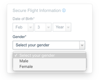
3. 3 dropdowns for the Date of Birth. The respondent can even set 1897 year of birth… Why not just to use 3 numeric fields where he will be able to simply type in the date from the keyboard? But yeah, in this way you have to use the right input constraints, so the respondent will be limited with what he can type in there.

4. Even for gender, they use dropdown… It’s much better from a usability point of view to use segmented control here. The benefits: the respondent instantly sees all the options; need only 1 click/tap to choose.
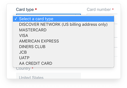
5. Totally senseless card type selector because it can be easily detected by the first 2 digits (sometimes 3) of the card number (more on this in the 3rd part). So we can easily get rid of this question.
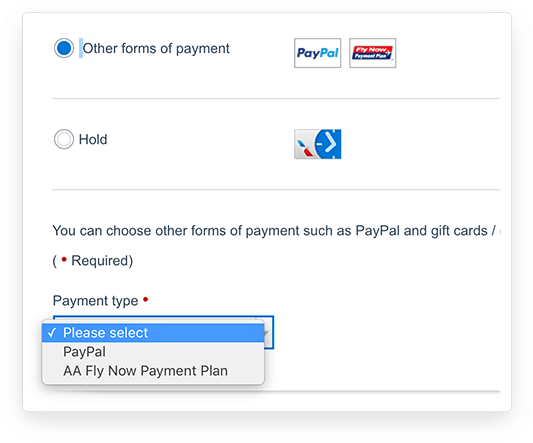
6. One more idiotic dropdown for binary choice. The respondent have to make 3 clicks to select PayPal as the payment method instead of only 1…
7. On each new page, you gonna see the same ad box which takes a lot of space and more importantly the respondent’s attention. But, yeah, that’s exactly the goal of AA marketers…


This is a little bit another case and a much shorter one but still, relates to the topic.

This is the flow of adding the credit card in PayPal iOS application.
- Tap plus button at the top-right corner.
- On the new screen tap only one option on the screen ‘Credit card’.
- On the next screen choose the card type.
- On the next screen type in the card number/exp. date/secure code and confirm.
The second step — probably in my case only — and the third one are senseless. If there is only one option to be chosen why should I see this screen, right? Jump to the next step automatically! And why should I choose credit card type if it can be easily and automatically detected by first 2 digits of its number? So, this flow can be reduced to only 2 steps without any sacrifices. In half, Karl!
— — — — — — — — — — — — — — — — — — — — — — — — — — — — — — —
There are 12 more checkout processes of other well-known services (like Amazon, DBahn, Ebay, Emirates Airlines, etc.) that I wanted to sort out here. But there is too much information to be described, otherwise, the article will swell up to the size of a book... Anyway, the essence is clear already, so let’s keep going further.
You might notice that I described the Guest flows only. Of course, if you have an account on the Apple Store and you use PayPal as for the payment method, the flow will be reduced to just a few short steps. But you still, one way or another, had to set these Shipping-Billing-Payment details when you created the account earlier.
Hence, the problem has not gone anywhere.
In fact, the problem is everywhere. For instance, according to Baymard Institute researches:
- 40% of online services don’t have inline form validation, 20% get it wrong
- 92% are wrong with the description to labels
- 80% don’t use auto-format for credit card number
- 40% don’t format the Exp. Date fields as it on the credit card
Probably your question right now is something like “If these problems are so well-known and valid then why the big-name companies are not fixing them?”. Honestly, I don’t know the right answer. But I do know that the design and implementation of all these parts — the proper validation for each field, the input and visual constraints, the right relations and dependencies between the fields — will definitely take a lot of time, money, and effort.
Pushing the Boundaries
Of course, there are some services that are trying to fix the situation and actually are good enough so far. For instance, Shopify Checkout Form.

Frankly, they are good from visual and navigation points of view, but on another hand:
- Use validation only for Email and Zip-code fields
- Use control version type of data validation
- Don’t use any input constraints for the fields
- Don’t use dependencies between fields

So, you can easily make an order for the non-existent address or postal code, or a fake name. Hence, I’m sure they have a lot of bounces all the time and constantly have to make refunds because of the wrong data and typos. But anyway, Shopify’s checkout experience is much better than other services!
Also, there are projects like PayPal, Apply Pay, Facebook Messanger Payments, Stripe that are trying to push the boundaries in online shopping. But still, even so, a client/user have to answer a bunch of shipping-billing questions at least once to make “the magic happen”.

We were no exception. Here is how our previous checkout flow and the form looked like – starting from the plan selection and to the checkout itself.

Yes. These 3 steps are 3 different pages. And yes, we do not detect the country and select the first alphabetical one — even not one of the most popular — automatically.
In the meantime, please don’t forget to clap for this article, so more people will read it. Thank you.
You might ask “So what is the problem with it?”. Yeah, probably from the visual point of view there are no obvious problems, but it is the wrong perception.
- It causes a lot of questions and doubts
- Doesn’t feel secure at all
- Doesn’t have any details of total price
- Doesn’t have any input constraints
- Doesn’t have any validation
- Doesn’t have any notes or tips in case of questions.
And so on…
Obviously, my goal was to completely redesign the whole flow and the form itself to significantly improve a sale-funnel, reduce the load on our customer success team by improving onboarding process, and cover a bunch of other issues and problems. And this is exactly what we are going to talk about further.
Now let’s figure out what we actually can do to design a greater experience for our forms with these 16 must-do principles →