
Why should minimalism be considered in design?
Minimalism came to the forefront of design during the 1940s and 1950s. Its signature traits were bold colors, vivid photography, and crisp sans serif typography.
It is important to note that minimalism is not a technique exclusive to web design. The roots of this artistic movement can be traced to the early 1900s when the German-American architect Ludwig Miles van der Rohe pioneered the language of simple design — Less is More.
As the “less is more” attitude spread to other mediums, eventually it reached the web and digital platforms.
Personally, I find cluttered web pages difficult to navigate. When there is so much information or so many elements like shapes, colours, and animations, it can be difficult to interact with. Web pages with very large fonts or too much text content can make a user skip out on important information.
The thing about written materials is that they are designed to pass the information along. But if the target audience finds it hard to access and understand the material, it can be described as having a bad design or designed poorly.
As a designer, we sometimes get distracted by how much information we have to include in a product or website and how beautiful we want the material or product to look, and we forget how the users will receive and interact with this product.
The Concept of Minimalism in Design.
Minimalism is the mastering of the “art of less”. This is a popular modern design approach. Experimenting with colours, transitions, navigation, and broken composition in a way that unclutters elements — there are more ways to implement minimalism than you can imagine.
Minimalism in design has to do with prioritizing the essentials in a body of work. It takes on the phrase “less is more” and focuses on simplicity. Minimalist design can sometimes be efficient in terms of being cost-effective, eco-friendly, and accessible.
An interface’s content and information architecture are significantly affected by minimalism. Thus, minimalism greatly enhances the usability of interfaces that adopt it.
A minimalist web-design strategy is one that seeks to simplify interfaces by removing unnecessary elements or content that does not support user tasks. But when designers comply too rigidly with a minimalist ideology, they risk ending up with wastefully low information density and poor discoverability.
Note: Extreme minimalism can be useful as an internal design exercise, but should never be a final product.
Reasons why you should consider minimalism in design.
- Minimalism reduces information overload: The idea of minimalism as it relates to website content is that the more features and content you can cut out, the fewer problems people have to deal with. This helps your users only interact with the features they need to solve their needs. Also with fewer elements on the page, minimalist websites load faster.
- Minimalism also creates a state of aesthetically pleasing interfaces: Using minimal design elements like shapes, typography, spacing, colours, etc helps to create a visually or aesthetically pleasing interface. People also tend to respond better to aesthetically pleasing apps, and while using such interfaces, they are more tolerant of usability obstacles, as long as those flaws are minor.
- Minimalism in moderation can create efficient user experiences, as long as you don’t lose sight of the primary goal. — assisting users in completing tasks. The core purpose of seamless interfaces is to improve the experience of users. By making design decisions that reduce the load of the website content, users now find it easy to make decisions, this, in turn, creates a good experience for the users of your product.
- Minimalism is trendy, and it’s going to stay trendy for a while, considering that minimalism helps to improve user experience and user experience is now becoming the core of our design thinking process. This means that minimalism will always remain an approach for designing products with good user experiences.
- Minimalist websites are easy to make responsive: With fewer objects on the page, minimalist websites load faster: By making minimal design considerations, elements can easily take the resolution of the screens they are logged into without destructuring.
- Minimalism allows users to concentrate all their attention on the product or service you sell: When the elements on the interface are few, it is easy for users to focus on the contents of the web page rather than get distracted by so many elements.
- Minimalism makes navigation intuitive: it’s easy to find and faster to use. Website navigation needs to be intuitive and easy to use, but it doesn’t need to be boring. Minimalism allows designers to make use of features, icons, and other elements that only simplify users’ interaction and navigation with products.
Characteristics of Minimalist design:
- Less is more”: This phrase from Miles van der Rohe’s “Less is More” seems to sum up minimalist design in three words. Minimalism is focused on simplicity. It means fewer options give users better choices. It is giving your users only what they need so they can experience more satisfaction from your product.
- Focus on functionality: As a designer, your goal is to design a solution that meets users’ needs as well as business goals. The functionality of the product you’re offering should be a major concern in terms of what problems you are solving and how users would interact with the product to satisfy their needs. It has a flow to help bring people from casual passersby to customers. That flow needs to be simple, and it needs to be intuitive. This means from early ideation and conceptualization, only important features should be prioritized.
- Use clean, simple lines. The interface of a minimalist website is minimal unless it lacks exaggerated ornamentation and decoration. Its elements are simple to navigate through and guide the users in making the right decisions. This clean interface is not only pleasing to the eyes but also easy to navigate.
- Work with a limited colour palette: The core of the minimalist design is to keep elements to a minimum(just enough). When designing for minimalism, always keep to the 60/30/10 colour rule. Try not to use more than 3 colours unless they are properly blended into the design. Working with a style guide or design system makes this easy to use.
- Everything has a place and a purpose. Identify the most important features and elements and prioritize them. Use a hierarchy to implement text according to importance. Use colour to identify warnings and confirmations. Place icons where they can be easily seen and used.
- Place Focus on Content: One of the top design tips for minimalism is to ensure that content is the focus. Having a flashy-looking site means nothing if it sacrifices your content or dilutes your core message in any way. As mentioned earlier, hierarchy is a way to focus on content and still keep it to a minimum. Placing the important text content at the top and with larger fonts draws the attention of users to that text you want them to notice.
- White Space: Gone are the days of filling every space on the page. Empty or negative space is not to be feared. In fact, it can be a powerful tool in minimalist web design that can help focus user activity and drive people towards the pages you want them to visit. If need be, white spaces can be filled with illustrations or other minimal design elements.
Design Considerations for Minimalism
- Hidden Navigation: Most minimalist websites have hidden navigation bars, which may be placed at the top left or top right of the webpage. There are several types of navigation menus, but only a few can be used for minimalist design.
Gif of scroll-activated navigation
2) Scroll triggered: Scroll-triggered web effects have grown in popularity by bringing the user experience to a new interactive level of online viewing. These user interface effects are typically seen in animations or animated products, which are (you guessed it) activated by the user scrolling. In terms of navigation, scroll-triggered effects offer a rich and animated experience that can make navigation simple and fun to interact with. It is effective in minimalism because as a user scrolls or interacts with the screen, the menu comes out. If he/she is not active on the screen, then the menu bar becomes hidden.
vertical sidebar navigation.
3) Vertical sidebar navigation: Although this may be an out-of-date design style, it is important for minimalism to be designed properly. It is usually acceptable for web applications and can be used to hide things. While there are select exceptions where vertical navigation can work on the inner pages of a website, to design for minimalism with this feature, designers need to hide it from the user until it is needed. This can be activated by tapping the screen or tapping on an icon by the side of the screen.
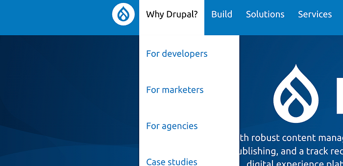
4) Hover-activated menu: Dropdowns are always a big yes to highly engaging websites. For instance, online newspapers, popular sports brands, multinational e-stores, etc. could use dropdowns to reduce the content on a webpage without losing any of the content.
However, this menu is a multi-functional and complex component that extends over the screen, entirely covering the breadth. So the minimalist designer would consider ways to make this effective in creating a good user experience. It is popular for balancing images, videos, and text. Adding to this feature is the fact that it works pretty fast even when the chances of the page becoming nonresponsive are comparatively high.

5) Hamburger: This navigation menu is the designer’s top choice when it comes to bringing all navigation links to one place. This menu is considered to be stylish, dynamic, mobile-friendly, and subtle. So, this type of menu grabs a lot of attention from people as it is stylish as well as realistic.
Minimalism’s Flaws
Although minimalist websites are quite easy to create, this does not exempt them from having errors. Even experienced designers can make the following two mistakes:
- Making products that look unfinished because they don’t think through the design thoroughly: This is one challenge encountered in minimalist design. Designers are often focused on creating minimal design solutions with fewer colours and elements, so we end up designing a monochromic interface that looks deactivated and undeveloped. As much as we want to deliver an unclustered web design, it is important to also minimize the elements in such a way that we deliver aesthetically pleasing, minimalist web interfaces that deliver a good user experience.
- Hiding important navigation buttons in favour of minimalism makes for an uncomfortable user experience: In the course of designing for minimalism, we often lose important features or hide them from the users. During the research, designers should identify features that users need to solve a problem and prioritize those features. This means they should be in clear sight but should not obstruct minimalism. Proper research would help designers identify edge cases that users may encounter and help them design solutions in plain sight.
CONCLUSION:
As a designer interested in crafting great products with intuitive interfaces, it is important to consider minimalism in design decisions. Proper research can act as a guide to prioritizing features and web content materials. Identify areas in your current designed products that you can apply minimalism to and test them to see your users’ reactions.
REFERENCE
Kate Moran (2015). The Characteristics of Minimalism in Web Design Nielson Norman Group
Mike Tungate (2019). 8 Design Tips for Creating a Clean Minimalist Website
StillKiwi inc.(2018).Best Practices for Minimalist Website Design
Template toaster staff(2021). 8 Types of Modern Navigation Menus for Websites
Gate 39 media staff(2019). UI Design Spotlight: Exploring 7 Types of Navigation Menus

