Won’t it be awesome, if Twitter notified only what you care?
Is it time for Twitter to segregate notifications into sub-folders?
If you are a social media person, I am sure you would be aware of Facebook’s sub-folder story. But just in case you missed Facebook’s tweaking in design, here it goes - Prior to the release of sub-folders, all notifications related to the page you manage came under a single folder — notifications. But, considering the huge sect of audience, social media forums like Facebook and Twitter cater to, the challenge was to provide a good experience to all users. Users have their priories in attending to notifications. Like, comments and shares are not equally exciting enough for jumping into the app. So, the design team at Facebook took a wise step and made sub-folders for the three.

Long back, I read an interesting article that talks about the User experience honeycomb. It beautifully states the 7 facets of user experience — usefulness, usability, desirability, accessibility, credibility, find-ability and value. When we are talking about notifications, desirability plays a very crucial role. Isn’t it?

About Twitter
Twitter is a platform wherein users share their thoughts, news, information and jokes in 140 characters of text or less. Twitter makes global communication cheap and measurable. When you need to know what’s going on — in your town or across the globe — get the best of what’s happening now on Twitter.
Objective of Usability Test
Identify the pain point in dealing with notifications under one head on the Twitter app and testing out how a sub-folder design works opposite to that.
Do users need selective notifications?
I recently came across an article on Medium that my friend, Nick Babich had written about “What Makes a Good Notification?”. It shows a very interesting graph -
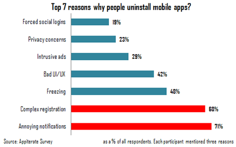
The graph suggests that the number #1 reason for uninstalling mobile apps is — Annoying notifications. The immediate question that came to mind when I saw this was, will users, in that case, appreciate notifications that interest them?
So I planned up a usability test to validate if creating sub-folders in notification makes the experience any better. Sub-folders in notifications ensure that users check the ones they care about. The other folders can be either put to mute or checked once in a while.
User Research
- User persona
Prior to conducting usability tests, I developed a user persona to better understand the target users of Twitter’s iPhone app. This process helped me get into the mindset of the users, thinking in terms of their contexts, needs, and goals
So meet Daniel!

- Platform used
I have used the CanvasFlip online tool for creating the prototypes and for UX insights such as session replay (the user videos). conversion funnel and heat maps.
- Number of users in the test
I had a user base of 31 users. So, each prototype was tested by 15 and 16 users each.
- Task given to users
“Spend some time checking out the notification on Twitter”
The idea was to see, which notification grabs the user’s attention in the first few seconds and which notifications goes unattended.
Usability testing
Generally, for my usability tests, I prefer unmoderated prototype testing. But, this time, I had some issues after I put together the Twitter prototype.
Just by seeing the heat maps and user session of users playing around on the notifications page, can I conclude whether or not a user wants sub-folders for notifications on Twitter? I wasn’t convinced enough. So I divided my test into two parts
- Usability test
The usability analysis included drawing conclusions from session replays, conversion funnels and interaction heat map.
- A survey
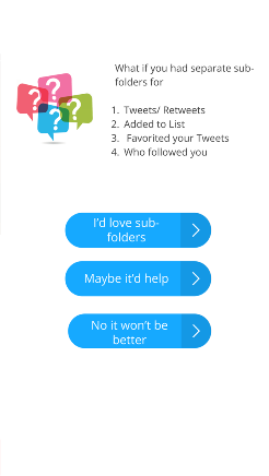
This survey screen appears towards the end in the prototype. When the user comes to the end of notifications a hotspot directs them to this survey.
Survey was a good way of interacting one-to-one with the user behind the device.
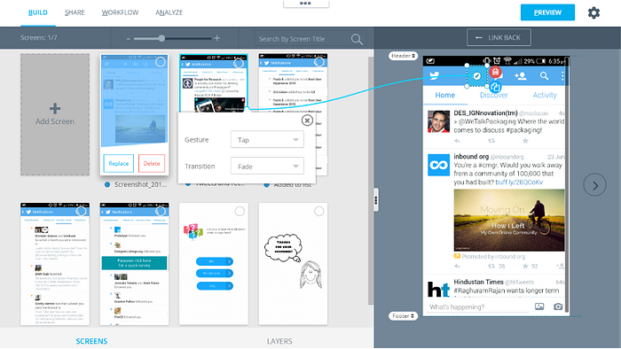
Friction with existing design
Checkout this prototype of the existing Twitter app.
This test was super fun. I was extremely excited to see the results of the test. By the end of the day, I got the UX insights on the first prototype. As it turned out, few sections of the notification got repeated interactions such as notifications about who followed you, who tweeted about you and who favorited your tweet.
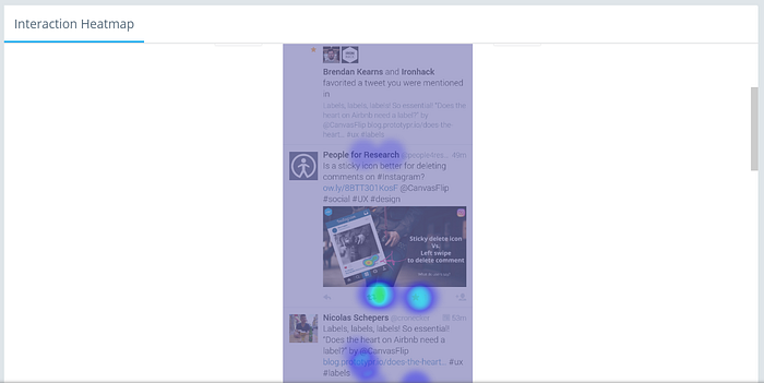
But the most interesting conclusion is yet to come - The overall interaction on each type of notification was almost same (as evident from the heat map), but as you dig deeper there was an interesting conclusion. Each user had a single or double preference! Absolutely nobody was interested in checking all the four (tweets/retweets, favorited, followed you, added to list).
Conclusion — Users do have preferences when it comes to notifications. Some notifications get very minimal attention. Obviously, these notification would be a disturbance more than excitement.
Coming to the survey results, the hierarchy of interactions on the options was 1. I’d love subfolders
2. Maybe it would help, and then
3. No it won’t be better.
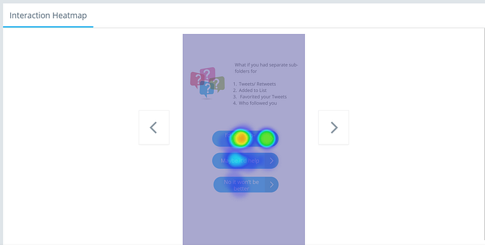
Conclusion — Users agree that a structured notification page will be much more helpful for them.
Insights on the design suggestion
Checkout this prototype of sub-folder Twitter notification.
This particular prototype will be more helpful in checking out which type of notification gets more attention. The survey validates if users love the sub-folder pattern more than the existing design.
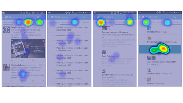
This hierarchy of interaction with options validates that users are more comfortable with sub-folders.
Final Words
The notification design pattern is a problem much much bigger than just increasing number on the unseen tab. New direct message? Buzz buzz. New mention on twitter? New notification. New follower? New notification.
To be fair, not all notifications interrupt attention at all times. I believe, structuring notifications in sub-folders assures that you check the ones that are really exciting for you. Additionally, a mute feature to selected sub-folders, will only make life even more peaceful for users. (Probably this is why gmail made structures to seperate out primary, promotional and social)
Do let me know what you feel about notification structuring. Would love to hear from you.