Your Customers Don’t Read
Applying the age old advice to e-comm sites in order to help customers scan for the relevant information they need efficiently.

Nobody reads things. They just don’t. Because they are always in a hurry.
Like, even Mellow Steve who just meditated in the park for 4 hours and plans to spend the rest of his afternoon doing chill basketweaving near the harmonious respite of a babbling brook while smelling a lovely bouquet of roses, will probably be at least a little in a hurry when he uses the internet.
It’s human nature.
In fact, odds are pretty great you won’t even read this entire article. At least, not every word of it. In a study done by Norman Nielsen in 2008, they found that the average user will only read about 20% of a page¹, often less, and things haven’t changed much since then.
As we go through our day to day lives, we are constantly bombarded with information. News, ads, articles, books, emails, and everything in between compete for our attention, creating an overwhelming amount of noise. There’s no way we can afford the time to read it all. So what do we do? We scan and skim until we find what we’re interested in.
I’ll get to how this impacts an e-comm website here in a few, but first let me cover some basics.
How to Support Readability on a Page
Volumes of general advice about how to structure content to support scanning has already been written, but I can summarize:
- Write descriptive headings — I almost made the heading of this section “What to do?” Then I realized that would mean nothing to someone that didn’t read the intro, so I updated it for clarity.
- Make one-topic paragraphs — If users like the heading, they might read the leading sentence of the following paragraph. Make it count. Put the main subject or most valuable information at the front, and make the rest of the paragraph about that. If you want to talk about something new, make a new paragraph. Often, users will only read the first sentence, or even the first few words of a sentence, before deciding not to continue reading.
- Highlight key information — Literal highlighting draws the eye to important stuff.
- Avoid “fluff” language — I mean, there’s a time and a place for good fluff, but how many times did you have to scroll through someone’s life story before you finally got to the recipe you were looking for?
- Do eye catching stuff at the right frequency — Headers, bold words, and highlighting all help the user scan. The key is not to have too much or too little. Having eye catching content everywhere will generate too much noise and competing priorities. Having too little will present as a wall of text that no one wants to read.
I think that is about most of it!
Reading Behavior on E-Comm Websites
Well, I mean, it’s pretty much the same. Nobody reads anything and the same general rules I listed above still apply. But there are a few things I’ve learned in my adventures that are really unique to e-comm, because there is a lot of information to convey and poor design will cause customers to skip reading critical pieces of information, or worse, feel bamboozled.
Transparency is a big deal. Customers want to make informed decisions with no surprises, and that means communicating everything from shipping times to product descriptions with accuracy and clarity. Even a minor infraction is enough to lose sales or repeat business, so you want to make sure that customers see the information they care about.
Avoid huge descriptive blocks of text, pretty much always
When a customer is on a product listing page, product description page, cart, or checkout, they are definitely not interested in reading a novel.
What they are interested in is learning about the product they are thinking of purchasing, understanding what it costs, and figuring out how fast they can get it. Any other information is a waste of their time, and people dislike wasting their time.
On PC Connection, there is a large and very wide block of text at the top of their product listing page.

There are many problems here.
The first thing that will deter people from reading this text is that it is too wide and tall, which makes it more difficult for the eye to find the beginning of the next line. The effort alone is enough to stop customers from reading this paragraph.
Second, the first 6 words “do you have a mobile workforce?” in the paragraph makes it clear that the contents are some sort of ad or self-promotion. Most people will correctly judge this to be non-essential information and skip reading the rest of it.
Third, for the few customers that do read it, the information is not helpful. This copy is simply a long-winded way of saying “laptops are useful”, which a person shopping for a laptop already knows anyway. The company does not need to tell them that.
Fourth, this block of text is pushing down the search results below the fold, which could actually cost sales, because a lot of people don’t scroll either.
The most useful thing about this text is that it has a link to a laptop buying guide, and since that has the potential to be helpful, some people might be interested in it. However, that could have been strategically placed on its own without the the fanfare of the paragraph before it and still have been be just as effective.
For contrast, Dell utilizes a much more minimalistic approach on their product listing page, with the top only showing helpful information: What we’re looking at (Inspiron laptops) and some breadcrumbs to help us navigate in case these laptops turn out not to be the right thing.
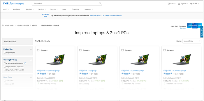
Simply put, it lets customers get down to the business of shopping.
Font-load microcopy and keep it short
Since users don’t read, it is crucial to put the stuff you want them to read at the front of your copy, but also to keep the copy as short as possible. According to Baymard Institute, readers will typically stop reading after the first 4 to 6 words² so you want to get anything important in that limit.
On this Everlane email capture, the copy is overall pretty short, but the part that is mostly likely to encourage customers to sign up (10% off) is bolded and placed in the first 6 words of the copy. Additionally, they link to the lengthier terms of service and privacy policy, rather than spelling it out in a large unreadable paragraph.
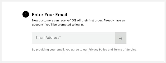
Often terms and conditions are required for legal reasons and have to be offered to the customer, but whether you put a big paragraph or a link, the user isn’t likely to read it anyway, so you might as well save yourself the visual clutter.
Use spacing and proper grouping to help scanning
Many e-comm websites try to cram as much text as possible everywhere, and the result is overwhelming, but correctly grouped content with adequate white space will help customers who are skimming the page to find what they are looking for faster.
BJ’s wholesale has a bit of an issue with spacing that makes it harder to scan their PLP. Some content looks like it is running into the items below it. Further down this page, this can confuse customers, who may associate the information with the wrong item.
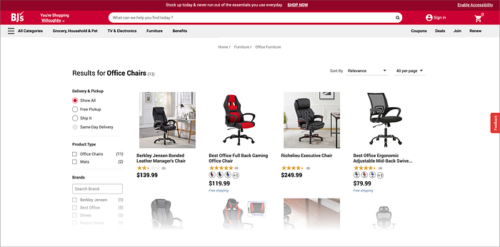
The other issue is that it is difficult to scan content from the left to right. For example, if a customer is most interested in price, it isn’t in the same place on each listing, nor does it particularly stand out because all of the text is black, so they’ll have to look harder for it.
Toys R’ Us makes it easer to scan the information for their product listings.
- There is a proper amount of white space below each row, making it clear what image the content is grouped with
- The title is always blue so it is easy to spot and scan for.
- The price is large and is always starts in the same place (even if the title above it is short), which makes it easy to spot in each listing even though they are sometimes different colors
- The rating acts like a divider.
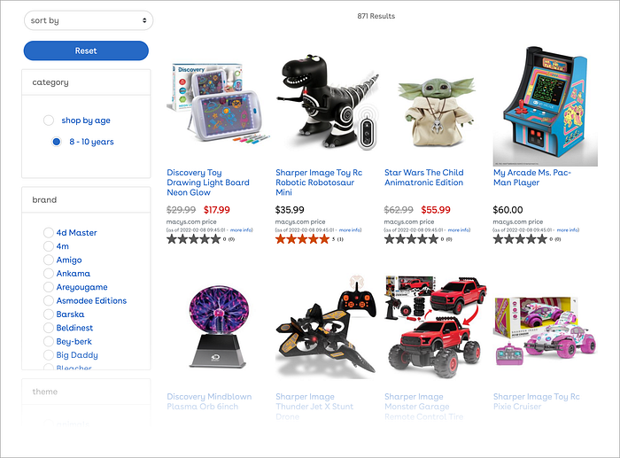
Overall, it is much faster for a customers eye to find what they are looking for with Toy’s R Us because there is adequate white space and good grouping of content.
Market only where and when it’s relevant
It’s really tempting to promote to customers everywhere, and a lot of sites are obnoxious about it. We want to tell customers who we are, what our programs offer, what makes us different, and what great deals we have. That’s awesome, but if it’s in the wrong spot or has too much text, customers won’t read it anyway.
The first way to get rid of some text? Don’t tell them who you are (except maybe on the about page, which is the proper place), show them!
If you want to tell customers you are this super amazing toaster company, show them with amazing toaster product shots, spot-on toaster product descriptions the truly ease worries, clearly-well-designed toaster specs that demonstrate quality, and a simple, straight forward e-commerce process that will knock their socks off.
Want to tell them about a sale? Absolutely. But keep it brief, and put it in a relevant location.
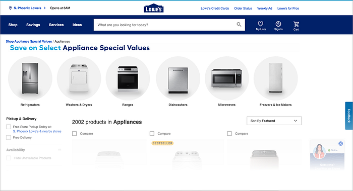
If you have a deal on appliances and the customer is looking at appliances, that is an appropriate place to let them know there’s a sale. In this case, Lowe’s puts the ad on top where it’s easy to find, but it doesn’t have much copy (quick for the customer to read) and it isn’t forcing the products too far down the page (doesn’t interfere with the customers goals).
Use very precise language
There’s no need to over-explain things. Take this product from B&H Photo:
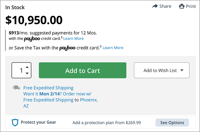
It explains that there’s expedited shipping, and then explains that there’s expedited shipping again. This could have been significantly shorted by changing the copy to “Free Expedited shipping by Mon 2/14 to Phoenix”. They also don’t need two separate ads for Payboo. With a little creativity they could shorten that up quite a bit too, especially since the “Learn More” call to action does the same thing for both.
Wrapping up
Users don’t read. They scan. The best UX on e-comm is to do everything you can to shorten, condense, and laser focus copy. Only tell them what they really need to know to shop and leave out fluff. Make marketing relevant. Then use proper spacing, hierarchy, and color to help make things easier to scan and locate information quickly. You won’t have any regrets.
References:
- Norman Nielsen Group | How Little Do Users Read?
- Baymard Institute | Optimize Microcopy to Support Skimming

