
YouTube overlay Ads - Boost your Conversion Rate with a slight change in the design

Disclaimer: I am just sharing my insight & perspective which I have learnt working as a designer.
One fine day I was re-experiencing the “Docking scene” of interstellar. And now I am holding my breath for the next frame to come and
crap 😤 Here comes the Ad
Problem
Based on my research, the content (Logo & Value Proposition) in the YouTube overlay Ads do not get clear attention which impacts the Conversion rate.

Solution
Repositioning the “Info (i)” & “Cancel (X)” icon to the centre.

I know, the redesigned version does not look that great but it might work well.
The rationale behind moving the “i” and “x” icons in the centre is to get the user’s attention to the Value Proposition (i.e. Get 3 months of Premium at just $0.99).
As the Value proposition is the most important part of this Ad, this needs to get the attention of the viewer.
Now, let’s compare the current design with the redesigned version.
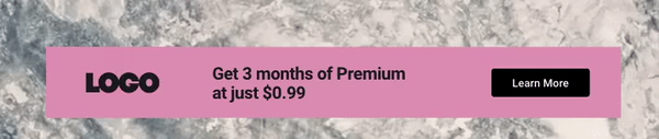
Current version 😶
- In order to get rid of this Ad, the viewer closes the ad without paying attention to the “Logo” as well as “Value proposition”
- The only element that is paid attention is “Learn more” which is in close proximity to the “X” icon
- And the “Learn more” button does not give any context about the Ad
Redesigned version 🤩
- In order to get rid of this Ad, the viewer moves the cursor to the centre of the banner where the “Value proposition” is in close proximity to the “X” icon
- The viewer would probably get a glimpse of the “Value Proposition” which he/she might remember or get interested in
Hence, acquiring a potential lead which might help in conversion
Well, you might be wondering, why did I use the “Hover” effect instead of directly displaying the “i” and “X” icon
It’s simple..
Not to occupy the real estate of the banner with elements which are not necessary to display always. The action taken is always proportional to the intention of the person
- If the viewer got interested in the Ad, he/she would prefer to click on “Learn more” which should be always visible to the eye
- If the viewer just wants to get rid of the Ad then give them the chance to explore the easy way to get rid of it. Once they learn, it would be obvious for them
Please comment below if you think in any way this idea/redesign could help Businesses improve the conversion rate.
Would really appreciate some 👏
Thank you for your time!

