Zomato app — UX Redesign

UX Feedback was written in response to Zomato “Hunt for the best UX feedback” based upon the Research of User Feedback, app review on PlayStore and tweets to Zomato. Keeping in my mind the following objective of this UX Teardown:
- Identify opportunities
- Substantiate design changes
- Identify technical issues
- Highlight UX improvements
Notifications

Problem: First of all look they look like Debug log of IDE when there is no active food order also the Zomato icon in the side is not conveying any information about the notification message.
One of the important messages which Zomato can highlight among these notification is :
Slow and steady wins nothing😋
That’s why we delivered your order in 17 minutes. Enjoy!
It missed the opportunity to notify the user that food was delivered in less than 30 minutes, which is very powerful strategy in food industry to attract users.
Feedback to Improve this: Show the information in the tracking page of order in the form of process and remove the notification submenu [Reduce extra menu] and also give action notification of fast-delivery with an option of the share button.

Results: Users will like removal of Sub-menu of Notification because information about tracking their food is present only when it is needed. From the usability point of view, it is still usable with one less feature of sub-menu of notification.
Profile Menu
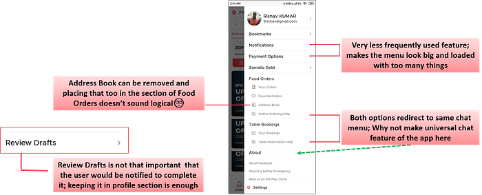
This section is decently well designed but needs to lay off clutter(options that are rarely used) which makes it difficult to find some important option.
Restaurant page
Story: A couple came for a business trip to a new town for 2–3 days and they are looking for a restaurant to eat and also wants to do sightseeing in the new city without devoting the extra time(user has a location constraint). So, they have to switch between Zomato and Google Maps, to check the restaurant rating on Zomato and its location(services nearby) on Google Maps.
Problem: Searching and viewing restaurants in map view is missing, as showing the name, rating and cuisine of the restaurant are not sufficient in choosing the restaurant to go out as it also depends on the location of it(public transport nearby/sea-side view/or any personal choice).
On viewing the restaurant main page, there is no option of a quick action button of been here. Instead Been there is present in the profile section which is 3 clicks away.
No option of sorting the restaurant based on the tag of visited, as many times the user wants to visit new places.
Feedback to Improve this: Adding “Been here” option on the restaurant main page. The option of Sorting the restaurant on the basis of visited or new places.
Bookmarks
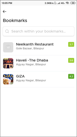
Problem: Bookmark is a place where users can keep their personal favorite on which they trust irrespective of what Zomato suggests. But, there is no filter for sorting the restaurants nor search option to search for food among those restaurants only searches the restaurant(can be easily fixed by the technical team)
Result: This feature will make Zomato a user-centric product giving the user freedom to search their favorite food in the bookmarked restaurants with order filters.
Liking you own Reviews
Problem: Liking our own review/post has been customary across different platforms. But, it makes no sense as you wrote it, you will, of course like it.
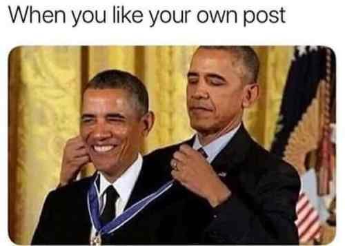

Feedback & its Impact on User: For the user, it will show how deeply Zomato cares about the consistency in design and even stillest details of the app mean something for the user.
Little things which make Zomato different!😍
Changing the rider logo on the 23 July(Launch of Chandrayaan-ll), this small gesture shows how connected Zomato is with the people of the nation.

Level of Foodie
Problem: The removal of the level of foodie feature from the profile has disturbed the foodie ecosystem in the Zomato. It is one of the key ingredients of Gamification(reward) which is making it different from other food apps who are only serving the food.
Feedback & its Impact on User: Encourage user engagement to order food more, write a review and be a part of the food community.
More Instructions
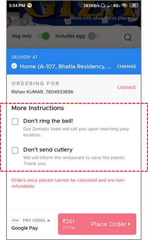
Problem with Current Scenario: No option to ask for chopstick/cutlery when ordering continental foods. Neither user inform the restaurant about allergic behaviour of the user with any ingredients. Most of the time, instructions are not considered by the restaurant in Zomato and other apps, which makes the user feel neglected.
Feedback & its Impact on User: This feature can make the user feel that Zomato care for its experience of eating continental food. If possible, acknowledge the user about the instructions from the restaurant as soon as the order gets accepted.
Downloading of Receipt
Problem with Current Scenario: People on the official/business tour have to mention the receipt of food to get reimbursement for the food. Most of the time Receipt with food get dirty and are not need a paper receipt.
Feedback & its Impact on User: Sending receipt with email can save paper also it will be easy for those niche users to get it reimbursement. Moreover, it will be a small contribution to save paper.
Checkout Experience
Problem with Current Scenario: Checkout experience on selecting the debit/credit/ATM card gets a little slow for the user doing the online payment for the first time, especially in case of old parents who are not digitally empowered. For the user in general, entering the card details is mundane.

Impact on User: This feature will not only make the experience better but this micro-interaction will make the experience rememberable.
Notification Sound
Opportunity in Current Scenario: Hungry user is impatient and waiting eagerly to eat the food. During waiting time, the user checks the app multiple times to see if the valet is at the door or not, which increases the screen time. With the increase of food ordering apps users in the group don’t know the app from which it is ordered.
Opportunity for Zomato to announce arrival of food with a different notification tone, letting everyone about the origin of food order.
Feedback & its Impact on User: The Customize tone of the valet can make the user aware of attending the valet at the door without the need to check the phone for absorbing the information and other people around him that this user has used Zomato to order food (just like car parking tune when OLA driver reach us to pick)
Booking a Table
Problem with Current Scenario: India doesn’t have a culture where tables are booked in advance. User care notice very small details in the overall User Experience, and with time other food apps will also give this feature, so only solving the problem will not be sufficient, but also giving them natural user interface can make this action rememberable.

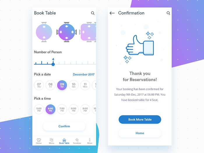
Feedback & its Impact on User: Adding some graphics while booking a table can give the user a pleasantly memorable. This small change matters because the people(non-CS person) even CS guy will not likes
I found these problems or bad moments of different niche users from their tweets and play store review of Zomato. To which I presented it with a opportunity to give the user a User Experience like never before!
Wanna like to see more feedback, check this! and Do check the winning feedback of Divyanshu Nandwani.
Feel free to leave comments or suggestions. You can also email me at 9rishav@gmail.com Or let’s connect on LinkedIn✔. I’m always open to meet and talk. 😀 Here’s a shout out to my friends Shantanu(check his design work on Behance), Kishore and Utkarsh for their support.
Thanks for reading! 😊

Disclaimer: This is a self-published project and I do not mean to disrespect Zomato in any way, or discredit the amazing design of vijay verma team’s & engineering teams at Zomato.


