
3 alternatives to the floating action button
UX-friendly alternatives to the Floating Action Button, Google’s cute UI design element that doesn’t always cut the mustard
Everybody loves the Floating Action Button, right? That little action button at the heart of Google’s Material Design language is appealing, useful and makes for streamlined UI design.
But cute as it may be, the Floating Action Button has critics as well as admirers. Possibly “detrimental to the overall UX experience of (an) app” according to one commentator, the Floating Action Button isn’t always the right UI element to use.
Justinmind hunted down some user-friendly alternatives to the floating action button, and found out some interesting stuff about UI design patterns along the way.
What is the Floating Action Button?
Back in 2014, Google launched Material Design, a design language that tries to unify the user experience of all Android web and mobile app users. You’ll recognize Material Design by it’s heavy use of grid and card layouts, animated transitions and, most strikingly, illusion of depth created by smart shadows. The UI design system harks back to the paper and ink days when things had “physical surfaces and edges”, but the result is clean and modern.
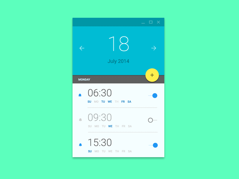
The Floating Action Button (or FAB to its fans) is one of the most striking elements of the Material Design UI language. It’s that colorful button you’ll see in Android apps, often on the lower right of the screen. It’s just kind of floating there, apparently just situated somewhere above the rest of the user interface.

Functionally, the Floating Action Button represents the most common user action on the screen. Take the example of the home screen of Gmail’s Android app. When a user opens Gmail, the action they are most likely to perform is that of writing a mail. And that’s exactly what the FAB calls them to do: the UI element is bold in color, eye-catching and intuitive. The little pen icon helps with the last part.
Whats so good about the Floating Action Button?
The Floating Action Button’s biggest selling point is that it’s a recognized, standardized UI navigation pattern. Standardized navigation patterns lighten users cognitive load substantially and are predictable. Minimum cognitive load means maximum usability, as pointed out by Kathryn Whitenton of NN Group.
The Floating Action Button also allows Android app prototypers and designers to improve design consistency. It’s pretty convenient, as a UI designer, to know that if you’re prototyping an Android app, you have a universally spoken design language at your disposal, for free.
Add to that the admirable concision of the floating action button. It captures the core function of your appear screen in one simple, space-saving UI element. And it’s attention-grabbing, helpfully guiding users through the app’s functionality.
If the Floating Action Button is so great, why do we need UX-friendly alternatives?
Good question. Like all UI elements, the Floating Action Button works for some UIs more than others. Here are some occasions when a Floating Action Button detracts from usability rather than enhancing it.
- Sometimes floating action buttons can hide content that people need to see. If you have a floating button that covers part of an email, or the time that it was sent, this can cause frustration among users as it blocks important content.
- Perhaps you want to include more than one option behind the button. For example, the floating action button may interfere with other UI elements on the page such as non-floating, less fabulous buttons.
- Direct conflict with Apple’s iOS 10 Human Interface Guidelines (HIG). If you’re making an iOS app then stay clear of the floating action button. While FABs make great CTAs, Apple tends to prefer top-right navigation.
- It can mask the true primary action of a screen if not used judiciously. Take Gmail, whose floating action button makes little sense when you consider that most people prefer to read emails on the go and can compose a reply within the opened email itself, making the button almost obsolete.
- A floating action button without an icon is mystery meat but icons are hard to make intuitive. Icons are understood by a user’s previous experience and since there is no standard, getting icons right is hard enough, let alone making sure they’re universally understood.
3 UX-friendly alternatives to try in your next app wireframe or prototype
Dynamic action button
A dynamic action button is a button which appears when a particular event occurs. For example, you might want to hide the floating action button when you scroll so that it doesn’t get in the way of important content (or accidentally click it resulting in frustration), having it reappear when the action stops. No good UX designer wants to pollute a page with unnecessary items or content, so a button that hides itself when another action is performed and reappears intuitively when needed is a good option.
This is a nifty alternative, especially if you don’t want your action button to block important content.
Floating action expansion button
One way to really exploit the floating action button is to add more options within the button and make it expandable. An expandable FAB’s additional options must, of course, be related to the purpose of the floating action button otherwise it can cause major confusion. But don’t exhaust your users with a heap of extra options, keep it simple — a maximum of 3 should suffice. Anymore may create decision fatigue.
Nick Babich highlights how the floating action expansion button, however, can be an opportunity transition to a new screen, giving you a lot more space to put content. For example, in your notes app the floating action button can expand into a new sheet to compose a new note. These sort of intuitive transitions are used when creating new content and are a useful and practical way to add more options without necessarily hindering the user experience.
Bottom or top toolbar
Sometimes the most obvious solution is the best one. The trusty old toolbar can be used to replace the floating action button in apps that are content-heavy or have more than one primary action. A bottom toolbar is within striking distance of the thumb zone and doesn’t conflict with iOS UI layouts. With Justinmind, prototyping navigation bars is simple and heaps of fun.
If you do decide to replace a floating action button with a toolbar, take care not to mix Actions with Navigation in the bar, and ensure you’re using recognized, consistent icons. And be sure to create a strategic and consistent information hierarchy that makes sense.
Conclusion
The right UI navigation depends on the screen that you’re using. Sometimes a smaller screen just screams out for a glorious, useful floating action button. Other times, the floating action button needs to take a backseat when there’s plenty of real estate to work with, such as in web design. Whichever option you decide to implement in your interactive prototypes, be sure to stay consistent and always have the end user in mind when designing. After all, what’s cool today can be a functional nightmare tomorrow.


