Member-only story
8 Laws of UX that Uber Follows
Laws of UX design that Uber’s Interface Follows.

You people are awesome, all of our followers show a great response to my previous article in which I explained every law that Spotify follows to make their design more amazing, and in that article’s response some followers ask for another one so I researched a bit and found the 8 laws that Uber follows to make their design more useful and effective.
#1 Aesthetic Usability Effect

Users often perceive aesthetically pleasing design as design that’s more usable.
The design of Uber is beautiful, you might say that the design of the Uber is not that unique or stylish, every app nowadays designs its UI beautiful but the thing is that Uber is designing its UI beautifully from the start, their UI is clean, simple, and attractive and way out of the league from a while ago.
In India, the Ola is the direct competitor of Uber, Ola is a company started by Indian entrepreneurs that offer similar services like Uber, but personally, I like to use Uber.. and why is that, because of its design. I love it.
Designing a beautiful UI is a necessity nowadays, which according to the law of aesthetic usability makes the design more useful in the eyes of users.
Shooting at two targets with one arrow.
#2 Doherty Threshold

“Productivity soars when a computer and its users interact at a pace (<400ms) that ensures that neither has to wait on the other.”
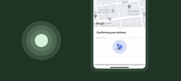
Providing useful feedback is necessary, both in real life and design life, In real life when you’re nodding your head while communicating with others it shows that you’re into the conversation and makes them talk more, and in design when you show the animation it shows that the UI is listening to the users.

