Apple Vision Pro Spatial Design 101 - (Part 4)

This is part 4 of an ongoing series, catch up on part 1, part 2, part 3, part 5 here.
UI Sizing & Spacing
In visionOS, points are used as the unit of measurement for sizing and spacing.
Interactive elements must have a tap target area with at least 60 points of space, so they can be easily selected.

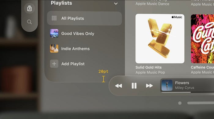
This means that UI element can be visually smaller, like the standard button, which is 44 points, as long as enough space is added around it. Such button needs to have at least eight points of empty space around it, so it meets the minimum of having a target area of 60 points.


When designing several buttons in a stack, use standard system buttons with at least 16 points of spacing in between them.

When designing visually smaller element, like a disclosure control, a mini button with size 28 points can be used, in an area like the section header.
Even though this button might look small, it must have 60 points of space around it to make it easy to select.


This small button still has 60 points of space around it because the text next to it is not interactive (as shown in the example below).

Similarly, using large and extra large buttons requires less spacing around them, because each button’s size is close to 60 points, making interactions easy (as shown in the example below).

Placement of Ornaments
When ornaments sit at the bottom edge of the window, place them so they overlap the bottom edge by 20 points. This helps ornaments to feel like they’re integrated with the main window without blocking too much content.
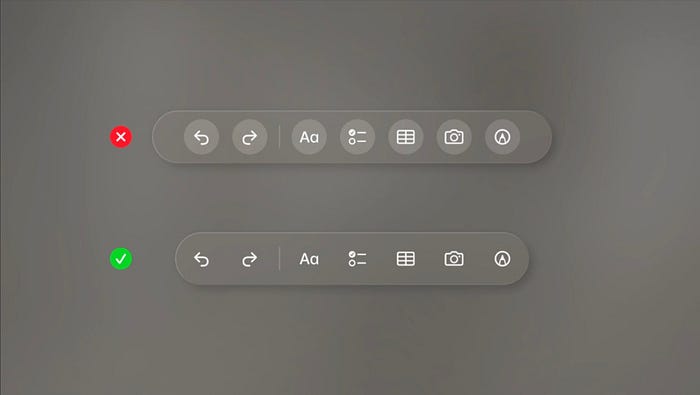
Borderless Buttons
Since ornaments are usually a collection of buttons and sit on their own glass container, this is a perfect place to use borderless buttons. In this case, it’s clear that these are interactive elements, and they’ll still get the hover effect as people look at them.
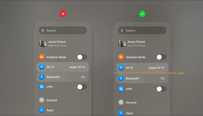
Spacing during Hover Effect
When creating layouts, it’s important to take the hover effect into account.
For example, while creating a list or a menu, a small amount of padding in between each item must be included to avoid having the hover effect overlap. Four points of space is recommended.
Spacing between Lock-Ups
Lockups are single interactive elements that contain image and text that belong together.
To display the hover effect on each lockup clearly, define an invisible shape around each lockup region. This shape should surround the elements belonging together.
It is important to keep small space in between each shape to maintain clearly defined regions.
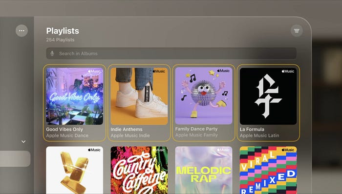
In the example below, there are invisible shapes around each lock-up region. Each region displays the hover effect and brightens as people look at them. This helps users understand that the entire area is a single element that can be selected.

Keep Nested Elements Concentric
Always ensure nested elements have relative corner radii and padding that keeps them concentric with each other.
To help figure out how to size corners, use this simple formula: Corner radius of the nested element, plus the padding in between it and the outer container, gets the outer corner radius.
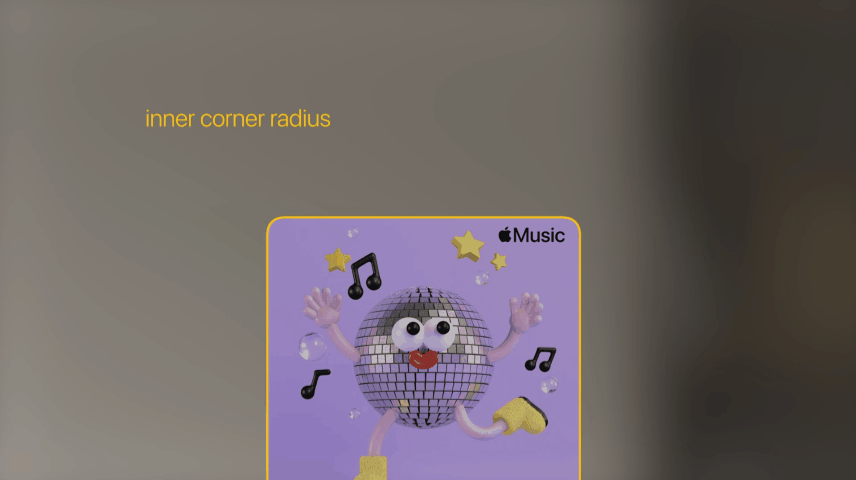
Throughout the system, every element must be concentric to one another, starting from the relationship of the window to the elements in the corners. So, remember to keep nested elements concentric with each other, as this will help them feel like they belong together.

Following sizing and spacing guidelines is crucial to standardize the spatial interface and interactive elements.
In my next article here, we learn about some best practices in spatial design, field of view, ergonomics, and more.
Credits: Apple
Let’s work together on an interesting project. Ping me at xrfuturism@gmail.com.

