Case Study UX — Kindle Redesign — Reader Screen
The inception of this project began nearly a month ago when my cousin (a book blogger) and I started discussing things we’d like to change on our kindle. The existing model is brilliant and its features have allowed it to become the most popular e-reader. I took up this redesign as a challenge to myself and also as a learning project. Due to the massive size of this project, I decided to dissect it into smaller components and attack those individually.
This is the second part of the study which will be focusing on the most significant feature of the kindle — The Reader Screen of the PaperWhite.
Approach

The goal for me was to interact with users and identify what their needs are. With a deeper understanding of user behaviour, I defined a set of objectives — solve their current issues, enhance existing experience and improve overall usability. The next stage involved ideating to meet solutions for the objectives defined. Finally, the last stage was translating these ideas into mockups.
UX Research
As an avid reader myself, I spend over 3 hours on my kindle in a day. Based on my experiences, I formulated a questionnaire to gauge whether other users had the same experience and displayed similar behavior.
I sent out a survey to a group of book bloggers as well as a few senior citizens. Involving both a young and old pool of audience helped me get a wider view of how the technology was used.
When asked to rate the interface, (1- Complicated and difficult to use 5- Perfect and Intuitive)
83% of the users rated it 4 or 5
When asked to name any issues faced while reading, the following was the result
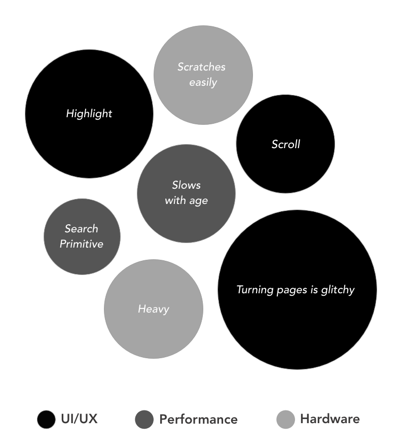
I categorized them into UI/UX issues, Performance and Hardware related issues. The size of the circle is indicative of the relative percentage of users stating the issue.
One particularly common complaint was that highlight texting that starts at the end of one page and continues to the next page is difficult.
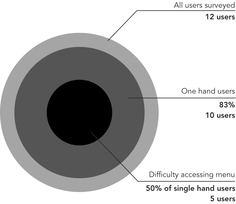
Based on my own experience, I usually use only a single hand to hold the device and this makes it difficult to open up the menu or to adjust brightness.
One blogger mentioned that the highlight feature on other e-readers allows one to highlight in different colors, and this feature is extremely useful. Colour coding highlights allowed her to segregate quotes for review, character development points, and so on.
Defining Objectives
The results of the UX research brought about clarity on the areas that needed focus and attention.
- Solve current issues
- Highlight text in an easier manner
- Page Turn interactions
2. Propose enhancements for usability
- Solution for easy use of device using a single hand
- A feature for categorization of highlights
- Search Optimisation
- Button to easily access Dark Mode (Color Inversion)
Ideation & Prototyping
The ideation phase followed after defining the objectives. In order to meet the objectives, I went through several iterative rounds. At each point, (since I didn’t have any stakeholders) I shared my thoughts with a few users and built on the feedback I got.
- The bottom bar reduces the weight of the top menu and creates a specialized zone only for reading features
- By introducing two buttons for brightness and dark mode, users can easily customize their screen without having to visit the settings panel.
- Addition of two features “One Hand Reading Mode” and “Highlight Mode” that addresses some of the issues faced by users
- Replacement of Store and Goodreads tabs from the top menu with a specialized search
One Hand Mode
This mode is ergonomic in design. By placing common controls in easy to reach areas, the user’s strain on the hand reduces significantly.
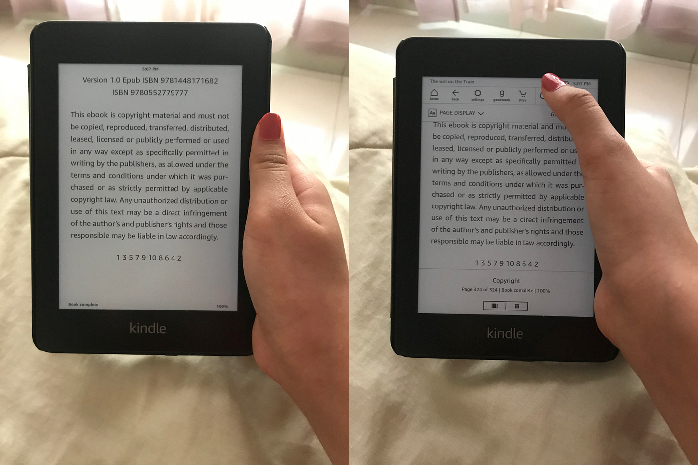
The photo of the left shows the areas which are easy to access while using the kindle with just one hand.
In order to bring up this side menu, the user would need to double-tap at right-hand center.

Users can switch the panel to the left by selecting Left Hand in the settings panel.
Interactivity in the one hand mode was another focus point for me.

While retaining the original swipe left and right to turn pages, I also introduced tap zones to turn pages. This will make flipping pages easier.
Another proposition would be long-press the tap zone to turn pages at 2x speed in the given direction.
The reason for introducing these zones is because it might alleviate some of the problems users have with the current swiping motion which glitches.
Focusing this tap zones in the areas of easy access makes the design more ergonomic.
Highlight Mode
Many users have issues with the long press and drag highlight feature, especially when trying to highlight text which continues into the next page.
The highlight mode allows users to simply drag their finger along text which would highlight it (Swipe to turn would be disabled in highlight mode). If the user highlights the last word on a page and drags his/her finger to the edge of the screen, the page will turn.

The tag feature which allows users to add highlights to certain categories, these tags can then be found under the go-to/ list icon.
Minor UX changes

I constantly find myself typing the author's name into the search menu while reading only to realize I’m searching in the book and not in the store or on Goodreads. This feature would let the users search any platform easily without exiting the reading screen.
A subtle touch of adding the battery percentage while reading goes a long way. Users no longer need to use that extra tap to check their battery percentage.
What I have accomplished?
- Introduction of a bottom bar for specialized reading features
- Highlight and One-hand mode that addresses most of the user's pain points
- Increased interactivity with the new tap model
- Tag categorization for book enthusiasts
- Simplistic improvements like search and battery percent display to improve the usability
I would love to hear some feedback on the points mentioned and the points I have missed. Please comment and let me know what you guys think about the case study.
You can read part one of the Kindle Redesign series here https://uxplanet.org/case-study-ux-kindle-redesign-settings-screen-18d14c962b7