Visualisations are a crucial part of any dashboard design and choosing the right chart type to present your data is the most important part, but often the trickiest one. Choosing the wrong type of chart could cause confusion or lead to mistaken data interpretation.
If you have ever designed a dashboard or worked on any other project that requires data-visualisation, you know it could be a particularly challenging task. Pie or donut charts could be often a designer’s first choice as they look very attractive and user-friendly but usually they are not the best way to present data. In this article I want to share some of the knowledge I gained from designing data-heavy applications. Besides explaining the easiest way to choose the right type of chart to visualise your data, I will give an overview of the most common chart types and design best practice for each of them.
How to choose the right chart type
Choosing the right chart type depends on what kind of data you want to present. Typically charts are used to convey composition, comparison, relationship or distribution. Therefore, the following four questions will help you to decide which chart type to use:
- Do you want to display composition of something?
- Do you want to compare values or show differences over time?
- Do you want to better understand the relationship between two or more variables?
- Do you want to show the distribution of your data?
Depending on what you want to show, here is an overview of the most common chart types:

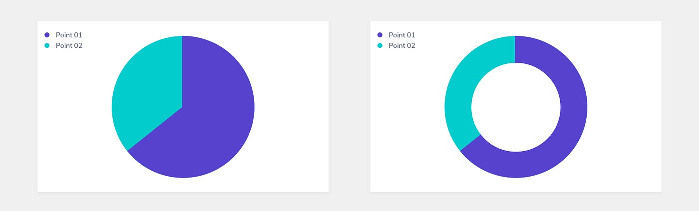
01. Pie and donut charts
A pie chart, or its most recent variation, donut chart, is one of the most overused charts. They are used to show parts of a whole and represent numbers in percentages where the total sum of all segments needs to equal 100%.
The pie chart is one example of a data visualisation where I would argue that there is almost always an alternative that displays the data in a better way. However, maybe the problem is not in the pie charts itself but that often they are used wrongly. One of the greatest defenders of pie charts is Robert Kosara (the author of a EagerEyes blog) and without doubt they could be very efficient in certain cases. An example of good usage would be plotting the outcomes of a survey where users have to provide simple “yes” or “no” answers.
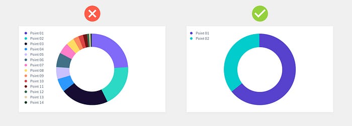
Principles to follow for better pie charts design:
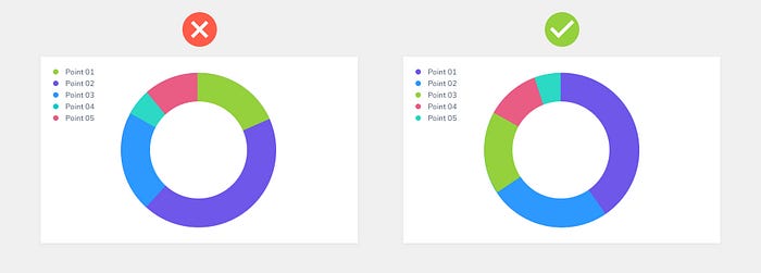
- Never use pie charts if you have too many categories as slices will get too thin to be comparable. Use pie charts only if you have maximum 6 categories.
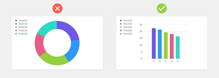
- Do not use pie charts for values that are very similar. Bar charts would be much better choice in that case.
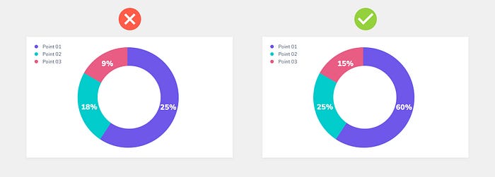
- Do not use pie charts if values don’t add up to 100%. The total sum of all segments needs to equal 100%.
- Order slices according to their size for easier comparison.
02. Bar and column charts
Bar and column charts are the simplest and most straightforward way to compare different values or show differences over time. Column chart has vertical bars while the bar chart has horizontal ones.
There are 3 types of bar charts: single bar charts, clustered bar charts and stacked bar charts.
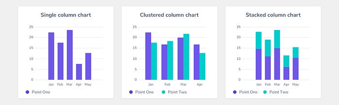
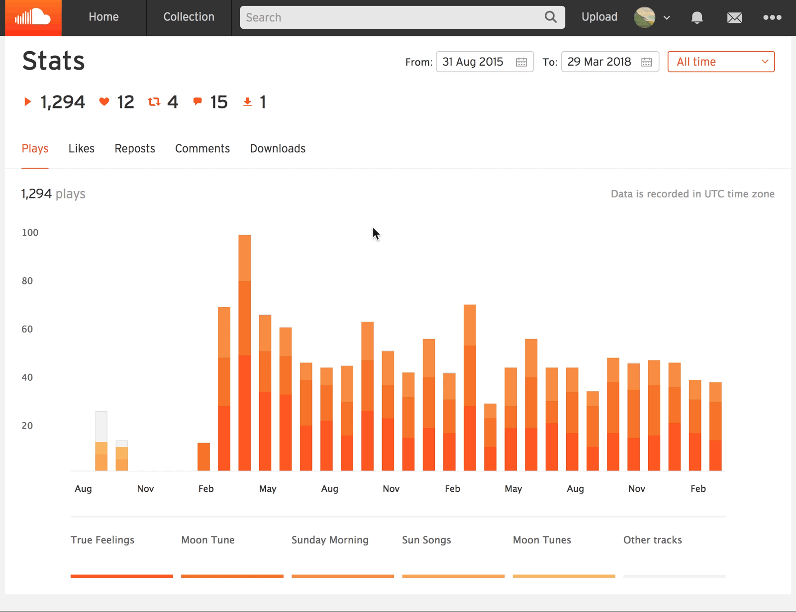
If you want to know the quantity, ratio and frequency of each category in a chart, you should choose a single bar chart. To compare items across categories use clustered bar charts. If you want to show a part-to-whole relationship among each category use stacked bar charts. Good example of stacked column charts is SoundCloud’s overall plays chart.
Principles to follow for better bar and column charts design:
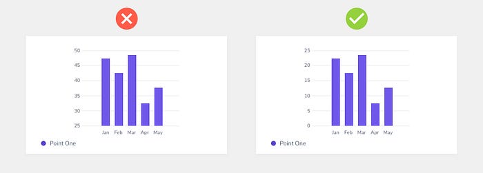
- Always start the y-axis at 0 to appropriately reflect the values in your graph.
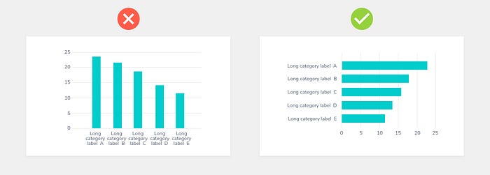
- Use a horizontal bar chart when you have long labels.
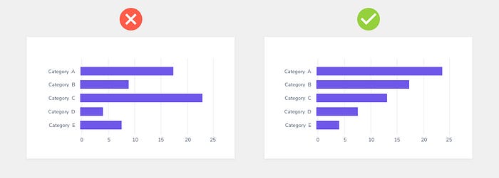
- Order data series unless you are working with dates.
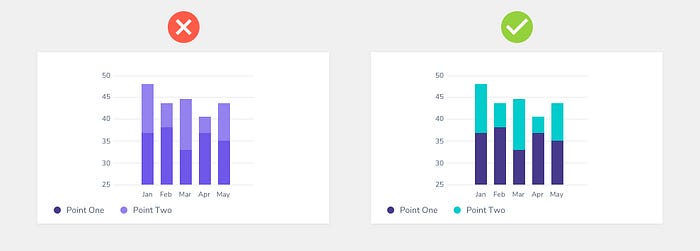
- Use contrasting colours for greater clarity when presenting data with stacked column charts. I usually use Strark plugin for Sketch, Figma and XD Adobe as a colourblind simulator and contrast checker.
03. Line charts
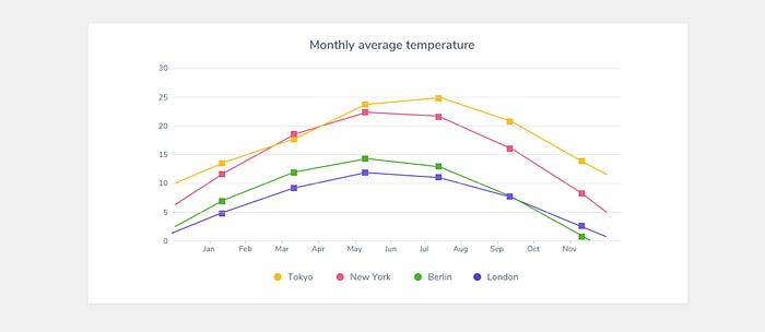
Line charts show trends in data over a period of time or a particular correlation. For example, one axis of the graph might represent a variable value, while the other axis often displays a timeline. Good example of a line chart is the presentation of average temperatures for different cities.
Principles to follow for better line charts design:
- Avoid comparing more than 5–7 lines.
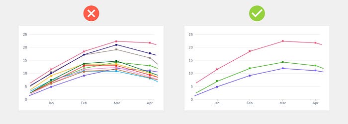
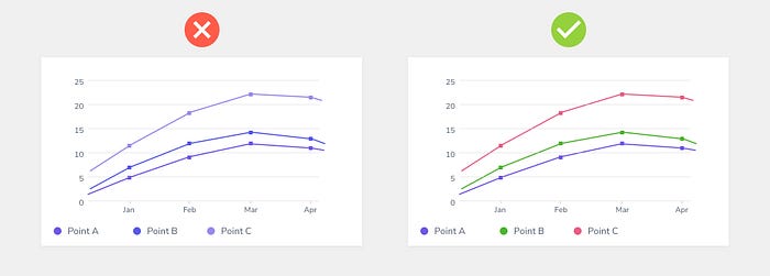
- Don’t use randomly generated colours as you risk colours not to be contrasting enough. I usually use Strark plugin for Sketch, Figma and XD Adobe as a colourblind simulator and contrast checker.
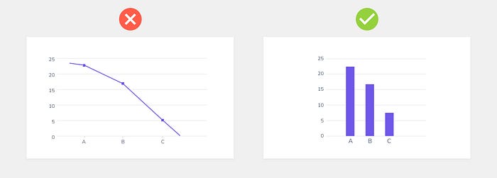
- Don’t use line charts if not comparing values over time, as it might create confusion. Select a bar graph in that case.
04. Area charts
Area charts are a lot like line charts, with a few subtle differences. They can both show change over time, overall trends, and continuity across a dataset. But, while area charts may function the same way as line charts, the space between the line and axis is filled in, indicating volume.
There are 3 types of bar charts: single area charts, overlapping area charts and stacked area charts.
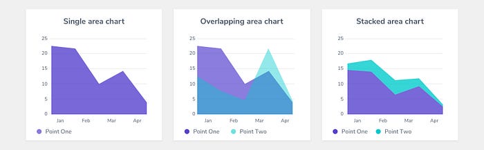
In the case that we want to compare the values between groups, we end up with an overlapping area chart. You will use a stacked area chart when you want to track not only the total value, but also want to understand the breakdown of that total by groups. Comparing the heights of each segment of the curve allows us to get a general idea of how each subgroup compares to the other in their contributions to the total.
Principles to follow for better area charts design:
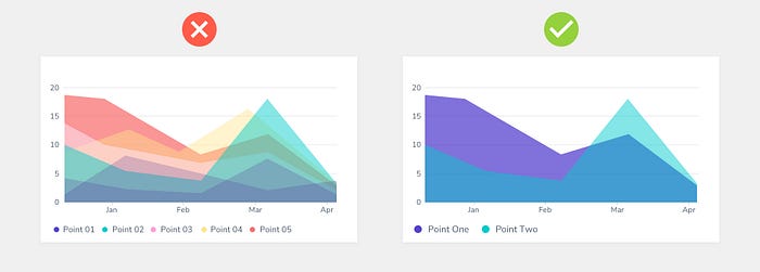
- When using overlapping area charts make colours transparent so information isn’t obscured in the background.
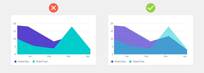
- Avoid using area charts when there are more than 3-4 categories. In that case use line charts.
Key learnings
- Choosing the wrong type of chart could cause confusion or lead to mistaken data interpretation. When deciding which type of chart to use, think about what you want to show: composition, comparison, relationship or distribution (check the chart chooser).
- Use pie charts, stacked bar charts or stacked area charts to present parts of a whole.
- Use single bar charts or clustered bar charts to compare different values or show differences over time.
- Use line charts to show trends in data over a period of time or a particular correlation.
- Use area charts instead of line charts when you want to indicate volume.
- Follow design principles for better charts design.
References
- Chart chooser https://extremepresentation.com/tools/
- https://www.ibm.com/design/v1/language/experience/data-visualization/chart-models/
- What you should know before designing dashboard https://uxplanet.org/best-practice-for-powerful-dashboard-ac4c3ddca016
- https://material.io/design/communication/data-visualization.html#style

- Free Charts UI Kit by Mimi to help you create beautiful dashboards. It has more than 60 charts, carefully crafted and designed in light and dark mode.