Visual cues, as known as directional cues are the elements for drawing attention subtly to the areas of importance, they help your website visitors interact with your website. When designing a website, don’t forget to use this powerful tactic so that the well-crafted content is read, the important message is delivered and more conversions are made.
Images, colours and layouts are so much more than just decoration. If you are new to web design or you are going to set up your own website, this is the guide for you.
Explicit visual cues
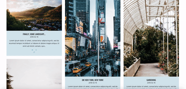
Before diving in, let’s look at the screenshot below:

Where are you looking at in the first few seconds? Are you looking at the top right corner?
Most people are looking to the direction which the man in the image is looking to, which is the top right corner.
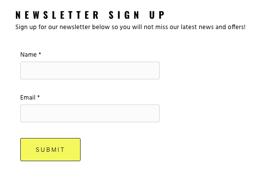
Now we do the same test but with another screenshot:

Are you looking at the text “NEWSLETTER SIGN UP” directly this time?
The examples above are two dummy newsletter sign up pages that I created to illustrate the theory, the purpose of the pages is simple: I want my website visitors to sign up for my newsletters so that I can market my sunglasses to them. In the second screenshot, I strategically use an image with a man looking to the left, where I have my newsletter sign up form so that the website visitor would follow the man’s line of sight and would know what to do next.
A famous example is Google Analytics 360 Suite. The man in the image looks to the right where the product description and the call to action button are located.
Using line of sight as a visual cue is an explicit way to draw attention. The other way of doing is adding an arrow, like the example below:

Landrover’s homepage offers a perfect example of using arrows to grab the website visitors attention and show them what to do next. The homepage above the fold is using a video slideshow to showcase their cars and the arrow at the bottom of the slideshow guides the website visitors to the next section with more information about the models and price.
Implicit visual cues
We have discussed using an image or a symbol as a visual cue, how about colours? Using colours as a visual cue is an implicit way to direct your website visitors’ attention, there is no arrow or image to show them where to look at. Like the example below, the call to action button “SUBMIT” is in yellow, in a simple page as above, this call to action button grabs your attention instantly.
If changing the colour of the call to action button doesn’t match your website’s overall style, you can change the style of the text in the call to action button, for instance, make the text bold or use another font.
Another way of using implicit visual cues in web design is making use of white space. White space, as known as negative space, is the blank area on your page. Do not underestimate the impact of white space, if you fill your page with too many images, text and call to action buttons, your website visitors would feel overwhelmed, confused and lost = they don’t know what to do. To draw attention to the important area, allow some white space around it. White space improves the readability of your website, removes distraction, makes your website appear more modern and most importantly, your website visitors would be able to sense your cue as to what to do next.
Conclusion
Grabbing your website visitors’ attention doesn’t have to be using something obvious like a big .gif banner with your call to action button. Doing it subtly using visual cues would improve the overall design of your website, but still gives the same effect. Whenever you are going to try out a new design, don’t forget to do A/B test to see which design works best for you.
If you are interested in learning more about web design, you may want to check out my other article, How to create a start page for your website that attracts attention and follow me on medium!