Improve The Accessibility of Your Designs With ARIA
An Introduction to Accessible Rich Internet Applications for Designers

Introduction
Imagine if you clicked on a checkbox and instead of the square filling in or turning into a check, you saw it behaving like a dropdown, giving you other options and selections to choose from. Naturally, this would be a frustrating and confusing experience as the element did not function as you expect it would. When users with disabilities navigate your site with assistive technologies, they may be experiencing this issue more than you might think. This is why when designing, it’s important to ensure that elements are clear in their purpose and function for all users and the different ways that they interact with your site.

Assistive technologies like screen readers dictate the functionality of elements, their current state, and any changing UI on the page to their respective user. Sometimes, complex designs or custom UI elements break the way that these devices read the content on your site and leave these users with a disjointed or sometimes even an inoperable experience. To make sure that your website is helping assistive technologies give the best experience to its users, designers and developers can make use of Accessible Rich Internet Applications (ARIA).
When designing, it’s important to understand when to (and not to) use ARIA to enhance the experience of your website for individuals who are using assistive technologies. This, in turn, will help your site be more inclusive and accessible for all.
What is ARIA?
ARIA identifies different elements on a site, their current state, and different areas/sections of a digital experience. Essentially, this means that when someone is navigating your site using an assistive device, ARIA will help them complete both simple and complex tasks with relative ease.
ARIA notes an element’s roles, properties, and states to inform the user of:
- The functionality of an element (such as a menu, progress bar, slider etc…)

2. The structure of a page like headers, sections, and footers.

3. The state of an element (if a checkbox is checked or unchecked, for example)
4. Any live updating section of a page.
5. Drag and drop sources and targets.

By working with developers to make sure that your website has ARIA attributes that account for all of these cases, you will reduce frustration and uncertainty for those using assistive devices to navigate your site.
Note: ARIA is not always needed
It’s important to note that if your design calls for browser native elements, then assistive technologies should automatically pick up and dictate the functional properties and states of an element. Generally, in these cases, there should be no need to add any additional ARIA to these elements as this could override default accessibility semantics and confuse the user as a result. ARIA should enhance an experience, and not act as a band-aid to cover up other accessibility issues on a site.
Four Ways to Incorporate ARIA Into Your Designs
1. Clarify Custom UI Elements
If you’re designing visually unique UI elements, developers may not use browser native elements to build your design. In situations like this, assistive technologies would not be able to automatically tell what an element is or how it should function. Adding ARIA roles to these custom UI elements would guarantee that assistive technologies would know how these elements should behave.
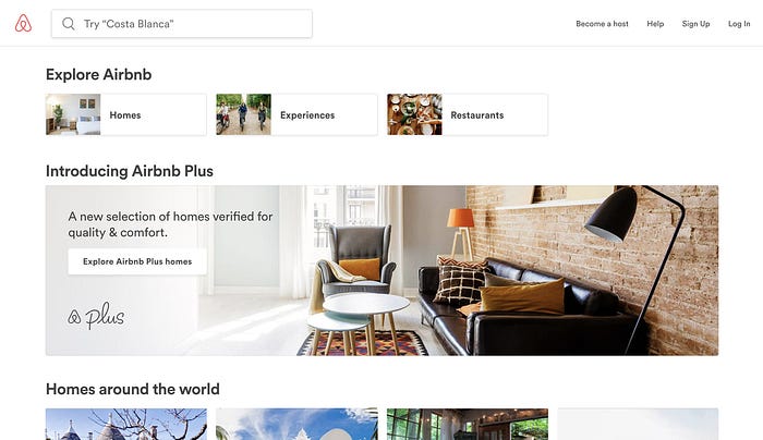
One example of this might be a checkbox that animates the checkmark in when clicking on it instead of using the default browser toggle animation. A developer may not have built it using a checkbox element and if so, adding an ARIA role of checkbox to this element would let the screen reader know that this is, in fact, an interactive checkbox.
2. Dictate Notifications and Alerts
Critical alerts and notifications that convey important information to a user should have the alert role associated with them. By doing this, screen readers and other assistive technologies would be able to interrupt their current speech and dictate the alert to the user.
If you need a user to take an action from the alert, you should use an alert-dialog role instead of the standard alert role. The dialog field within the alert should also have a focus state when it appears as well.
3. Define Landmarks
Landmarks define the structure of a site by marking the different areas of the page to assistive technologies. When designing, it’s important to understand the different areas of your site and note which landmark each falls under. Doing this allows users with assistive technologies to navigate sites faster and with relative ease.
Landmarks have 9 different roles that dictate specific areas of a site to a user:
- Application declares an area as a web application as opposed to a web document. This changes assistive technologies’ mode into application mode to make interacting with these experiences easier.
- Banner is typically reserved for a site’s header. You should only use it once on the entire site.
- Complimentary is hierarchically similar to the main content on a page but separate. Sidebars are a good example of Complimentary areas.
- Contentinfo outlines the footer content on your site including privacy policies, copyright information, and any other legal or accessibility statements.
- Form identifies a group of interactive elements as a form. It is not to be used for each individual input field, dropdown, or checkbox within the form itself.
- Main is the main content area of a page.
- Navigation is a series of links or other navigational elements like buttons typically within the header or footer of the site. If there are multiple navigations on any given page, you can label each one to further clarify the difference between them.
- Search is the collection of elements that form the search functionality on the site. In other words, if a search box has an input field and a submit button, together they can be labeled with the Search role.
- Region defines areas of your site that aren’t properly defined by the other landmark roles. You can have multiple regions on a page at once but each one must have a label.
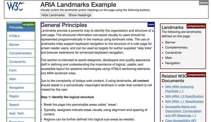
Note: HTML5 elements like Footer, Main, Aside, Section, Form, and Nav can have default landmark roles mapped to them in specific browsers. It’s important to test your site to see how it functions in cross browser scenarios to avoid redundancies and missing information.
To learn more about landmarks, check out this great interactive article that visually outlines landmarks and headings on the page. It also gives further information about how to approach labeling the different areas of your site as each of these different landmarks.
4. Label Interactive Elements
Sometimes, an interactive element like a button does not have text associated with it. As a result, assistive technologies would not be able to dictate what the element is or what would happen when the user interacts with it. Adding ARIA labels can help you further clarify the purpose of these elements to assistive technologies.
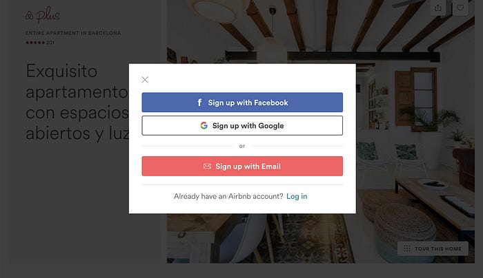
One example of this is having an ‘X’ icon as a way to close a modal or menu. Since the screen reader would be reading the X verbatim as text, the user would not understand that by clicking it, the modal will close. To fix this, adding an aria-label of ‘close’ would tell the assistive technology to dictate the word close instead of x.
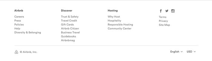
Another example of this is to use ARIA labels for social icons on your site. This will further help inform users that by clicking on the Facebook icon, they will go to your Facebook page, rather than just hearing ‘F-icon’ from their screen readers.
Note: If there is descriptive text next to the icon, you can use the aria-labelledby attribute instead of the standard aria-label to establish their relationship. An example of this is if your design has a Facebook icon that has the text ‘Facebook’ next to it, you could use aria-labelledby.
ARIA in Practice
Although developers may be implementing ARIA, designers should have a basic understanding of how they function. Doing so will further provide a great user experience for individuals who are accessing your site with assistive technologies.
These are only a few of the many different situations to be aware of when designing with ARIA in mind — There are many different ARIA attributes used to dictate different UI elements and their functionality to assistive technologies. You can dive deeper to learn more about other scenarios in the WAI-ARIA 1.0 documentation and read more about the ARIA authoring practices here.
Nicholas Kramer is a designer currently working at Barrel in New York City. He solves design problems for businesses by helping them simplify ideas and communicate their value to customers.

