Prototyping mobile UI animations: 5 inspiring examples
How to create mobile UI animations that boost usability and bring app interfaces to life
Animated transitions can make the difference between a great mobile app and one that’s just meh. Transitions — those little animations that make UI elements visible or invisible — often go unnoticed, but when executed right they contribute to a seamless user experience. So what makes a good animated transition and how can prototyping help?
What are mobile UI animations for?
Animated transitions signal a change of state to the user. That can mean signalling a movement in the navigation flow, task completion, introduction or subtraction of on-screen UI elements, and changing position in the interface hierarchy. Designer Davey Heuser helpfully explains animated transitions in terms of movie sound-effects: “It’s not peculiar to use animations and sound effects in movies when someone goes through a time machine, so it’s only natural to use this in your interface as well.” And that’s where animated transitions come in handy.
“It’s not peculiar to use animations and sound effects in movies when someone goes through a time machine, so it’s only natural to use this in your interface as well.”
What makes a good mobile UI animation?
Software developer and UX influencer Nick Babich succinctly defines what separates a good animated transition from a bad one in his post Animation in Mobile UX Design:
Effective animated transitions:
- Have a clear purpose
- Reduce cognitive load
- Establish spatial relationships
- Prevent change blindness
- Bring an interface to life
Badly designed animated transitions, on the other hand:
- Confuse the user
- Complicate the interface unnecessarily
- Are random and without purpose
Animated transitions can make mobile UIs more dynamic, engaging and user-friendly. But use them incorrectly and they will have a detrimental impact on both user experience and conversions.
Our list of 5 inspiring mobile UI animated transitions provides top examples of mobile animation, plus we’ve thrown in some expert prototyping tips to help you test out animations in UI prototypes. Enjoy!
1 — iOS camera app focus animation
Predictably, Apple’s iOS Camera app includes a stunning example of well-executed mobile UI animation. As users attempt to focus the camera, a crosshair appears — with a fade-in effect — and shrinks as it finds focus. Once focused, the crosshair blinks in and out of visibility and then fades out.
Check out the video to see the animation in action.
Create something similar in a mobile UI prototype using Justinmind’s animated effects. Effects are triggered when a UI elements is shown or hidden — you can choose the style in which to reveal the element from fade-in or out to bounce, fold and puff.
2 — Template gallery menu animation
Sergey Valiukh from Tubik Studio has come up with an animation that converts a standard contact list into an interactive, engaging experience. Users scroll through their contact cards with a vertical swipe gesture that causes each contact to move forwards, then drop out of sight when dismissed. The animation effectively focuses user attention and uses information hierarchy to good effect.
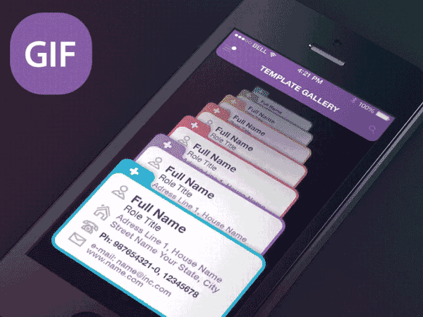
You can build a similar effect in Justinmind mobile prototypes by using dynamic panels to create transition effects. Link the transition effects to gestures and then test on the prototype on your mobile using the Justinmind app.
3 — Weather Rebound app
This mobile app prototype from Chris Slowik incorporates sophisticated mobile animation that both delights and informs. Not only has Chris incorporated a transparent animated skin that matches the current weather conditions (which we love!), but he’s also built animated his UI elements simply and beautifully. On command, hourly weather icons slide up onto the screen; a lateral slide-bar menu allows users to select the day they need the weather report for. It’s simple but beautifully executed, and allows users to see weather throughout the day at a glance.
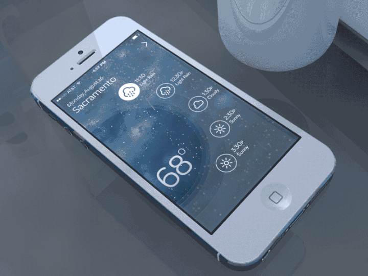
Chris has used his own brand assets as the icons for the weather app, but if you’re short on time you can take advantage of the pre-made UI libraries in Justinmind: there are UI elements for all main operating systems and devices, which you can organize into groups and reuse across projects. Or import your own brand assets as SVG files and make them interactive with Hotspots.
Check out some examples of mobile UIs made with our Android Lollipop UI elements.
4 — Elastic progress bar
Mobile users have very., very little patience for slow loading times. According to Kissmetrics, a 1 second delay in page response can result in a 7% reduction in conversions. Mobile animation is a great way to make the wait seem shorter and lower user abandonment rates. UI designer XJW nailed a download loading progress bar and shared it on Dribbble. The animation starts out as a download icon, which transforms into a button moving along an elastic tightrope wire and marking the percentage completion of the download. If the download fails, the progress button fails off the wire. A cute, personality-filled way to convey progress through mobile animation.
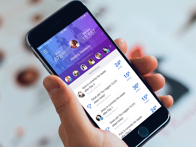
5 — Fitness Tracker — Pull Down to Refresh
One of the most common mobile animations is the so-called Pull Down to Refresh, where users refresh screen content by swiping vertically downwards. It’s become an intuitive feature for mobile users, so conveying that the gesture is recognized and being executed is crucial to seamless user experience.
That doesn’t mean that UI designers and prototypers can’t have fun animating the gesture, though. Take Fitness Tracker’s prototype, in which they use the Pull Down to Refresh feature as an opportunity to strengthen the brand while conveying functionality. Instead of introducing any old loading wheel, they add an animation of a character power walking across the top of the interface. It’s simple, good-looking and reinforces the ‘why’ of Fitness Tracker in the user’s mind.
The actual refresh button backs this up with its own great animation. The yellow gradient thumb spot fades in, sweeps down and then explodes out of sight, supporting the dynamism of the UI as a whole.
You can use rich interactions to create this Pull to Refresh button in Justinmind, and add conditions to your event to make it even more advanced. Add animated effects to the event to make the animation richer.
Prototyping mobile UI animations: 5 inspiring examples — the takeaway
Animated mobile transitions can be charming, useful and user-centric. They guide users through a mobile app experience and ensure that both user goals and conversion goals are catered to. But mobile UI designers have to resist the temptation to animate for mobile animation’s sake. Animations should always be relevant, targeted and with a purpose. That way, your UI will be as effective as these inspiring examples of animated mobile transitions.