
UX Design: Drop-Downs in Forms
by Nick Babich
Select, or drop-down, menus can be great when used correctly — they progressively disclose the options and prevent users from seeing too much information at once. Drop-downs come with a lot of nice features, such as grouping options and keyboard navigation.

At the same time, drop-down control is one of the commonly misused UI controls. In this article, we will review how and when to use drop-down.
Select Menu and a Number of Options
It might be tempting to use drop-down to allow users to choose from 2 available options or to choose 20 options. But in both cases you should avoid that temptation, and here is why
Too Many Options
When select menu grows larger than 15 options they become difficult to scan and navigate. Huge drop-down lists can be real nightmare for your users, because they will have to start scrolling inside the list and, and part of the options always be hidden, it creates a painful user experience and slow down overall process.
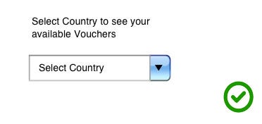
A good illustration of this is a country-selector with more than 100 options. It becomes harder for users to find the option they’re looking for. I often find myself struggling to select United States: sometimes United States can be found at the top of country list, other times Afghanistan tops the list due to alphabetical sorting and United States is far down the list, just after United Arab Emirates. So the first thing the user has to do is to figure out the sorting logic. In other words, you make your users think and this is bad.

In cases the users know what they are looking for, consider using a text field with auto-complete functionality instead of select menu. Country-selectors are a good candidate for this solution. Also, from a development standpoint, you can try to auto-detect the user location and pre-fill the field with your best guess.

Takeaway: Consider using a text field (plain or with auto-complete) instead of select menu if you have more than 15 option.
Too Few Options
When select menu has only 2 options it suffers from a lack of up-front information. The user has to click in order to see the available options.

In this case you should use radio buttons. Your users will be able immediately scan how many options they have and what each of those options are, without clicking (or typing) anything to reveal this information.

Select Menu and Labels
Like other form inputs, a select menu should always have a label next to it (W3C standard). You should also have a clear and meaningful label (not generic ones like “None” or “Please select”) inside the select menu that tells users what exactly they’re selecting. The label should clear and distinct in order to fully describe the group of options.
Select Menu and Default Option
You should avoid having a default unless you believe a large portion of your user’s (maybe 90%) will select that value. Particularly if it’s a required field. Why? Because by doing that you will introduce errors because people go through forms quickly and sometimes they assume that the drop-down has a pre-selected value. In most cases, it’s safer for users to show an error message for not selecting an option than to submit the form with the wrong option.
Select Menu and Mobile Devices
Mobile devices have very limited screen real estate, which means users have even less page context when scrolling, and actually finding the option they’re looking for takes longer. And still too often designers use select menus for inputs in mobile forms when simpler or more appropriate controls would work better.
Problems
Interacting with select menus on mobile and the desktop is a multi-step process—tap to see the option, scroll to find the right option and tap on the relevant option. Here is the number of actions required to complete the form with drop-down menus from previous example.
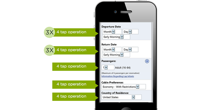
Select menu also take a lot of screen estate on mobile devices. On an iPhone with iOS 9 the select menu takes up almost 50% of the screen space and this simultaneously limits gesture space to the same 50%
Solutions
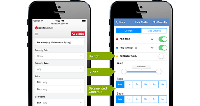
Taking into account the problems listed above, following controls can used in place of drop-down menus:
- Radio groups, or segmented controls, are a set of closely related, but mutually exclusive choices (e.g. select a region).

- Steppers can be used to increase or decrease value by a constant amount and are great for making small adjustments (e.g. select the number of passengers).

- Switches support two simple, diametrically opposed choices.

- Sliders allow you to select fine-grained values from an allowed range.

When starting with a drop-down heavy form, look at each question and consider if any of these controls is a more appropriate way of getting an answer.
Try to simplify the form by removing all unnecessary inputs. In some cases multiple select menus can be condensed into one input control. This solution decreases both the cognitive load and interaction cost for your users.
Conclusion
What is the main difference between poorly-designed and well-designed forms? Well-designed forms should make use of the most appropriate input control for each question they ask. Sometimes that’s a radio group, an auto-complete field or even a select menu.
Thank you!
References:
Originally published at babich.biz

