UX-Design Case Study- Evaluative Design Project- Ajio App Redesign
An evaluative project within 48hrs timeframe.

Overview
I recently participated in a UX Design Hackathon under the guidance of my mentor Anudeep Ayyagari, where I had to collaborate with my community members and work as a team of 6 members. This time the given problem statement is for the Evaluative project, Understand the business, Usability issues, Research, Journey mapping, ideation, and then came to a better user flow in just 48 hours.
Yep, you heard it right….complete project in just 48hours!🤯
While working together we need a name for our team so, we become UX_Minions (because Minions destroy things, but cutely, we were here to destroy bad UX, but politely- this whole idea was one of my teammates).
UX_Minions
Himanshu
Pragya
Swetha
Nagasai
Anil
Sheetal (it’s me)👩💻
The Project
I start with the problem statement that we pick to solve in the upcoming 48 hours, and why we fought for choosing this particular problem statement. The need to solve this particular user flow and the impacts.
Problem Statement-
Evaluate the product search and filtering flow of Ajio app, which includes search, product listing, and filter page and redesign the use flow while identifying opportunities to make usability better for the working women which will lead to decrease in bounce rate and increasing the frequency of use per month.
Category of Problem Statement-
After understanding the problem statement, we understand this is an evaluative problem statement, In evaluative problems, we have to work on the existing work to minimize the usability issues, for the Business, rather than start from scratch as in exploratory projects.
Reason for choosing this problem statement-
We as a team wanted a problem that would challenge us and make us push our limits. We discussed it a lot and eventually decided to choose this problem statement because of the following reasons-
- We thought it would be challenging to find issues and solve the problem from just a small flow i.e search, filter, and listing screen.
- We had varied users in our team who used to shop from AJIO, who still shop from AJIO and those who just come there for window shopping. So we were very curious to solve this problem of conversion, retention, and lower bounce-off.
- Also as every team had one unfair advantage over a problem, ours was that we had a 50:50 gender ratio in the group (it won’t lead to female-specific bias)…. and finding users for usability testing was easy as per the given timeline i.e. 48 hrs
Understand the needs-
- The problem is any reason that is affecting the bounce-off rate for women who come to the Ajio app and search for something. (Only concerning searching and filtering and reaching the listing page post entering their search.)
- anything that makes them not want to return to the app to not only search, but also finish a purchase (wrt searching, filtering, and listing)
The outcome of solving this problem statement-
- It will reduce the bounce rate.
- Conversions will increase once they find what they are looking for.
- Users can easily find what they are looking for.
- They may explore a nice dress/product.
- All these things will increase the user footfall on the app.
- The retention rate can increase.
- Reduce the time on performing any task.
Plan of action
There is no textbook way to complete any project, it always depends upon the available time, budget and need. The steps we followed for successful completion of the evaluative project are shown below:
- Understand the problem statement & select User Flow
- Self Heuristic Evaluation of the user flow
- Hypothesis & Assumptions based on heuristic evaluation
- Secondary Research( Desk Research, Competitive Research)
- Primary Research ( Usability Testing)
- Data Analysis (Affinity Mapping, Journey Mapping, Screen Mapping)
- Making ‘ How Might We ’ questions, Ideation & Wireframing
- UI and prototyping
- Usability testing with users
- Improved prototyping as per the feedback
Timeline of the Project
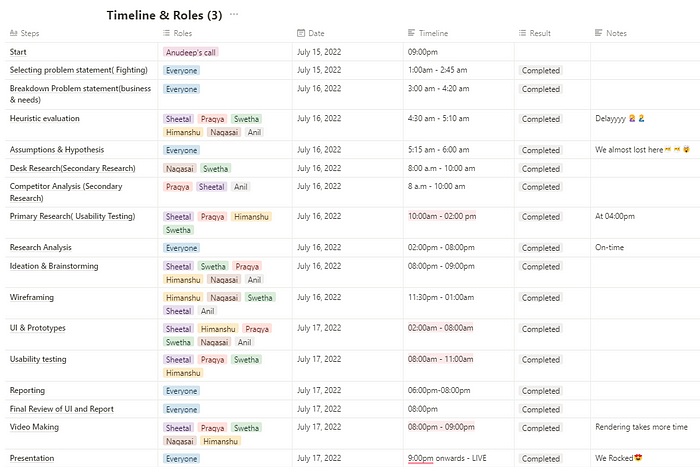
My Role
Majorly I play my role in self-heuristic evaluation, Primary research, competitive research, data analysis, journey maps, user personas, HMW questions, validation of assumptions, ideation, prototyping, usability testing, and handling Figjam documents. well, most of the work we did as a team of 6, but sometimes as per the knowledge & skills in a particular stage, we give preference to that person.
Stage 01 - Understand the problem statement & select User Flow
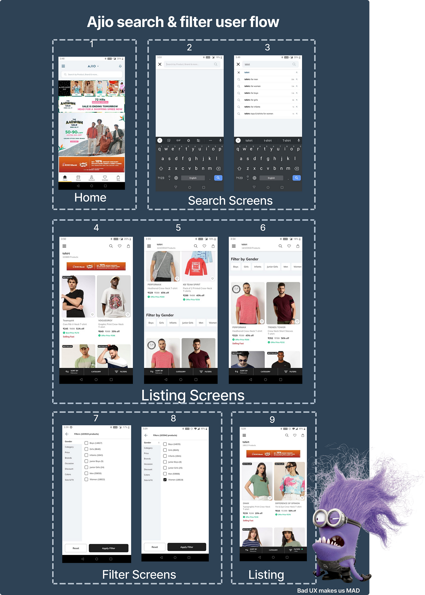
After we finalized our problem statement, we decided to understand the current user flow that we are working on. As per the given problem statement, we took the screenshots of our user flow by using the Ajio app.
This stage helps me to understand the existing user flow, and how can I help our business by focusing only on this user flow. To do the evaluative project there’s a need to perform self heuristic evaluation, which is the next step.
Stage 02 - Self Heuristic Evaluation of the user flow
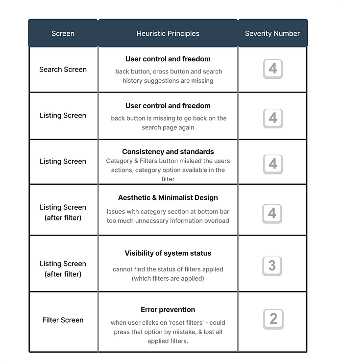
Here we evaluate the screens w.r.t. Heuristic principles, which gives the existing problems in the flow.
first I’ll explain to you the Heuristic principles…..
What are the Heuristic principles-
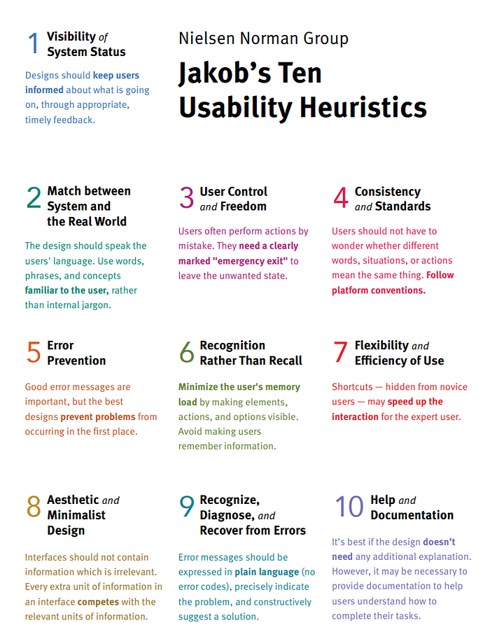
What we do at this stage-
We took one heuristic principle and evaluate all the screens in the user flow w.r.t. that heuristic, and after identifying issues, we make a note near that screen. we repeat the same step with all the 10 principles one by one. Once done, then we refer to the severity scale and tag each issue found with a severity rating. This helps us to prioritize issues while solving them.
First I go and brush up on my knowledge of the heuristic principles, then start evaluating one by one, It’s fun to work as a team with lots of argument and learning exchange.
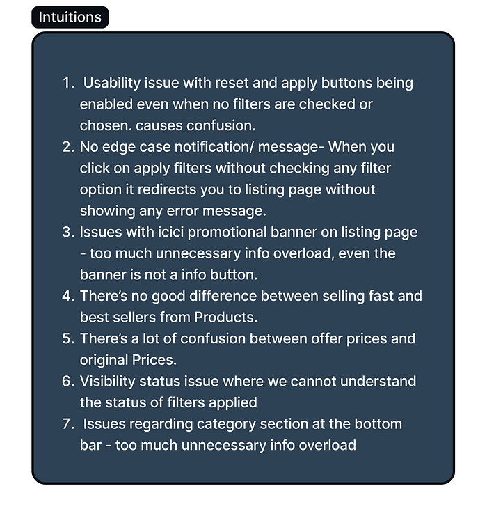
The blue box indicates the heuristic-based evaluation and the grey box indicates our intuitions for the respected screen.
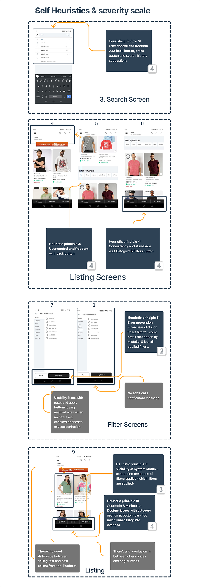
Listed down all the problems according to the heuristic principles with the severity number, severity number helps us to make the decision based on the severity of the problem, a higher number indicated this problem affects our users more.
Severity Scale-
Problems Identification (non-heuristics based)-
As a designer, we always have some sense to feel the existing problems other than the principles and rules, basically, the Intuitions, so some of our intuitions are shown below:
After getting insights from evaluation and intuitions we have lots of data, in the next step, we do brainstorming sessions with teammates to refine the problems that the user faces.
Stage03 - Hypothesis & Assumptions based on heuristic evaluation
Now, that we have identified all the possible problems within the timeframe, here, we try to solve these problems without doing any research, and all the ideas we came across to solve the problems are called the hypothesis. In later stages, we validated this hypothesis with actual research.
Brain-storming on Journey Map (based on our hypothesis)
we create a user journey map of the given flow as per our hypothesis, we gathered all the data in a single map in the form of DTFPO.
This map helps us to frame our hypothesis statements in the upcoming step.

Finalizing the hypothesis-
From the problems and solutions we made till now, come up with ‘Hypothesis statements’, and that requires doing some research so it will be validated or answered.
I prefer to make hypothesis statements based on each stage of a given user flow so it looks more categorized.
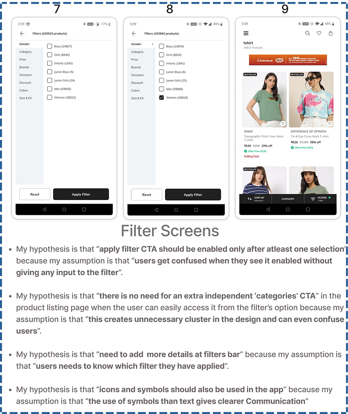
Some Hypothesis & Assumptions statements are as follows:-
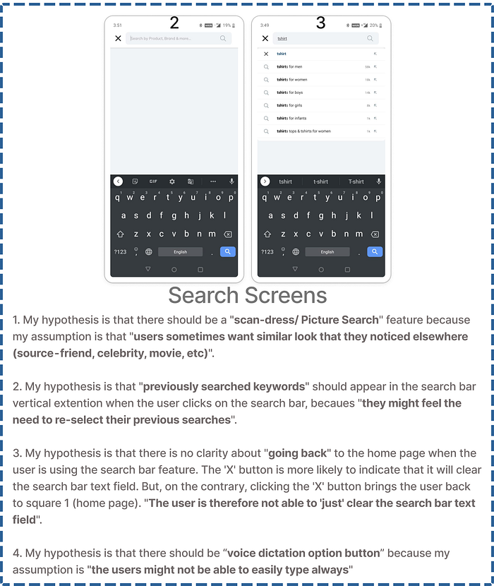
Search Screens
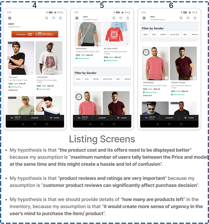
Listing Screens
Filter Screens
We make lots of hypothesis statements based on time, getting enough hypotheses helps us to do better research. Now we are moving on to the next step the research part, where we validated our hypothesis.
Stage04 - Secondary Research ( Desk Research, Competitive Research)
This becomes a very important step before going and talking with users (primary research) as it helps us to have a better context of the business and its users.
Here we do some secondary research through Desk Research (online reports, articles) and competitor research( Direct & Indirect Competitor) which can help you validate or invalidate your hypotheses in the later stages of your research process.
In this stage, I majorly took part in the competitor research, since I am a regular online shopper so have lots of shopping apps on my phone like H&M, Amazon, Forever21, Nykka Fashion, etc.
Desk Research-
The following insights were gathered through secondary research:
Article 01- Link
Because of the mixed products in search list, it is becoming hard to take the decision and users are leaving the app .
55% of women users are looking for Feature of body frame to see the outfit.
High percentage of new users wanted to find perfect fitting clothing in their size.
Most of the users are expected shortlisted items in Wishlist and then do a mix-and-match of your selections using a different colours.
On the basis of research AJIO has youth as an active user base population aged 16–40 are mostly active with shopping.
80% of the user finds it comfortable to shop on a mobile app.
Small missing details in descriptions are creating a lot of Confusions in Users Shopping Journey.
Users are facing difficulty in navigation.
No reviews of products in search results it self, is reducing users to continue of the shopping.
42% of top e-commerce websites lack category-specific filter types.
20% of the e-commerce websites lack thematic filters.
Providing too many choices can confuse and overwhelm your customers.
A horizontal filter bar will be more effective in focusing the attention of the shopper and in many cases will be more convenient to user.
90% of companies avoid crowding the Surrounding Area of Search Box with other Icons.
60% of Users bounce back from Submit page in E-Commerce Apps.
Always give Seach Bar its space and make it stand alone to Catch the Eye of the User.
Making submit button too small especially in touch devices will Cause User distraction and Confusion.
73% of Apps have Search box at Top Right Corner.
The Search Input should be wide enough to Contain 27-Characters.Making Search Bar wide enough to accommodate 90% of queries in the world.
42% of the E-Commerce Apps do not provide category-Specific Filters.
32% of teh E-Commerce apps do not allow users to apply Multiple Filters.
Truncate long lists of Product Filtering Values — 26% of Apps Donot do this.
20% of the E-Commerce Apps donot have Thematic Filters.
Competitor Research-
In this stage we perform competitor research, we go ahead with two types of industries, direct & Indirect.
Direct Competitor- H&M, Nykka Fashion, Myntra, Flipkart.
Indirect Competitor- Pinterest, Instagram, JioSaavan
While doing benchmarking of competitors, I kept hypotheses in my mind and paste the relevant screenshots of the flow side by side.
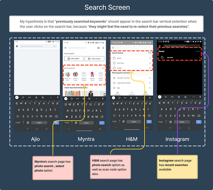
Search Screen- with respect to picture search option

Search Screen- with respect to recent search history
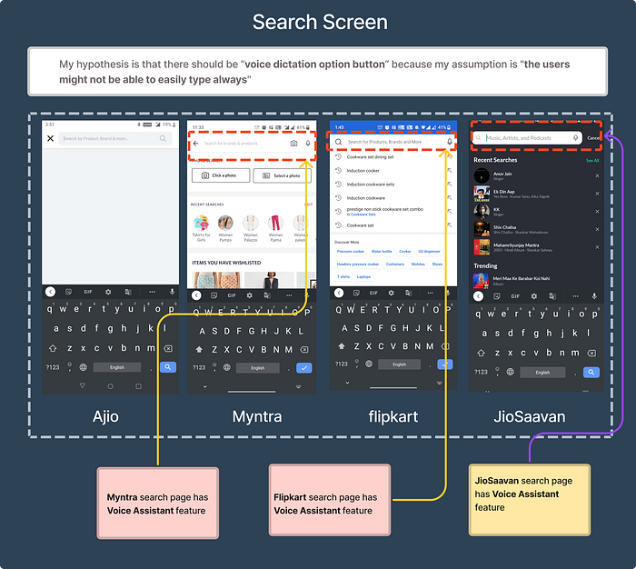
Search Screen- with respect to Voice Assistant feature
Filter screen- While without applying any filter CTA button looks enabled

You can see the fig-jam file to view more research insights. click here
Stage05 - Primary Research (Current Experience Usability Testing)
In this step, we do usability testing of our existing user flow with the end user and get their feedback to validate our hypotheses, and get more user behavioral insights. We interviewed a total of 4 working women(target users).
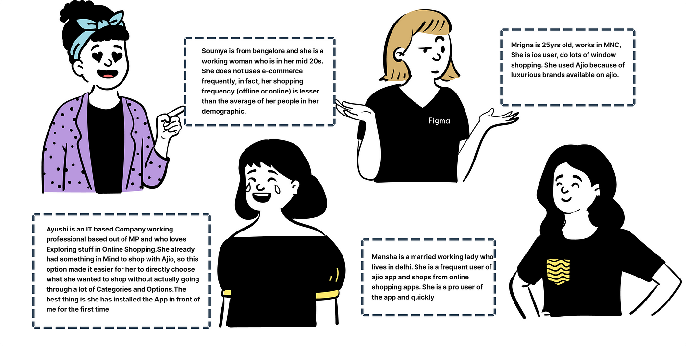
Before we conduct the interviews, we need to prepare a task-based question chart. It helps us to observe our user's actions and their frustrations. The task is all based on the existing user flow. I actively took one user interview and arranged one more user for my team member.
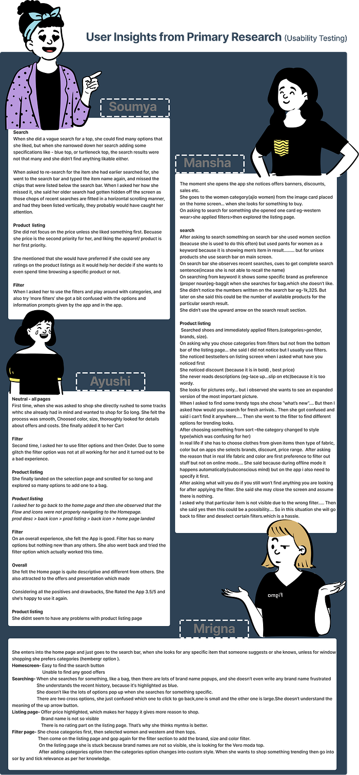
Few validated research Insights-
Search
-Unable to find recent histories.
-unable to find the back button( confusion between back and cross button)
-one user looking for the voice search buttonProduct listing
-unable to find the reviews and ratings of the products
-Confused between category and filter button
-unable to find the go-back button
-Unable to read out the brand name(not visible clearly)Filter
-A user accidentally click on the reset button and lost all the applied filters.
-the user is confused about whether to select the filters or not because the CTA is -active all the time.
Stage06 - Data Analysis (Affinity Mapping, Journey Mapping, Screen Mapping)
after doing usability testing, we have a lot of data from the research. so we condensed the data into artifacts. To categorize and understand the user more we create an affinity map of the above insights.
After creating the Affinity map we go ahead and worked on a research-based journey map, in this step we do brainstorming and started putting the views.

You can access the detailed Figjam file. Click here
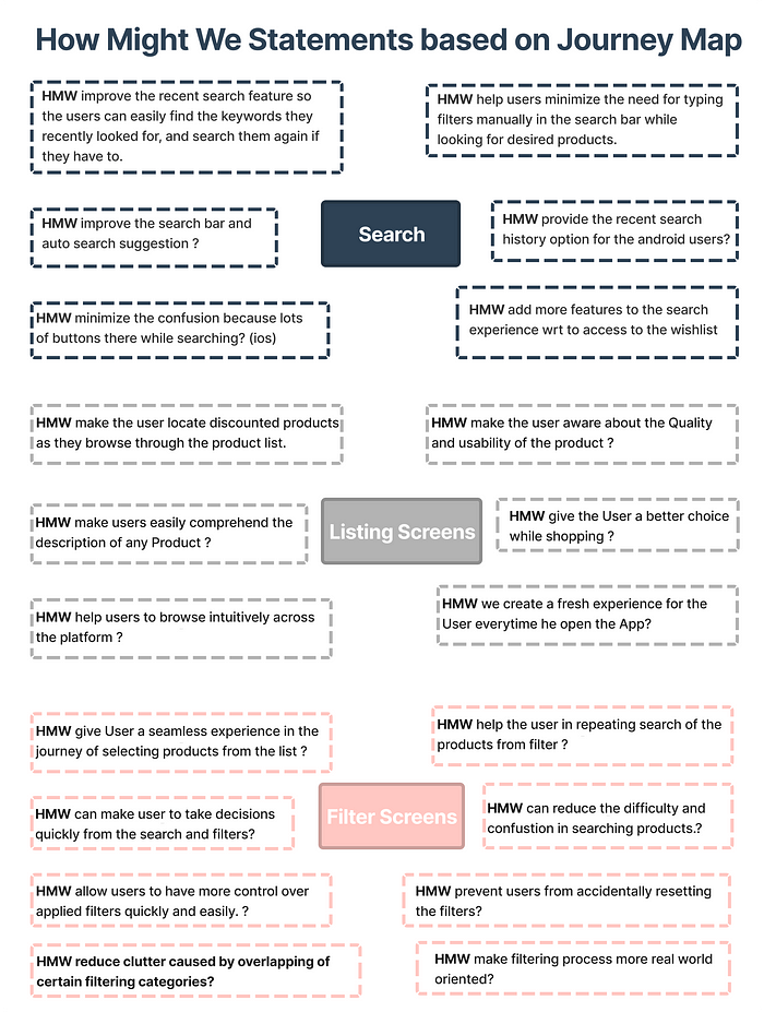
Stage07 - Making How Might We questions, Ideation & Wireframing
Making How Might We questions
Here we start framing the How might we questions based on the insights from the research-based journey map. I actively took part in framing search screen HMWs, and also helps my teammates to refine other HMWs.
Ideation
In this stage, we try to use the crazy 8 method, since it is used in the community more often, but we have limited time so we go with the brainstorming of ideas and start solutions for each HMW. We have around 45 ideas based on our HMWs. you can have a look at all those ideas in the Figjam file link here.
Some solutions are as follows:-
1. HMW make the user aware about the Quality and usability of the product?
- By adding Product review and rating of product in the listing pagebelow the image.
2. HMW help the User get to know all details about the product with minimum clicks possible?
- Carousel Options Privided on Images of the Product with few deatils about the product.
3. HMW allow users to have more control over applied filters quickly and easily ?
- Give a chip bar on top so that user can remeber what all filters they applied, from here they can cancel certain filter if they think it is not working.
4. HMW help users minimize the need for typing filters manually in the search bar while looking for desired products?
- Enabling audio assistant option in the search bar, It minimize the manual search.
Problems we decided to solve and WHY?
There are some problems, we gave preference to them as per the research they seem more prominent.
1. Home screen — Search Bar prominence
:-While our flow was only from Search to Filter, we decided to just make one change to the search bar by making it more prominent, because that is the start of our flow. We understand that we are evaluating only one flow, but our solutions could be of any flow (that affects the flow in focus)
2. Search Bar — Added new features (tapping opportunity) and improved the current design
:- From the secondary research, we realized that it helps users to be able to search for a product by uploading an image or clicking a new image of apparel they liked and using AJIO search to find it or something similar. Therefore, we included the feature of clicking and uploading a photo.
3. Filter — Improved existing layout
:-The filter seems to confuse a lot of users — an insight we got from our primary research and so we decided to work on that. The filter is an important feature for the user to find what they are looking for, without an efficient filter, they will not find what they are looking for, resulting in bouncing off. We improved the overall layout of the filter, we added the applied filter chips on the product listing page so users can clearly see what filters they have applied.
4. Product listing — Improved the product display cards on the product listing page, and added a signifier for an important but ignored feature.
:-We feel that our users are not able to make first decisions by just looking at the product cards. Giving them more open space to make this decision by adding information like product rating, and sneak peek, and improving the readability of the brand of the product.
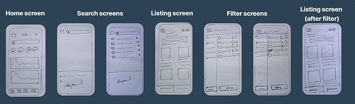
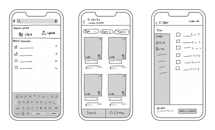
Wireframing
We created these wireframes and their iterations after choosing the problems we are solving.
Stage 08- UI and prototyping


Stage 09 — Usability testing
At this stage, we have our prototype ready, so it’s time to start testing it with real users. We give them some tasks to perform and we first observe the actions and then ask for feedback.
Some Major Insights from usability testing-


Stage 10 —Revised UI screens after usability testing
Withing a timeframe it’s quite difficult to go with all the changes, but we consider some of the significant feedback and work on it, and revised the prototype.


Prototype of the new user flow-
We create a prototype of the revised user flow, you can test it by clicking on the link given below.
Learnings/ Takeaways from this project
- A team always means lots of learning, brainstorming, arguments, and fighting, we do everything. But all these things give me a box of confidence and yeah awesome friends also😈.
- The Evaluative project gives me the knowledge of whole new things like usability testing as primary research, business matrix, etc.
- Initially, we tried to go deep into each and every problem, Since I’m a timekeeper so I push my team to re-prioritizing our work to complete the project. ( It was fun to push team members….guys run run run…🏃♀️).
- Sometimes our intuitions are also right, so think…think but all we need to validate them.
If you take part in the Hackathon then it is a win for you, so don’t worry about winning just enjoy those 48hrs and then late night chit chat with your friends about the hackathon. (Too emotional🤦♀)


A big thank you to Anudeep Ayyagari 😎
Thank you for your time and if you like it or have any feedback you can drop it in the comment section or reach me out on LinkedIn (link below) and don’t forget to clap 👏 ( you know, you can clap 50 times also….give it a try)
Gmail: sheetalguptaarc@gmail.com.
Linkedin: Sheetalgupta

