
Functional Minimalism for Web Design
by Nick Babich
Rooted in Bauhaus school of design, minimalism has reemerged as a powerful technique in modern web design. This technique is known as an attempt to prioritize content over the chrome. Applied correctly, minimalism can help designers to simplify user tasks.
When it comes to web design, minimalism brings a few additional benefits to user experience—less elements means faster loading times and better compatibility between screen sizes.
The simplicity of minimalism may create a false impression of something that is easy-to-design, but under the surface of less is more approach lies far more than just using a limited number of objects. Below are a number of principles of minimalist design, as well as best practices for this technique.
What Is a Minimalist Web Design?
Although there is some debate about what exactly qualifies as minimalist design, there are a few common features that most designers can agree upon. Let’s define characteristics of minimalism:
Using only the essentials
The philosophy of minimalism sounds very simple — “less is more.” But what exactly does it mean in the context of web design? In web design, less is more is achieved by using only elements that are essential to a given design. Web designers who apply minimalism seeks to simplify interfaces by removing unnecessary elements or content that does not support user tasks, because
The less elements on a screen, the more potent the remaining ones become
By that logic, if you had only a single element on the screen, you have a better chance that users will read your message.

Minimalism is the intentional stripping away of everything that distracts users from content. But at the same time you need to be sure that you won’t make your users’ primary tasks more difficult by removing or hiding content and functional elements. Thus,
Design around content, and leave just enough elements (content and functional elements) so that users don’t get confused.
Negative Space
It should be no surprise that the most common element in minimalism is no element at all. Negative space — also known as whitespace — is the most important feature of minimalism, and what gives minimalism much of its power. Negative space is a tool that helps to guide the user’s visual flow:
The more negative space around an object, the more the eye is drawn to it

5 Visual Characteristics
In a minimalist design, every detail has meaning, including the visual properties of elements that choose to leave:
1. Flat textures
Minimalist interfaces often rely on flat textures and simple icons because they have low visual weight. True flat interfaces don’t use shadows, gradients, or other textures that make UI elements look glossy or 3D.
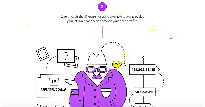
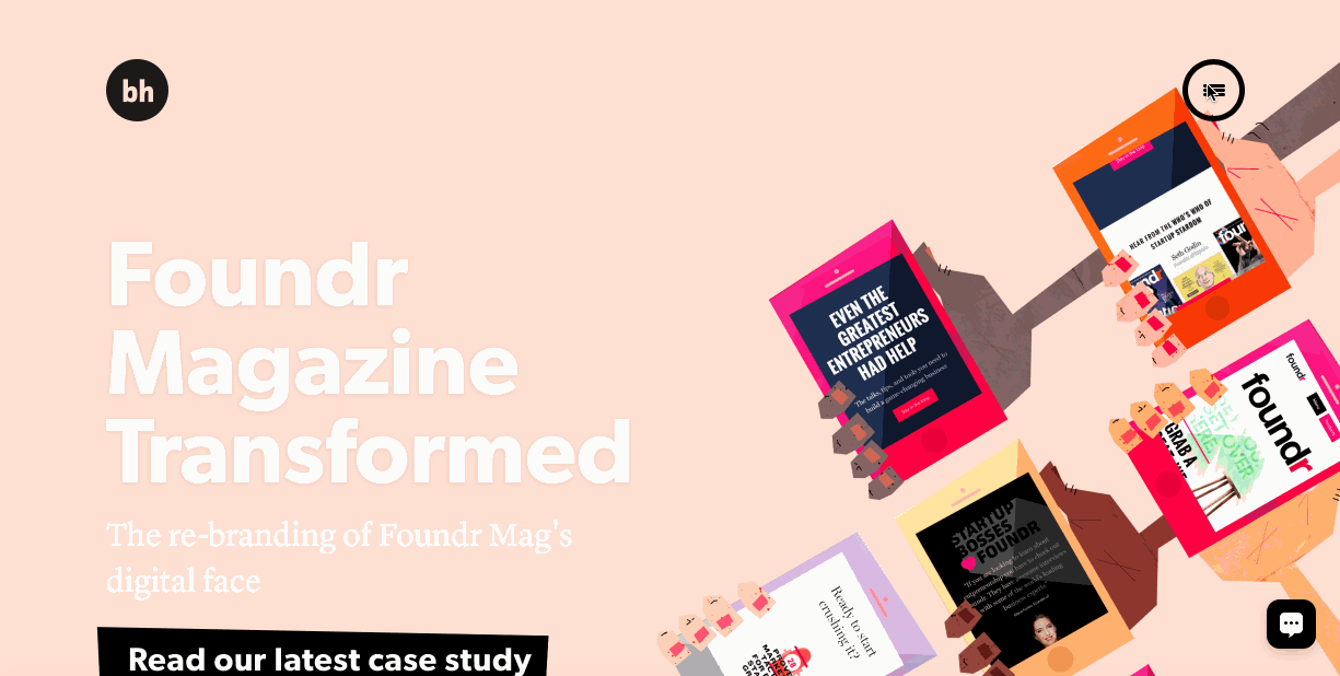
2. Vivid photography
Images can help designers create an emotional connection with their users. However, remember one key tip when selecting the imagery: the photo should have all the visual characteristics relevant to minimalist.Choosing a wrong image (e.g. busy photograph full of distracting items) can negate the benefits of the surrounding minimalist interface.
3. Color Minimally
In minimalist design we use color to create visual interest or direct attention without adding any additional design elements or actual graphics. Since you should design with fewer colors, you need to get creative when it comes to creating a visual hierarchy.
4. Dramatic typography
Bold typography brings immediate focus to the words and content. The most impressive examples of minimal often use interesting letterforms. But remember, drawing attention to bold typography is only useful when that text communicates meaningful information.
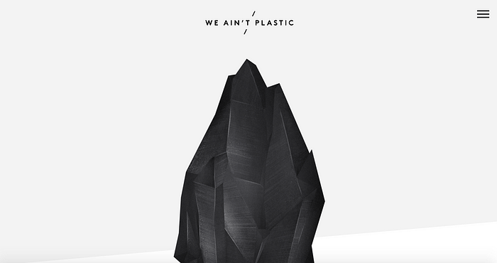
5. Accent contrasts
Since you work with fewer elements, you need to be creative when it comes to creating a visual hierarchy. In the We Ain’t Plastic example below, you see the staple of minimalism, the white background contrasted with the black gemstone.
5 Minimalist Web Design Best Practices
Creating good minimalist design is not an easy task because you must provide the same level of usability with less interface elements.
1. Use single focal point per screen
Follow the rule “one concept, one page” and design each page/ screen to focus on only one concept.
2. Design the top area of a page to set great expectations
The top area of the pages should creates an impression and engage users in scrolling down to get more informaiton.
3. Write a crisp copy
Trim all unnecessary text. Edit your content to include only the bare minimum of information truly needed to explain your message.
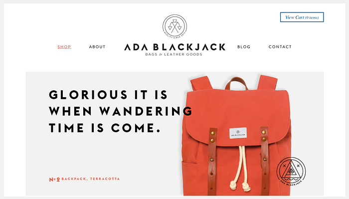
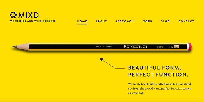
4. Simplify (but don’t hide) your navigation
Creating predictable navigation experience is always one of the top goals of web design. Be careful with patterns like a hamburger menu —they can help you simplify your interface, but can also make your navigation options less discoverable. In most cases, a permanently visible navigation options works better for your users.
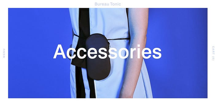
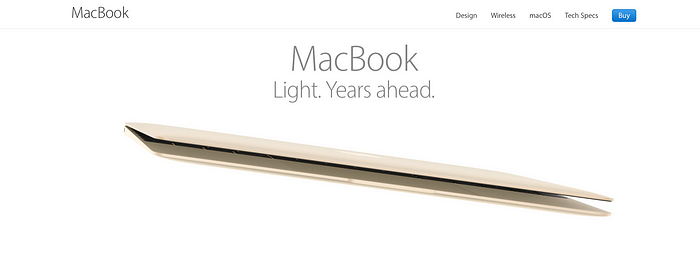
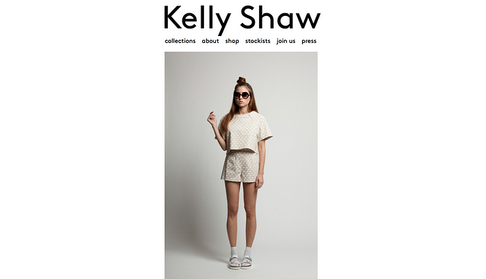
Just compare this site’s navigation:
With this one:
5. Use subtle animated effects
You can engage users into interaction with your product by using well-crafted animated effects. However, you should keep the principles of minimalism into account: try to use subtle animated effects.
Resources and Tools
- Minimalist Color Palettes — Some common minimalist color schemes deviating from the standard black-on-white.
- Color Contrast Checker — Enter your background and foreground colors to calculate the ratio of contrast to create the most accessible color combination.
Thank you!

