How to use images on your website and what to avoid

Many people think like this — it’s good to have images on a website. They make a website look good, fill up the white space and add more colour to the website. Are these the only purposes of having images on a website? Are images just for decoration? If you think so, you need to read on — images can do so much more!
Images make explanation easier to understand
The screenshots below are showing the visitors how to shop on a website, which one do you prefer, the first one or the second one?


I am sure most people would prefer the second screenshot. Both screenshots contain the same information but the second one is easier to understand and it takes less time to know how to shop on the website. The first one just has too much text. As I mentioned in one of my previous articles — visitors do not read the text on your website, they scan. That’s why it is much better to use images to illustrate how the shopping process works in the above example. I came across a number of online retailers’ FAQs section, most of them use plain text, as if the FAQs are the terms & conditions. Most of the time, I found what I was looking for but it’s just very time consuming to read all the text, a paragraph after a paragraph.
Images can evoke emotions

The dummy page above is about asking people to take responsibility for their pet, pets also got feelings and their owner should not ditch them whenever they want. I used an image with a sad looking puppy in a setting that looks like a forest. How do you feel when you look at the above dummy page? Do you want to give the puppy a big hug and perhaps take it home? If you just use plain text or a random dog image, it would not have the same effect:

Images are powerful, they speak more than thousand words.
Let images talk to your audience
Do you know the demographics of your audience? Depending on the nature of your website, the demographics could vary in a great deal. If most of them are female, you may want to use images that have some feminine colours, for instance, pink and purple. Likewise, if your audience is male, you may want to use images that have a darker tone: navy blue and black.

Apart from gender, you may also want to take the age group, interests, professions and so on into consideration as all of these affect how your audience reacts to your images.
Avoid stock images
It is very tempting to use stock images for your website. Stock images have good quality, they are low cost or even free. However, it is very hard to find a series of images that is consistent in term of quality, exposure, composition and so on that reflect your brand personality. For example, I was trying to find food images on Unsplash for a dummy menu I created. Here is what I got:
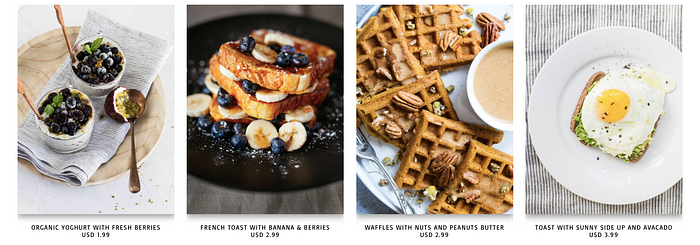
All images look professional BUT they do not look consistent. Unfortunately there is no easy workaround. To get high quality, professional, consistent images, you will need to hire a photographer. He or she would work with you so that the images would convey your messages, show your brand personality and style.
Avoid unnecessary decorative images
As you may know, page speed becomes more and more important when it comes to user experience and SEO (actually they go hand in hand as Google treats user experience as a priority). If your website is slow to load, your visitors would lose their patience and leave your website. According to a research by Google, 53% of mobile site visitors would leave a website if it takes more than 3 seconds to load. So what makes a website slow to load? There are a number of reasons but images play a role. Try to think about this: You have 20 images on a webpage, only one of them is necessary and the rest are just for making the page look good. They do not help in the actual conversion but they do help slow down your webpage.
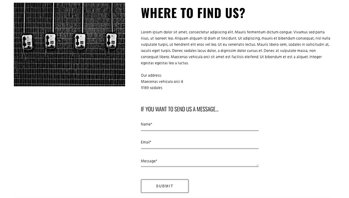
In the screenshot below, is it better to replace the image with a map that shows the office location?
Use the right image file formats
There are different image file formats, for example, PNG, JPEG and GIF. Different formats have their own advantages. If you use the right file format, you can greatly improve the user experience as well as the image quality on your website. Below is a brief introduction to PNG, JPEG and GIF.
PNG is best for logos as this format supports transparent background and if your images are complex, this format retains the quality when compressed. However, it comes with a cost — the file size is bigger compared to JPEG.
JPEG can handle complex colours but the more you reduce the file size, the lower image quality would become.
GIF supports transparent background, just like PNG and it also supports animation. However, it has a limit of 256 colours.
If all the images on your website are in PNG, you may want to consider switching some of them to JPEG to reduce the file size and optimise the page speed. For instance, decorative images do not need to have high quality, those images could be saved as JPEG with smaller file size.
A final tip about choosing the right image file format — use the Save for Web feature in Photoshop. This feature helps you save your images in a better way in terms of file size and quality. As the name suggests, the images that are saved for web have a smaller file size but retain a decent quality for web browsing.
Takeaways
Images have a bigger impact than you think. They are the first things that your visitors would see when they come to your website. Most web designers spend lots of time on layouts, colour palette and typeface selection, etc. but forget about images. Including images selection in the web design process would make the entire website more cohesive, consistent and professional. Finally, don’t forget to choose the right image file formats to make your images shine.
If you like this article, please 👏 and share so more people will see it. Don’t forget to follow me :). If you are interested in web design and user experience, you can read my other articles below:
How to style and arrange the text on your website
How to use visual cues in web design
How to create a start page for your website that attracts attention